Website Design Basics
Overview
Obviously, making your pages look good is important. But they must also be usable and accessible. A website that is visually stunning and boasts fiendishly clever interactive features will undoubtedly attract visitors, but your pages must also be user-friendly and provide useful content. In this page we will explore some of the basic principles involved in creating web pages that are fit for purpose, and will attract repeat visits.
The overall look and feel of your web pages will to a great extent be determined by the primary purpose of your website, the kind of visitor you are attempting to attract, and the type of information, goods or services you intend to offer. Perhaps the most important consideration, therefore, is how to ensure that the site will serve the needs of its intended audience.
The look and feel of pages on a personal website will be very different from the look and feel of pages on a commercial website. The overall format of web pages will vary considerably, depending on whether they are intended purely to provide information, or to sell goods online. For websites primarily intended to provide information, goods or services to people with disabilities, accessibility will be high on the list of design priorities.
This page will not teach you everything you need to know about designing web pages. It will however point you in the right direction and alert you to aspects of web page design that you should think about before you start writing any HTML code. Some of the fundamental issues to consider are listed below:
- Website structure - the overall structure of your website will to a large extent be determined by the size and scope of your project. Large websites are invariably broken down into a number of sections and subsections. Each major section of TechnologyUK, for example, is dedicated to a related group of subjects. Individual subjects get their own sub-section, and each topic within a subject has its own page.
- Navigation - the navigational scheme should be as easy to use as possible, and should reflect the overall structure of your website. The navigational scheme is perhaps the most important feature of any website apart from the content itself.
- Page layout - there are a number of possible approaches when it comes to laying out the structural elements of a web page. A typical web page has a footer and a header, a primary navigation scheme, and content of some kind. The size, placement and complexity of these elements, however, can vary considerably.
- Typography - the font face, font size and font weight used for headings, sub headings, hypertext links and body text can have a significant impact on the readability of a web page. The same goes for text alignment and the use of white space.
- Use of colour - we saw in the page "HTML Colours" that we can specify background and foreground colours for almost any HTML element, with a pallet of well over sixteen million colours to choose from. While there are no restrictions on our use of colour, there are some simple guidelines that we should follow to ensure that the colours we choose work well together, don't obscure the content of our pages, and don't draw attention away from important features.
- Consistency - as far as is practical, the layout, colour scheme and overall style of each page on a website should be the same. This is important for establishing the character of the website, and ensures that when visitors navigate from one page to another, they don't suddenly get the feeling they have jumped to a different site.
- Web standards - making sure that the HTML and CSS code used to construct the pages on a website conforms to the latest web standards is a good way of ensuring the interoperability of the site. In other words, adhering to the relevant standards ensures that the content will be accessible to users across a broad range of platforms, and will be rendered correctly by all standards-compliant user agents.
- Responsive design - unlike traditional printed media such as books, magazines and newspapers, the content of a web page is not restricted to a single, fixed format. The size and resolution of display screens on web-enabled devices varies considerably. Responsive design is all about making sure that the content of a web page can adapt itself to the device on which it is viewed in an optimal manner.
- Accessibility - in order for a website to be accessible to as many people as possible, including those who are hearing or sight impaired, web page design parameters should include the use of semantic markup and other features that are often invisible to most users, but that will facilitate the use of screen readers and other assistive technologies.
- Search engine optimisation (SEO) - this is another often invisible aspect of web page design, but one that is crucial to making sure that a website is found by mainstream search engines. Choosing appropriate keywords for a web page is only one element of SEO (in fact, meta keywords have largely been ignored by Google and other major search engines in recent years). SEO-related activities undertaken during the design process should also include things like choosing an appropriate naming scheme for the website's files and directories.
Website structure
The content of a website essentially consists of a number of files of various kinds. There will be HTML files, text files, stylesheet files, script files, media files, and other kinds of file. For a large website, the number of files can run into hundreds, or thousands, or even tens of thousands. For the TechnologyUK.net website, for example there are, at the time of writing, well over three thousand files located in more than one hundred different directories. And we don't consider TechnologyUK.net to be a particularly large website - not yet, anyway.
Obviously, if you have a personal website that consists of only a few pages, you do not need to concern yourself too much with how your website's files will be organised. In fact, you could probably get away with putting all your files in one directory (but make it a subdirectory of the root directory - we don't recommend putting anything other than top-level files in the root directory itself). For larger websites, you will need to organise your files somehow or things can quickly become very complicated.
The TechnologyUK.net website, for example, is an educational website, and is primarily concerned with technology and the science that underpins that technology. We have therefore broken the site down into a number of sections (computing, mathematics, physics, software development, etc.), each of which can be further broken down into more focused sub-sections. The mathematics section, for example, includes numerous sub-sections, including arithmetic, algebra, geometry, trigonometry and calculus.
Our website directory structure is therefore of necessity fairly complex. Each main section has its own sub-directory directly below the root directory. Each sub-section also has its own sub-directory, below the sub-directory of the section it belongs to. Each sub-section's sub directory has one or more sub-directories of its own to hold images and other media related to that sub-section.
The root directory also contains a directory called assets, which contains all of the common resources used by other parts of the website, such as style sheets, logos, icons, scripts and fonts. Each set of related resources has its own subdirectory within the assets directory. The directory structure has been designed to make it relatively easy for us to locate or make reference to specific files as and when we need to. It will also be reflected in our site navigation scheme, as we shall see. The list below shows the top three tiers of our current web directory structure.
The TechnologyUK.net - Directory Structure
htdocs
- assets
-
- css
- demo-audio
- demo-html
- demo-images
- demo-php
- demo-video
- dinosaurs
- downloads
- fonts
- icons
- images
- includes
- poems
- scripts
- computer-gaming
-
- game-technology
- gaming-landmarks-1960-1985
- images
- computing
-
- computer-systems
- operating-systems
- mathematics
-
- about-numbers
- algebra
- arithmetic
- differential-calculus
- geometry
- integral-calculus
- trigonometry
- vectors
- physics
-
- classical-mechanics
- electrical-principles
- matter
- measurement-and-units
- software-development
-
- c
- c++
- designing-software
- project-management
- sad
- uml
- vbnet
- telecommunications
-
- communication-technologies
- industrial-networks
- internet
- networks
- telecom-principles
- world-wide-web
- website-development
-
- html-basics
- introduction-to-css
- server-side-scripting
When designing your website's directory structure, think about how the content of your website will be organised. Take a top-down approach, and don't worry too much about naming conventions for files and directories until you have worked out the overall structure. One way you can do this is to produce a diagram - or maybe a series of diagrams, depending on the overall complexity of your project - showing the website's proposed structural hierarchy.
The block diagram below shows four tiers of the TechnologyUK.net website. The top tier consists of the root directory (htdocs). All of the second-tier directories (i.e. those immediately below the root directory) are also shown. The third-tier directories you can see here are subdirectories of the mathematics directory. The fourth-tier contains a single sub-directory (images) together with a number of individual HTML documents belonging to the vectors-and-vector-arithmetic sub-directory.
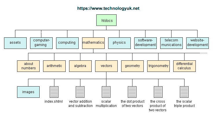
A block diagram showing part of the website directory structure of TechnologyUK.net
As you can see, it would not be practical to produce a single block diagram to show all of the directories and subdirectories within the TechnologyUK.net website directory structure. Depending on the size and scope of your project, you might need to produce separate block diagrams for each second-tier and possibly each third-tier sub-directory.
Designing and subsequently documenting your website's structure in this way can represent a significant amount of work, but it will prove invaluable in the long term, especially when it comes to implementing site navigation. The hierarchy of your navigational scheme will inevitably reflect that of your website's directory structure.
Site navigation
Navigating from one page to another in a web site is possible thanks to the presence on each page of hypertext links. The appearance of the links can vary. Traditionally, links are text elements that appear in blue and are underlined, although they may be styled differently and may consist of images rather than text.
The most commonly used navigational schemes tend to group the links on each page in a single location. This could be at the top or bottom of the page, or down the left-hand or right-hand side of the page. Most schemes tend to have the primary navigation links along the top of the page, or down the left-hand side. If the pages are particularly long affairs, a navigation scheme that is positioned at the top of the page may be repeated at the bottom to relieve users of the need to scroll back to the top of the page to access a link.
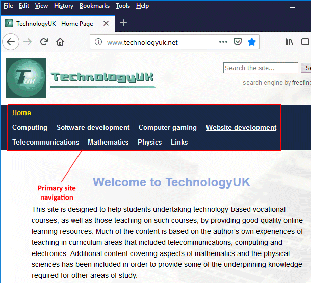
Navigational links tend to be grouped on each page in a single location
For large web sites with hundreds of pages it is obviously impractical to put a separate link on each page to every other page on the site. In this kind of scenario, a hierarchical structure is used to organise pages into categories and sub-categories. The home page will provide links to the main categories, and the linked-to pages will in turn provide links to their particular sub-categories, and so-on.
A site navigation system should be easy to use. At any given time, the visitor should know where they are in the site, and how to get to wherever it is they want to go. In keeping with the need for consistent layout, navigational controls should be in the same location on each page, and follow the same format.
The text used for a link should provide a good indication to the visitor of the nature and purpose of the target page. Above all, make sure that each link is recognisable as a link. If the underlined text style of link is not to your liking, or does not fit in with your page design, make sure that your links provide some other visual clue that identifies them as such.
There is a good argument for providing traditional text-based links to the main areas of the site on each page, even if there are sophisticated JavaScript or Flash-based menus available. Not all browsers support these technologies, and even if they do, there is no guarantee that the user has not disabled them for some reason. Every page should have a link back to the site's home page, just in case the visitor gets completely disoriented.
The collection of links on a web page is a bit like the table of contents in a book or magazine. The main difference is that the web is an electronic rather than a physical medium, which allows for a much more flexible approach to designing a navigational scheme. This is both a blessing and a curse. It enables us to be far more creative with our web page design, but it also means we have many more variables to take into account.
The position of navigational links on a web page is not as important as the underlying logical structure of the navigational scheme. This structure can be represented using a block diagram in the same way that our website's directory structure can. Indeed, the structure of the navigational scheme should closely resemble that of the directory structure itself, if the content has been organised in a consistent and logical manner.
The main areas of a website can be likened to the chapters of a book. Each chapter may contain a number of sections, which may in turn contain various sub-sections, and so-on. The number of levels in the hierarchy will depend largely on the size and nature of the site, but you should try to keep the level of complexity manageable. Ideally, each page on the site should be accessible from any other page on the site in a maximum of three clicks. We must however emphasize here that this is an ideal, and is not always achievable.
One of the techniques frequently used to enable visitors to keep track of where they are is referred to as breadcrumb navigation. This is usually seen in horizontal menu bars at the top of a web page, and consists of a sequence of page links, separated (usually) by a right-pointing angle bracket or double angle quotation mark. The sequence starts with the home page (or landing page if different) and ends with the current page.
The intermediate links in the breadcrumb trail point either to pages the visitor has traversed on their way to the current page, or to successively higher levels (going backwards) in the website's hierarchy. Breadcrumb navigation thus allows the visitor to return to the home page or to any of the intermediate pages in the breadcrumb trail.
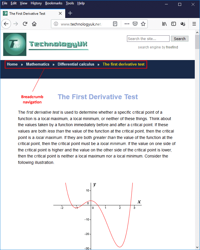
Breadcrumb navigation helps visitors to keep track of where they are
As you can see from the above illustration, the TechnologyUK.net website uses breadcrumb navigation to help visitors navigate through the site. This is particularly important if a visitor is likely to arrive at your site on a page other than the home page as the result of following a link from another site, or from a search engine. The page a visitor encounters when they arrive at your site for the first time is often called the landing page.
Note also from the illustration that we provide a site-search facility within the page header, in the top right-hand corner of the page. It's pretty much standard practice for large sites to provide a local search facility these days, and you will almost always find it in this location. The page header is also a popular location for banner advertising (this site, in fact, used to display a banner advertisement here).
Layout and responsive design
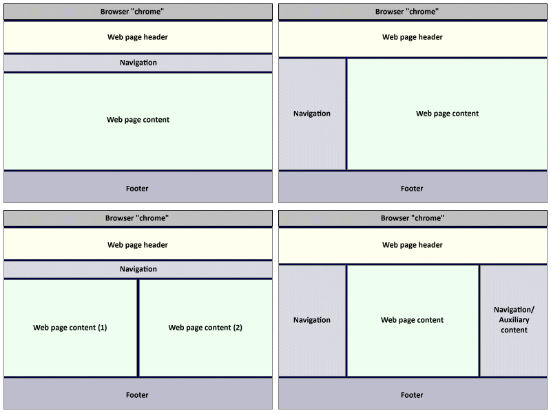
When it comes to designing a web page layout, there are no binding rules. There are however some basic conventions you would be wise to follow, and which you will see used on most of the websites you visit. The main components of a web page, and where you can reasonably expect to find them, are summarised as follows:
- Header - a full-width block that appears at the top of the page.
- Primary navigation - may take the form of a horizontal navigation bar beneath the header or a vertical navigation pane to the left or right of the main content pane.
- Content pane - a large block of screen real estate that holds your main page content; usually located directly underneath any headers and horizontal navigation bars. May be flanked on either side (or on both sides) by a vertical navigation pane. May also be subdivided into any number of subsidiary content panels.
- Footer - a full-width block that appears at the bottom of the page.
Here are some additional components that you will often encounter:
- Site logo - almost always located in the top left-hand corner of the page, within the header block. Usually configured as a link to the site's home page.
- Search bar - if present, almost always located in the top right-hand corner of the page within the header.
- Secondary navigation - there can be multiple instances of secondary navigation. Secondary navigation links are often found in the footer, and point to other pages containing things like the site's privacy policy, a sitemap, contact details, terms and conditions of use, and so on.
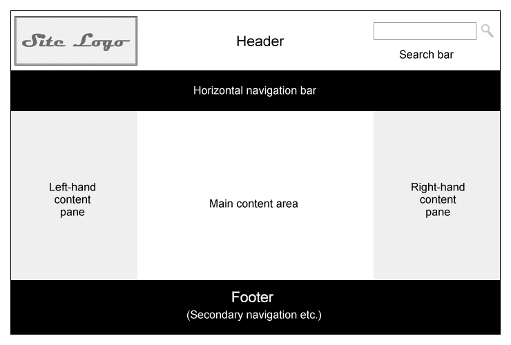
Typical web page components and layout
Page headers are typically the primary source of a website's identity because they are the first thing visitors see, and usually contain the site's logo. Depending on the exact nature of the site, they may also contain features such as a search bar, or a link to the site's shopping cart or checkout page. A collection of web pages that have identical page headers is conceived by the user as being a single website, even if the pages are actually located on different servers.
The primary navigation for a webpage is often located in a horizontal navigation bar underneath the main page header, or in a vertical column on the left-hand side of the page (or sometimes on the right-hand side). The main content area can be broken down in a variety of ways, depending on the nature of the content itself. Again, there are no hard and fast rules, but you should try and ensure that your layout presents the content in an optimal way.
The footer is usually reserved for less important things, like secondary navigation links, redundant primary navigation links, print buttons, external links to affiliates and social networking sites, and copyright notices. The footer is, in fact, a good place for any information you don't want to appear in your main content area - or anywhere else "above the fold".
In order to display the elements of a web page - including logos, headings, blocks of text and graphic media - we need to impose some kind of underlying structure on the page by dividing it up into a number of areas, each of which must have the correct shape and size to accommodate whatever we're going to put into it. Web page designers have in the past used HTML tables for this purpose, but this practice has fallen out of favour - which is understandable, because HTML tables were never intended to be used in this way.
Today, web page layouts are usually created using structural HTML elements like <div>, <header>, <nav>, <section> and <footer>, together with cascading style sheets (CSS). This is in keeping with the W3C philosophy that the presentational aspects of a web page should be completely separate from its content and meaning. When you think about it, this also has much in common with the way in which printed media is handled.
Authors and journalists, for example, produce written or word-processed documents; they do not need to concern themselves with issues related to typesetting, printing or book binding. In the same way, the team or individual tasked with designing the layout and presentational aspects of a web page are rarely involved in producing the actual content of the page.
Technology has made it possible for just about anyone to publish just about anything online. Anyone with a computer and an internet connection can set up an account with a web hosting service and upload their deathless prose for all the world to see. Unfortunately, technology has also thrown up a number of new and perplexing challenges for those of us involved in publishing online content.
One ongoing problem - albeit one that is usually relatively easy to work around - is the fact that the major browser vendors do not always see eye to eye on web standards. A far greater challenge from the web developer's point of view is the sheer diversity of web-enabled devices. Our web pages can potentially be downloaded and displayed on every kind of device imaginable, from a wristwatch-sized "wearable" to a room-sized Smart TV.
In the early days of the World Wide Web, designing a page layout that would display correctly on different devices simply meant thinking about the lowest common denominator in terms of computer screen resolutions. Today, developers must undertake what is known as "responsive web design" in order to ensure that the web pages they create will render correctly on any kind of end user device, regardless of display resolution, aspect ratio, or any other technical constraints.
In a sense, this highlights the need to identify your target audience. For example, we have gone to some lengths with the TechnologyUK website to ensure that it can be accessed by mobile users. However, given the nature of the site (it is essentially intended to be an educational resource for those engaged in various forms of technology-related study), we tend to assume that most of our visitors will be viewing these pages on a decent-sized display device, probably in the comfort of their own home or in a classroom or office.
A screenshot of TechnologyUK.net on a Samsung Galaxy A5 smartphone
For many kinds of website - social networking sites, information services, and online gaming sites for example - it is fair to assume that a significant number of the visitors to those sites, perhaps even the vast majority of visitors, will be mobile users. That being the case, the use of responsive design techniques is not only desirable but an absolute necessity.
Some web design experts argue, perhaps with some justification, that developers should design all of their web pages with the needs of mobile users foremost in their minds. It is certainly true that there has been a dramatic shift in the relative number of mobile users versus desktop users in recent years, with some sources reporting that the former has now overtaken the latter.
We take the position that (a) the two groups often have very different consumer needs and (b) there is a large amount of overlap between them. Mobil users tend to access the web on their way to and from work, for example, to catch up with the latest news, check the weather forecast, play an online game, or message their friends on social media. Many of those mobile users will switch to using a laptop or desktop computer for their online activities at home or at work, because it's simply a more comfortable way of working.
Our advice would therefore be to use responsive design to the extent that your pages provide a reasonable degree of access to mobile users, but that the amount of time and resources you should spend on this aspect of your website's design must really be determined by the proportion of traffic you are likely to generate from the mobile user base.
Taking the TechnologyUK.net website as an example, the statistical information for December 2018 (see below) seems to indicate that almost 50% of our visitors were using a desktop operating system, and we are of the opinion that this will remain the case for the foreseeable future. Windows users alone make up approximately 43% of the total, whereas Android users constitute just 33%. Most of the remaining 24% is split between IOS, OS X, Linux and "unknown".
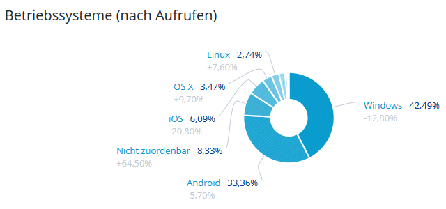
Visitor operating system use, TechnologyUK.net (December.2018)
Before the arrival of cheap, web-enabled hand-held devices, there were two basic approaches to designing a web page layout. The first approach involved making an assumption about the size of the most commonly used screen resolution and optimising the page layout accordingly. This worked in the majority of cases - if your original assumption was correct - but it ignored the needs of a significant number of users. Furthermore, the pace of technological change is such that, even if your pages are displayed in an optimal manner for the majority of users on the day of publication, things can rapidly change.
The second approach, and one that has both stood the test of time and evolved to take advantage of new technological developments, is to attempt to design the pages so that they will be rendered in a satisfactory manner no matter what kind of display configuration is being used. This approach is today referred to as "responsive design". It essentially enables pages to both automatically resize themselves and, if necessary, automatically reconfigure themselves according to the user's display device parameters.
We will not attempt here to teach you everything you need to know about responsive web page design. Detailed coverage of such an important subject is beyond the scope of this page. We will however offer you some examples of basic web page layouts that can be used for a wide range of projects, together with fully working code. You are welcome to use the coded examples as templates for your own pages.
The example pages we will present involve the use of cascading style sheets (CSS). We have already used inline styling and embedded stylesheets (courtesy of the <style> element) in many of the other examples presented in this section, so this is not completely new territory, although it will probably take a little more time to get a firm grasp of what the code is actually doing and how it works.
Once again, however, we stress that CSS is a complex subject that will be dealt with in far more depth elsewhere; this page is not intended as an in-depth CSS tutorial. We will show you the HTML and CSS code you will need in order to implement the examples, and explain in general terms how it all works. That said, you should be able to create some professional-looking web page designs using just these basic examples.
As your knowledge and experience grows, you can extend the examples provided here to better suit your needs, or come up with your own web page layouts. If you are unsure of what kind of layout you actually need for your project, you may be able to get some inspiration and a few insights by looking at existing websites that are targeting a similar audience to the one you have in mind.
Web page typography
It might be a good idea to start with a definition of typography, and then discuss how this can be applied to our web pages. The definition currently given by the online version of Encyclopaedia Britannica is as follows:
"Typography, the design, or selection, of letter forms to be organized into words and sentences to be disposed in blocks of type as printing upon a page. Typography and the typographer who practices it may also be concerned with other, related matters—the selection of paper, the choice of ink, the method of printing, the design of the binding if the product at hand is a book—but the word typography without modifier most usually denotes the activities and concerns of those most involved in and concerned with the determination of the appearance of the printed page."
When we arrange the text in a web page, we don't have to worry about issues related to typesetting or printing. The appearance of the text, however, is just as important. Perhaps more so, for a number of reasons. For one thing, electronic display devices tend to make far greater demands on our eyes than printed matter.
What is perhaps of equal importance is that people probably spend far more time looking at a computer screen or a mobile device these days than they spend reading books, newspapers or magazines. And, because of the sheer volume, diversity and availability of web-based content, they are likely to be confronted with countless different fonts and text layouts.
As web developers, therefore, we should make every effort to ensure that our text is readable, and that it is laid out in such a way that reading it is a comfortable experience for the user. Whilst this is probably easier said than done in many cases, there are some fairly basic guidelines we can follow that will help us achieve this goal - some of which are simply common sense.
When it comes to things like site logos and headings, we can often get away with being fairly adventurous in our choice of fonts and colours. For the main body of our content, however, we should attempt to optimise the readability of the text. Pay particular attention to the following:
- Font size
- Font face
- Indentation and white space
- Text-alignment
- Line spacing
- Line length
Many of the issues relating to these points, and to the handling of text in web pages generally, have already been dealt with in the page "HTML Text" in this section. Nevertheless, it is worth revisiting these issues in the context of web page design.
Font size - The question of font size is fundamental to the readability of the text in a web page - or anywhere else for that matter. We strongly recommend that you allow the font size to be determined by the browser, for two reasons. First, browser defaults are usually determined according to platform, i.e. the device hardware and operating system. Second, the user can usually change the browser's default settings to suit their needs. If you hard code a font size into your web pages, you take this option away.
Font face - there are a number of issues here. First of all, we recommend the use of a sans-serif font face. There is an overwhelming amount of evidence to support the view that sans-serif fonts are simply easier to read than serif fonts. This still leaves you literally thousands of fonts to choose from. Once again, however, we recommend letting the browser use its default sans-serif font.
It's not a good idea to specify a particular font just because it looks good on your computer - it may not look so good on other platforms. More to the point, it may not be available on other platforms. If you really feel the need to specify your favourite font, offer a range of backup options, which should include the default sans-serif fonts used by major browsers and operating systems.
Don't use lots of different fonts. Your pages should have a consistent look and feel if you want to establish the character of your website and give it a unique identity. Using several different fonts on the same page, or using a different font on every page "just to mix things up", will achieve the exact opposite, as well as looking extremely unprofessional. Try to limit yourself to two or three fonts (you could for example use a generic sans-serif font for general text, and something a little more adventurous for your page headings).
Indentation and white space - when we talk about indentation, we are usually referring to the distance between the beginning of a line of text and the left-hand margin, although the term is often also used to refer to the distance between the end of a line and the right-hand margin, depending on context. White space is literally the space that surrounds the various elements on a page including, of course, blocks of text.
The term "white space" refers to the fact that books, magazines and newspapers have traditionally been printed on white (or near-white) paper. The space surrounding a block of text or an illustration on the printed page is thus referred to as white space. Although we still often use a white background for web pages for the sake of readability, the colour of the "white space" we refer to will depend on the background colour actually used.
Text may be indented for several reasons. The most obvious reason is to provide a degree of separation between the page margins and the text itself, which improves the overall appearance of the text and can also serve to limit line length (more about that shortly). We can also use indentation to signal the start of a paragraph by indenting the first line slightly (you often see this in newspapers where text is fairly densely packed and organised into columns).
Increasing the amount of white space around a block of text can both improve readability and make the text stand out. We should be careful not to use too much white space, however. We don't want the text to look like it doesn't belong with the rest of our page content. Indeed, the distance between the elements on a web page can often be seen as a measure of the strength of the relationship between them.
Text alignment - if you expect your visitors to read a block of text of any length, it should be left-aligned. Centred or right-aligned text makes it difficult for the reader to locate the start of each new line, which means that reading will rapidly become hard work. Fully justified text should also be avoided, because it can cause problems for dyslexic readers. In order for the text to be both left- and right-aligned, the distance between words is often stretched, leading to uneven spacing.
Line spacing - sometimes called leading because printers used to put strips of lead between lines of type to increase vertical space. This is the distance between the baselines of two lines of text (the baseline is the line upon which most characters sit, ignoring any "tail" they may have). Looking at it another way, it's an indication of the amount of vertical white space between two lines.
Standard line height is approximately 20% greater than the text's font-size (the font size us usually defined as the vertical distance between the bottom of the lowest glyph and the top of the highest glyph). It can thus be expressed as "1.2" as a ratio, or "120%" as a percentage. A line height of 2.0 (or 200%), measured in pixels, would be equal to the font size in pixels multiplied by two. For a 16px font with a line height of 2.0, the vertical distance between the baselines of two lines of text would be 32 pixels.
If the lines are too close together, the text looks cluttered and is difficult to read. If they are too far apart, the continuity of the text can be disrupted, which also makes it difficult to read. According to W3C's Web Content Accessibility Guidelines (WCAG), the optimum line spacing requires a line height of 1.5 (or 150%). The concept can also be extended to the space between paragraphs, for which the WCAG recommends a line height of 2.5 (250%).
Line length - this is one of the few areas where it's actually easier to comply with the guidelines for mobile devices - particularly smartphones - than it is for desktop computers. The WCAG recommendation for the maximum line length of a block of text is 80 characters. Other sources have suggested half this number of characters for mobile devices. There are, however a number of problems in implementing this requirement for desktop computers.
The main problem stems from the increasingly high resolutions of computer screens and the fact that the browser window is far more likely to be re-sized by a laptop or desktop user. It is therefore difficult, if not impossible, to guarantee a consistent line width across browsers and platforms in a desktop environment.
In fact, we have just been looking at the W3C article "Visual Presentation: Understanding SC 1.4.8", which states "Lines should not exceed 80 characters or glyphs (40 if CJK) . . ." Rather ironically, however, most of the lines of text in this article are well over one hundred characters in length when viewed in Firefox on a desktop computer with a 1440 x 900 pixel display monitor (fairly modest by current standards).
In fairness, the article does lead with the perhaps deliberately ambiguous sentence "For the visual presentation of blocks of text, a mechanism is available to achieve the following . . ." (text emboldened and underlined by us). We therefore have to assume that some responsibility must also rest with the user in this respect, since most browsers allow the user to configure both the size of the browser window and the browser's default font size.
Certainly Wikipedia, which must surely be one of the most heavily trafficked online resources in the World, does not seem to feel under any obligation to limit line length to 80 characters. In fact, most Wikipedia articles (other than mere stubs) contain sections in which the line length approaches, or in some cases exceeds, two hundred characters per line on a desktop computer, depending on screen resolution.
There are a few other points to mention here. Make sure, for example, that any background colours, images, or videos do not obscure the text you actually want your visitors to read. W3C recommends a contrast ratio for text against its background of 4.5:1 for small text and 3:1 for larger text. This contrast ratio is defined in terms of the relative luminance of the foreground and background.
If you simply want to check whether your chosen text and background colours meet these criteria, we can recommend WebAIM's contrast checker, which you can find here. If you have text overlaying an image, you might have to use your own judgement to decide if there is sufficient contrast, particularly if there is a lot of colour variation within the image. Another resource we have found to be useful in this respect is Experte's contrast checker, which you can find here. This tool can be used with either a single web page or multiple web pages to check all page elements for sufficient contrast.
Other fairly common-sense things to avoid include the use of blinking text (not only extremely annoying but potentially dangerous to anyone prone to seizures), using all caps (both difficult to read and synonymous with shouting), and the use of a significant amount of red or green text (apart from being sub-optimal for those among us who suffer from some degree of colour blindness, these colours simply look horrible - especially if used in close proximity to one another).
Colour schemes
The use of colour in web pages is a fairly specialised topic in its own right, and there are plenty of tutorials and other resources dedicated to the subject of web page colour schemes. Our main concern here is to ensure the basic usability of the web pages we create. One of the most important things to remember is that text should be clearly visible against the background colour used. White text on a yellow background (for example) is not a good idea.
Text and background colours should be chosen so as to provide a reasonable degree of contrast between the two. Bear in mind also that research appears to support the view that white (or light-coloured) text on a black (or dark coloured) background is more difficult to read than black text on a white background (and is also more expensive to print!). Just as importantly, be consistent - use the same colour scheme throughout your website. This helps you to establish the site's identity.
The colour scheme you choose will to a great extent depend on the nature of your website. Although the psychological aspects of colour are somewhat beyond the scope of this page, there are a few widely accepted principles with which you should probably become familiar, if you haven't already. For example, colours like red and orange are considered "warm", while colours like green and blue are considered "cold".
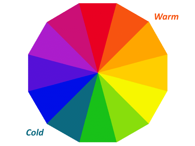
Red and orange are seen as "warm" colours, while green and blue are seen as being "cold"
Red is considered by many to be an aggressive colour, and is often associated with danger - you will often see it used in warning signs on roads, in industrial environments, and on construction sites. Orange is also associated with danger, but to a lesser extent. It is commonly associated with warmth, energy and fire. Orange is the colour most easily seen in poor lighting conditions, as well as in open water. It is often used in safety wear, and for life jackets and marker buoys.
Yellow is the most visible colour in the spectrum, which is why you often see it used in high-visibility (or "hi-viz") workwear. Yellow is often used together with black for hazard warning signs and tape. Green tends to be associated with nature and renewal - we see it all around us when we venture into the countryside.
Surveys of in North America and Europe suggest that blue is a favourite colour for almost half of all responders (both male and female). It is the colour most commonly associated with harmony (think about clear skies and calm seas), which is perhaps why it was used in the flags of organisations like the United Nations and the European Union. It has also been associated with intelligence and knowledge.
Black is often associated with strength and power. On the negative side, it is also associated with death, evil and the unknown. White is associated with purity and innocence, and imparts a sense of cleanliness and freshness. The combination of black and white gives the greatest degree of contrast it is possible to achieve, which is probably why the vast majority of books, newspapers, and magazines use black text on a white background.
So what colour scheme should you choose for your website? The short answer is that it very much depends on the kind of website you are creating. Do the research, based on what you perceive as your target audience. If all else fails, look at other websites that target the same or a similar audience. Whatever colour scheme you eventually decide on, based on your findings, there are still some general guidelines you should follow.
The first of these is to limit yourself to just three, or at most four, colours. This may sound strange, given that you have approximately 16.8 million colours to choose from. However, whilst you certainly don't want to restrict yourself to just one colour (which could make things a little boring), using too many different colours can have a negative impact on your ability to establish a unique identity for your website. This really is a case of less is more. The colours you need to consider are:
- A dominant colour - this will be determined by your research findings (see above)
- An accent colour - an additional colour (or possibly two) to compliment your dominant colour
- A background colour - usually white or a very light colour that allows your content to be seen
The dominant colour is essentially the main colour for your website. It should have a prominent role in features like your site logo, page headings, and anything else you want to immediately draw the visitor's attention to. The accent colour (or colours) should compliment the dominant colour. Accent colours are used to highlight other, less important page features like sub-headings and controls that are not the primary focus, but that you nonetheless want your visitors to be aware of.
The background colour, as we have mentioned several times now, should be either white or a light, neutral colour that allows the visitor to read your content without straining their eyes. This is especially important for informational websites, where the visitor is expected to concentrate on the information presented. Ideally, the visitor should focus completely on the information contained within your page content, and not even be aware of the background colour.
Let's assuming you have decided on the dominant colour for your web pages and are ready to pick accent and background colours. The big question now is, which colours got together? Fortunately, you don't have to be an expert in colour matching in order to find a set of colours that will look just right together. There are numerous online tools that will help you do this, most of them free to use.
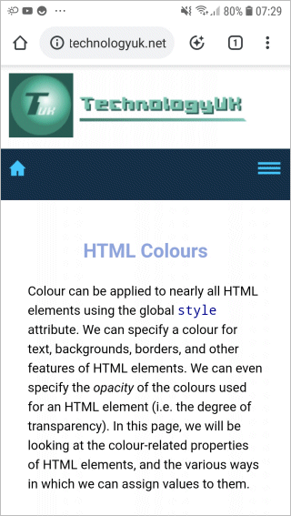
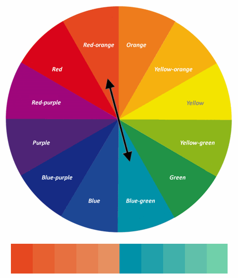
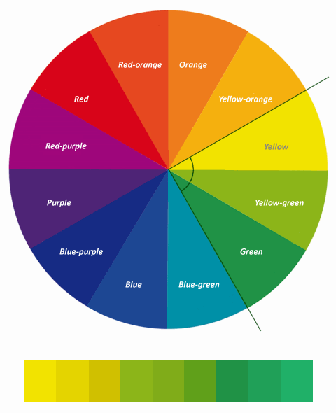
Before you rush off and find one of these amazing tools, however, there is one more aspect that you should be aware of. Professional designers choose their colour schemes using a colour wheel. The colour wheel typically contains twelve standard colours. A whole family of colours can be created from each of these base colours by incrementally changing the value of one or more of its red, green and blue (RGB) components (for a more in-depth look at how colours are specified, see the article "HTML Colours" in this section).
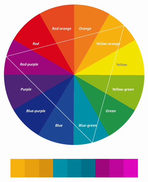
There are four basic types of colour scheme that can be derived using a colour wheel:
- Monochrome - the colour scheme consists of various shades of a single base colour
- Complementary - two colours are chosen from opposite sides of a colour wheel
- Analogous - three colours that sit next to each other on the colour wheel are used
- Triadic - three colours that are equidistant from one another on the colour wheel are used
The monochrome colour scheme, because it essentially uses variations on a single base colour, produces a very cohesive colour scheme, although it has the potential to become rather monotonous if sufficient care is not taken over how it is used. A series of monochrome colours can be created by lightening or darkening the base colour.

A monochromatic colour series based on Green
A complementary colour scheme is based on two colours chosen from opposite sides of the colour wheel. Because the two base colours will be very different from one another, colour schemes that use this approach can really have an impact.
A complementary colour series based on Red-orange and Blue-green
An analogous colour scheme uses three colours that are adjacent to one another on the colour wheel, and can thus achieve the same kind of cohesion that is possible with a monochrome colour scheme. However, because the colours are not the same, there is less chance of the colour scheme becoming monotonous.
An analogous colour series based on Yellow, Yellow-green and Green
A triadic colour scheme also uses three base colours. This time however, as the name implies, we must draw an equilateral triangle inside the colour wheel so that each vertex of the triangle touches its perimeter. The three colours that coincide with the vertices of the triangle are equidistant from each other, and will be the base colours for our colour scheme. The idea of using this approach is to create a diverse and yet balanced scheme.
A triadic colour series based on Yellow-orange, Blue-green and Red-purple
Wireframing and storyboarding
Wireframing is a quick and simple way of trying out different designs for the overall structure of a web page before you commit yourself to far more labour-intensive tasks like storyboarding and coding. Wireframes are typically just simple line drawings showing the main layout components, in which the page is broken up into a number of rectangular areas. Each area is labelled to show what it will be used for.
Some examples of wireframe web page layouts are shown below.
Wireframing can be used to visualise basic web page layouts
Wireframe layouts are all about page layout. They essentially ignore all other aspects of web page design, allowing developers to concentrate purely on the user interface and the functionality of the web page. Once the layout has been finalised, developers can concentrate on other design issues without having to concern themselves with page layout.
Wireframing is often carried out with the aid of a grid system that allows the developer to easily determine the relative size of the various layout components. This can save a lot of time, as it takes the guesswork out of coding the HTML and CSS necessary to actually implement the web page layout. The grid systems used vary in sophistication. We will be discussing them in more detail elsewhere.
Storyboarding essentially involves making a rough sketch of what you think each page should look like. It allows the web developer to experiment with layouts and colour schemes, and to visualise the overall appearance and structure of each page. The number of storyboards needed for a project will depend on the size and complexity of the project.
There is of course no reason why you should not create several storyboards for the same page. You can then evaluate the merits of each potential design before making a final decision. Once you have decided on an overall concept, you can create a series of storyboards for each section and sub-section. The completed set of storyboards will provide the design blueprint for your project.
The storyboard should specify the position of page features such as logos, navigational controls, headers and footers, page and section headings, images and blocks of text. Additional documentation, typically in the form of hand-written notes, can be used to provide more information about the page design, such as the fonts to be used for text and headings, details of the colour scheme to be used, the naming conventions to be used for HTML files and other resources, and so on.
Creating a set of storyboards for a project is one way of ensuring that the website will have a consistent look and feel throughout. This is particularly important if the website is being developed by or on behalf of a commercial organisation, because maintaining a consistent "corporate image" will be high on the list of design priorities. Developers can also use storyboards to present their design concepts to the customer.
A complete example - RoboCat!
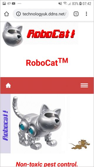
We will now create a website for the totally fictitious company "RoboCat!", which specialises in hiring out robotic cats to customers experiencing a rodent problem. We'll start by considering what a desktop version of our RoboCat! Home page might look like. One way to do this, before we start writing HTML or CSS code, is to create a storyboard.
The illustration below shows the storyboard we created for the RoboCat! website home page. As you may note, we have used graph paper to sketch out the design. This will help us later when we need to work out the relative size and position of each of the major components in our page layout.
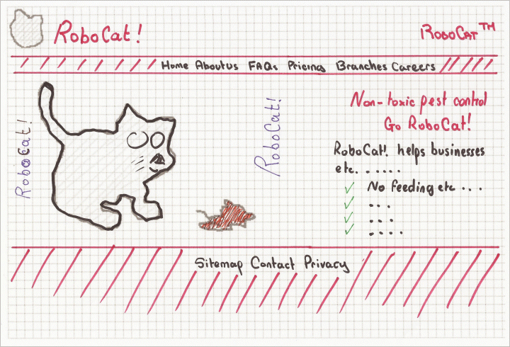
A storyboard for the RoboCat! home page
At the moment, the storyboard doesn't look too impressive but it does its job, which is to tell us where the main features of the page are located, including the navigational elements. Because this is the home page for the RoboCat! website, the intention is that most if not all of the page content should be visible to the user when the page loads.
Other pages may contain far more detailed information, requiring the user to scroll down the page in order to see everything, but you should always ensure that the most important information is displayed above the fold. The term "above the fold" invariably crops up in articles devoted to web design but is rarely explained fully, if at all, so we will quote Wikipedia's current definition, which is as good as any:
"Above the fold is the upper half of the front page of a newspaper or tabloid where an important news story or photograph is often located. Papers are often displayed to customers folded so that only the top half of the front page is visible. Thus, an item that is "above the fold" may be one that the editors feel will entice people to buy the paper. . . . . . The term can be used more generally to refer to anything that is prominently displayed or of highest priority. Above the fold is sometimes used in web development to refer the portions of a webpage that are visible without further scrolling or clicking."
The most important features of a page will include things like the site logo, the page's main heading, and the primary navigational controls. Visitors to the page should immediately be able to get a sense of the site's identity, see what the page is all about, and be able to navigate to other important pages on the site, even if they cannot see all of the page's content without scrolling.
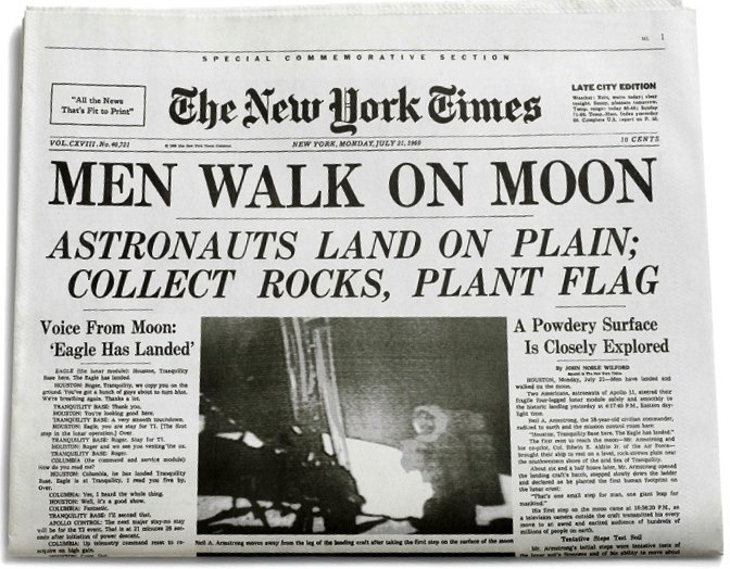
The "above the fold" portion of the front page of The New York Times, 21st July 1969
The RoboCat! HTML
Without further ado, we present below the HTML code for the RoboCat! home page.
<!doctype html>
<html lang="en">
<head>
<meta charset="utf-8">
<title>RoboCat</title>
<meta name="viewport" content="width=device-width, initial-scale=1.0">
<meta name="mobile-web-app-capable" content="yes">
<meta http-equiv="X-UA-Compatible" content="IE=edge">
<link href="css/robocat.css" rel="stylesheet">
<script>
function toggle_visibility(id) {
var e = document.getElementById(id);
if(e.style.display == 'block')
e.style.display = 'none';
else
e.style.display = 'block';
}
</script>
</head>
<body>
<div class="wrapper">
<header>
<div class="float_left">
<img src="http://www.technologyuk.net/assets/demo-images/robocat-logo.gif" alt="The RoboCat Logo">
</div>
<div class="float_right">
<h1>RoboCat<sup>TM</sup></h1>
</div>
</header>
<div class="bar">
<nav>
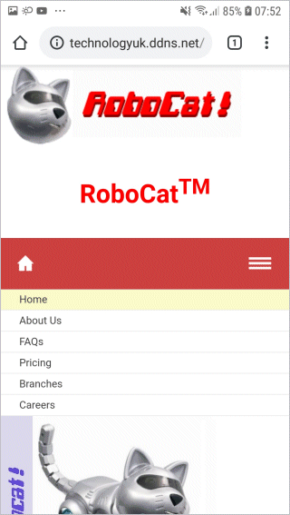
<div class="topnav_home">
<a href="#"><img src="http://www.technologyuk.net/assets/demo-images/robocat-home.gif" alt="Home"></a>
</div>
<div class="topnav">
<span>
<a class="dead">Home</a>
<a href="#">About Us</a>
<a href="#">FAQs</a>
<a href="#">Pricing</a>
<a href="#">Branches</a>
<a href="#">Careers</a>
</span>
</div>
<div class="topnav_menu">
<a href="#" onClick='toggle_visibility("MobileMenu"); return false;'><img src="http://www.technologyuk.net/assets/demo-images/robocat-menu.gif" alt="Menu"></a>
</div>
</nav>
</div>
<nav id="MobileMenu">
<ul class="mobile_menu">
<li class="dead"><a>Home</a></li>
<li><a href="#">About Us</a></li>
<li><a href="#">FAQs</a></li>
<li><a href="#">Pricing</a></li>
<li><a href="#">Branches</a></li>
<li><a href="#">Careers</a></li>
</ul>
</nav>
<div>
<div class="content_left">
<img src="http://www.technologyuk.net/assets/demo-images/robocat.jpg" alt="Picture of RoboCat">
</div>
<div class="content_right">
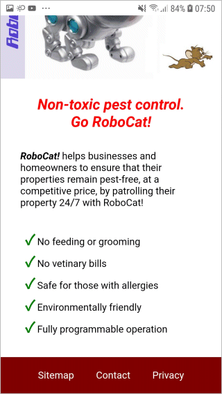
<h2><em>Non-toxic pest control.<br>Go RoboCat!</em></h2>
<p>
<em><strong>RoboCat!</strong></em> helps businesses and homeowners to ensure that their properties remain pest-free, at a competitive price, by patrolling their property 24/7 with RoboCat!
<ul>
<li><span class="check">✓</span> No feeding or grooming</li>
<li><span class="check">✓</span> No vetinary bills</li>
<li><span class="check">✓</span> Safe for those with allergies</li>
<li><span class="check">✓</span> Environmentally friendly</li>
<li><span class="check">✓</span> Fully programmable operation</li>
</ul>
</p>
</div>
</div>
<footer>
<a href="#">Sitemap</a>
<a href="#">Contact</a>
<a href="#">Privacy</a>
</footer>
</div>
</body>
</html>
The HTML code itself is relatively straightforward. Copy and paste this code into a new file in your HTML editor, save the file as robocat.html, and open the file in a web browser. You should see something like the following:
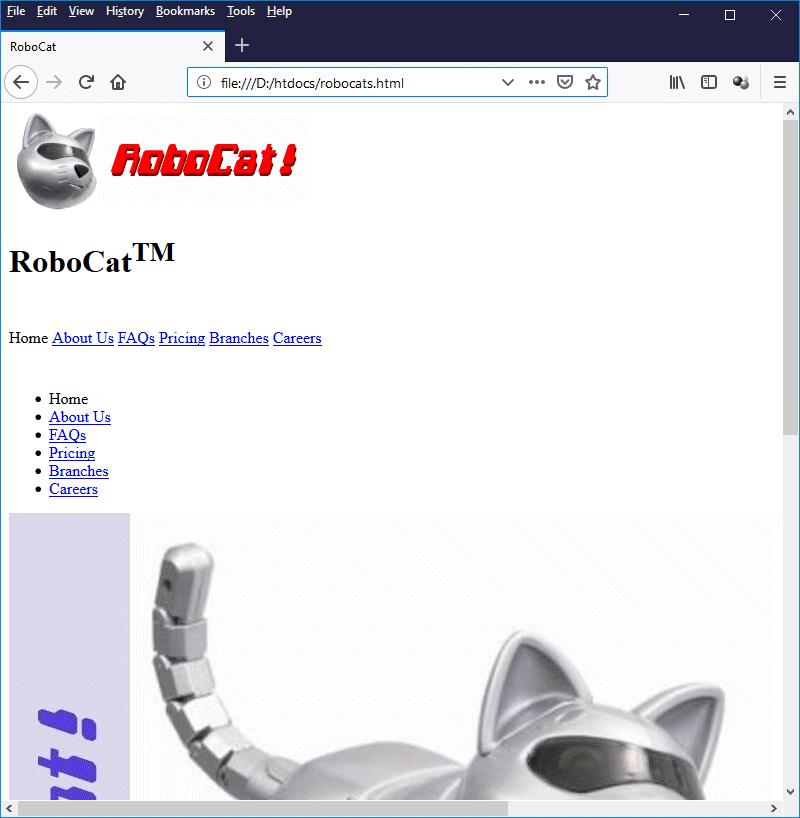
The RoboCat! home page with no styling applied
As you can see (if you scroll down the page), all of the main page elements appear to be in place, but there is obviously a lot of work to be done before the page will resemble our storyboard. About the only thing that is in the correct place is the site logo. In order to make things right, we need to add the Cascading Style Sheet (we'll just call it a style sheet from now on) that contains the styles for our page.
A RoboCat! stylesheet
Create a new folder in your htdocs directory (or whichever folder you keep your HTML code in), name the new folder "css", then use your HTML editor or a text editor to create a blank style sheet file with the name "robocat.css". Note that, like HTML files, cascading style sheet files are simply text files. They have the file extension .css. They can contain all of the style definitions for a single web page, or for an entire website.
We will not dwell too deeply here on the syntax of the CSS code used for the RoboCat! web page - that is something we will do in the section "Introduction to CSS". We will however offer a brief explanation of what the code is doing for us in terms of implementing the required presentational features. Before we look at the CSS code, note the following line of HTML code, which appears inside the <head> element of the RoboCat! home page:
<link href="css/robocat.css" rel="stylesheet">
This code tells the browser to fetch the stylesheet code from the file robocat.css, which can be found in the local folder css. Not that there is any stylesheet code to be fetched at the moment, but we'll remedy that situation in due course!
As we add each new block of stylesheet code, we will explain what it does, note its effect on the appearance of our web page, and where appropriate point out the references to it in the HTML code. We will not provide illustrations for every single step along the way, but we suggest you refresh your browser after each new piece of CSS code has been added in order to get a feel for the contribution it has made.
With the robocat.css file open in your HTML editor or text editor, copy and paste in the following code and save the file:
/* GENERAL STYLES */
html { overflow-y: scroll; background: #800000; }
body { font-family: sans-serif; margin: 0; }
The first line here is a comment. Comments are enclosed within the forward slash and asterisk construct:
/* <comment goes here> */
The next line defines styles that will be applied to the entire HTML document. It basically tells the browser to provide a vertical scroll bar regardless of whether or not the content will fit into the browser window, and set the background colour for the entire document to a dark red.
Supposing we had not done this, and the visitor goes from a page where everything is visible (which by default will not have a scroll bar) to a page where there is more content than can be displayed "above the fold" (which will have a scrollbar), then the transition will necessarily cause the page layout to adjust itself to the presence of the scroll bar, and things will reposition themselves accordingly. This behaviour is perfectly correct, but it can be annoying.
The background colour has been set to dark red because we have chosen to set the background colour of the page footer to that colour; we want to avoid the situation where, if our page does not fill the entire height of the browser window, there is a white band at the bottom. The last line simply sets the font face for the body of the document to a sans-serif font, and the page margins to zero.
Now copy and paste the following code into your CSS file underneath the existing code and save the file:
div.wrapper { background: #ffffff; }
If you look at the HTML code, you will see that all of the HTML code within the <body> element has been placed inside a <div> element whose class attribute has been set to "wrapper". As the name suggests, this element serves as a container that "wraps up" everything else in our HTML document. The style information defined in the CSS code above will be applied to this <div> element, which will therefore have a white background.
Now add the following code to your CSS file underneath the existing code and save the file:
header, footer {
width: 100%;
display: inline-block;
}
div.bar {
height: 24px;
background: #cc4040;
padding: 20px 0;
}
footer {
text-align: center;
padding: 20px 0;
background: #800000;
}
This code defines the styles for the page header, the page footer, and the menu bar that sits under the page header and contains the primary navigation links for the page. You might have noticed that these navigation links also currently appear at the side of our main content window. They will eventually be hidden from the user unless the width of the screen falls below a certain threshold (600 pixels).
Now you can add the rest of the structural CSS code, which (more or less) puts everything in the right position in relation to everything else:
div.float_left { float: left; }
div.float_right { float: right; }
div.content_left { float: left; width: 50%; }
div.content_right { float: right; width: 50%; }
The important thing to note here is the use of the float property. We have used it to position the <div> element containing our site logo on the left-hand side of the document header section, and the RoboCatTM text on the right-hand side. We have used it in similar fashion to align the two content panes - <div class="content_left"> . . . </div>, which contains an image, and <div class="content_right"> . . . </div>, which contains some text.
The float property makes the element it is applied "float" to the left or right of the container in which it resides, depending on the value assigned to it (left or right). Note that the width of each of the left and right content panes has been set to 50%. This means that, together, they occupy the total width of the <div> element within which they have been placed.
When expressed as percentages, the widths of the left- and right-hand content panes must not sum to more than 100%. If they do, the right-hand pane will still float to the right of the main content pane, but will be positioned vertically below the left-hand content pane; they will not be allowed to overlap.
We will now add the following lines to our style sheet:
img { max-width: 100%; }
h1, h2 { color: #ff0000; margin: 1em; text-align: center; }
p { text-align: left; margin: 2em 3em 2em 2em; }
li { list-style: none; }
span.check { font-weight: bold; color: green; font-size: 150%; }
The first line here is quite important because it restricts the maximum width of any image in our web page to 100% of the container in which it appears. This means that we don't need to worry too much about the dimensions of the images we use, because they will be automatically scaled to fit the space available.
The next three lines set the styles for the heading, paragraph, and list item elements. The final line sets the style for the tick (or check) symbol, which we are basically using as a list marker for our list items. The list items won't have the solid black disk list marker they would usually have in an unordered list because we have set the list-style property for the list item element to none.
Let's have a look at how far along we are with achieving our desired page layout.
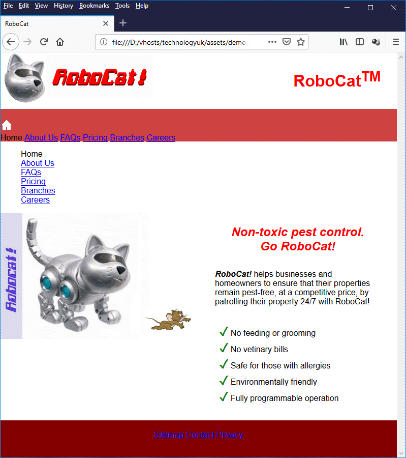
The partially syled RoboCat! home page
This is looking more like the design we sketched out on our story board. There are still a few things to tidy up, however. For one thing, as you can see, we seem to have duplicate navigation links on the left-hand side of the page which are displacing the rest of the content. These are, in fact, the navigation links that should only appear on display screens with a width of less than 600 pixels. They would normally only be displayed on a mobile device.
The CSS code below sets the styles for this "mobile menu". Add it to your robocat.css file.
/* NAVIGATION & LINK STYLES */
ul.mobile_menu { padding: 0; margin: 0; }
ul.mobile_menu li {
padding: 5px 10px;
border-bottom: solid 1px #eeeeee;
background: #ffffff;
font-size: small;
}
ul.mobile_menu li:hover{ background-color: #f0f0f0; }
ul.mobile_menu li a { color: #404040; text-decoration: none; }
ul.mobile_menu li a:hover { text-decoration: underline; }
ul.mobile_menu li.dead { background-color: #fafbc9; }
ul.mobile_menu li.dead a:hover { text-decoration: none; }
li a { display: block; }
Once you have applied this code, the mobile menu will still be visible, but it will look very different. You may have noticed from looking at the HTML code that we have implemented the menu items as hypertext links nested inside list items. Each list item now takes up the full width of the browser window, and hovering over a list item will cause its background colour to change. This is, essentially, how we want the navigation links to appear on a mobile device.
The last line is interesting; it sets the value of the display property for the hypertext link (<a> . . . </a>) inside the list item to block. This means that we don't have to click directly on the link to activate it; we can click anywhere inside the list item's bounding rectangle (i.e. the entire area that is highlighted when we hover over the list item). Hover over the list item with the mouse, away from the link inside it. You will see that the link become underlined as if you were hovering over it directly.
The primary (horizontal) navigation scheme at the top of the page is still looking a bit sorry for itself, as are the secondary navigation links in the page footer. The CSS code below, which we will now add to the robocat.css file, should greatly improve the appearance of both our horizontal navigation menu bar and our page footer.
div.topnav {
text-align: center;
padding: 0 1em;
}
div.topnav_home { float: left; }
div.topnav_menu { float: right; }
div.topnav_home a { position: relative; left: 5%; }
div.topnav_menu a { position: relative; right: 5%; }
a { text-decoration: none; margin: 0 1em; color: #ffffff; }
a.dead { color: #ffcc00; }
a:hover { text-decoration: underline; }
a.dead:hover { text-decoration: none; }
The final thing we need to do is to make sure our navigation links only appear when they are supposed to. Our "mobile menu" navigation should only appear when we are viewing the page on a mobile device such as a smartphone, or when we reduce the size of our browser window to a width of less than 600 pixels (and only then when we click on the menu icon provided). Conversely, the horizontal navigation scheme at the top of the page should only be visible when the display window is 600 pixels wide or greater.
Add the CSS code below to the robocat.css file to complete the stylesheet. Note that the code uses media queries to style the page. If the display device or window is at least 600 pixels wide, the desktop layout is rendered. If it is less than 600 pixels wide, we see the mobile device version. This is a fairly minimalistic approach to responsive design, but it seems to work well for the RoboCat! home page.
/* MOBILE DEVICE SPECIFIC */
@media only screen and (max-width: 599px) {
div.topnav { display: none; }
#MobileMenu {display: none;}
div.content_left, div.content_right { width: 100%; }
div.float_left, div.float_right { width: 100%; }
}
/* SXGA/WXGA Screens and wider */
@media only screen and (min-width: 600px) {
#MobileMenu { height: 0; visibility: hidden; display: none; }
div.topnav_menu {display: none;}
div.topnav_home {display: none;}
img { display: block; }
}
Here is the completed page as seen on a desktop computer:
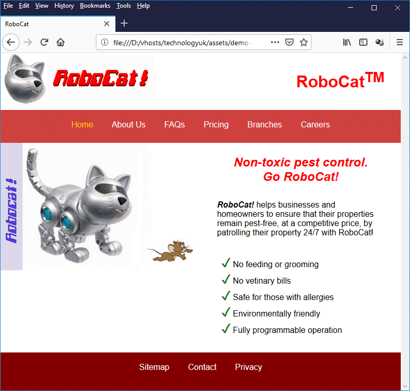
The final version of the RoboCat! home page as seen on a desktop computer
And these screenshots show what it looks like on a Samsung Galaxy A5 smartphone:
The RoboCat! home page as seen on a Samsung Galaxy A5 smartphone . . .
. . . the content panes are now stacked vertically . . .
. . . and the menu icon toggles the primary navigation menu on and off
One more thing we should draw your attention to here is the small block of JavaScript code in the header of our RoboCat! page. The code defines a function that toggles the visibility property for the <nav> element containing the mobile menu navigation links (<nav id="MobileMenu">). The code is activated when the user clicks on the navigation icon (this is located on the right-hand side of the page, within the horizontal navigation bar at the top of the page, as you can see from the illustration above).
Further examples
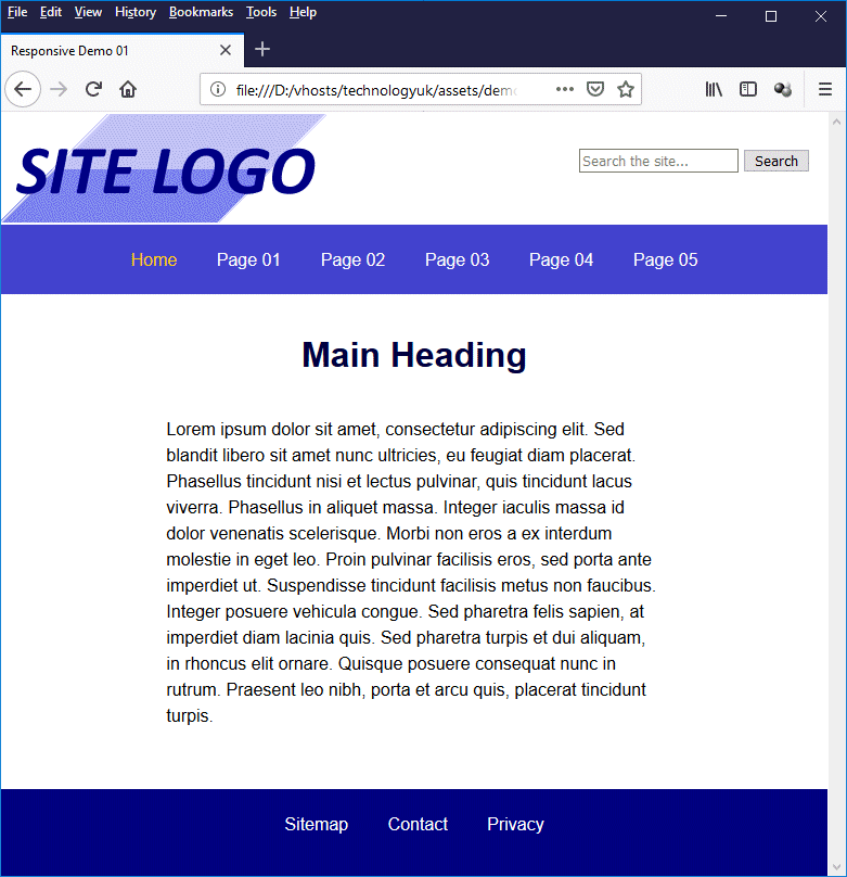
The illustration below shows a single-column web page with a header, a horizontal navigation bar, a single content pane, and a footer. If you examine the HTML and stylesheet code (see below), you will see that it is not all that different from the code we used for the RoboCat! home page.
A very simple single-column responsive page layout
Here is the same page as seen on a smartphone:
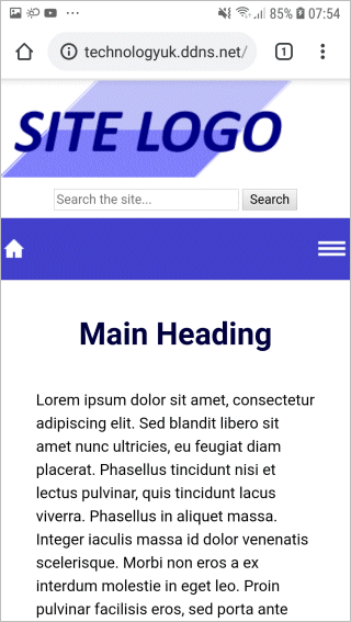
The single-column responsive layout on a Samsung Galaxy A5 smartphone
Here is the HTML code for the page (responsive-demo-01.html):
<!doctype html>
<html lang="en">
<head>
<meta charset="utf-8">
<title>Responsive Demo 01</title>
<meta name="viewport" content="width=device-width, initial-scale=1.0">
<meta name="mobile-web-app-capable" content="yes">
<meta http-equiv="X-UA-Compatible" content="IE=edge">
<link href="css/responsive-demo-01.css" rel="stylesheet">
<script>
function toggle_visibility(id) {
var e = document.getElementById(id);
if(e.style.display == 'block')
e.style.display = 'none';
else
e.style.display = 'block';
}
</script>
</head>
<body>
<div class="wrapper">
<header>
<div class="logo">
<img src="http://www.technologyuk.net/assets/demo-images/responsive-demo-01-logo.gif" alt="Site Logo">
</div>
<div class="search">
<form>
<input type="search" placeholder="Search the site...">
<button>Search</button>
</form>
</div>
</header>
<div class="bar">
<nav>
<div class="topnav_home">
<a href="#"><img src="http://www.technologyuk.net/assets/demo-images/responsive-demo-home.gif" alt="Home"></a>
</div>
<div class="topnav">
<span>
<a class="dead">Home</a>
<a href="#">Page 01</a>
<a href="#">Page 02</a>
<a href="#">Page 03</a>
<a href="#">Page 04</a>
<a href="#">Page 05</a>
</span>
</div>
<div class="topnav_menu">
<a href="#" onClick='toggle_visibility("MobileMenu"); return false;'><img src="http://www.technologyuk.net/assets/demo-images/responsive-demo-menu.gif" alt="Menu"></a>
</div>
</nav>
</div>
<nav id="MobileMenu">
<ul class="mobile_menu">
<li class="dead"><a>Home</a></li>
<li><a href="#">Page 01</a></li>
<li><a href="#">Page 02</a></li>
<li><a href="#">Page 03</a></li>
<li><a href="#">Page 04</a></li>
<li><a href="#">Page 05</a></li>
</ul>
</nav>
<div class="content">
<h1>Main Heading</h1>
<p>
Lorem ipsum dolor sit amet, consectetur adipiscing elit. Sed blandit libero sit amet nunc ultricies, eu feugiat diam placerat. Phasellus tincidunt nisi et lectus pulvinar, quis tincidunt lacus viverra. Phasellus in aliquet massa. Integer iaculis massa id dolor venenatis scelerisque. Morbi non eros a ex interdum molestie in eget leo. Proin pulvinar facilisis eros, sed porta ante imperdiet ut. Suspendisse tincidunt facilisis metus non faucibus. Integer posuere vehicula congue. Sed pharetra felis sapien, at imperdiet diam lacinia quis. Sed pharetra turpis et dui aliquam, in rhoncus elit ornare. Quisque posuere consequat nunc in rutrum. Praesent leo nibh, porta et arcu quis, placerat tincidunt turpis.
</p>
<br>
</div>
<footer>
<a href="#">Sitemap</a>
<a href="#">Contact</a>
<a href="#">Privacy</a>
</footer>
</div>
</body>
</html>
And here is the CSS code (responsive-demo-01.css):
/* GENERAL STYLES */
html { overflow-y: scroll; background: #000080; }
body {
margin: 0;
font-family: sans-serif;
}
div, header, footer, nav {line-height: 1.5;}
div.wrapper {
background: #ffffff;
line-height: 0;
}
header {
display: inline-block;
width: 100%;
}
div.logo { float: left; }
div.search { float: right; padding: 2em 1em; }
div.bar {
height: 24px;
background: #4040cc;
padding: 20px 0;
}
div.topnav {
text-align: center;
padding: 0 1em;
}
div.topnav_home { float: left; }
div.topnav_menu { float: right; }
div.topnav_home a { position: relative; left: 5%; margin: 0; }
div.topnav_menu a { position: relative; right: 5%; margin: 0; }
div.content {
min-height: 400px;
text-align: center;
background: #ffffff;
}
footer {
text-align: center;
padding: 20px 0;
background: #000080;
}
h1, h2 { color: #000040; margin: 1em; text-align: center; }
p { text-align: left; margin: 2em 20%; }
li { font-size: 90%; text-align: left; list-style: none; }
img { display: block; }
/* NAVIGATION & LINK STYLES */
ul.mobile_menu { padding: 0; margin: 0; }
ul.mobile_menu li {
padding: 5px 10px;
border-bottom: solid 1px #eeeeee;;
background: #ffffff;
font-size: small;
list-style: none;
}
ul.mobile_menu li:hover{ background-color: #f0f0f0; }
ul.mobile_menu li a { color: #404040; text-decoration: none; }
ul.mobile_menu li a:hover { text-decoration: underline; }
ul.mobile_menu li.dead { background-color: #fafbc9; }
ul.mobile_menu li.dead a:hover { text-decoration: none; }
li a { display: block; }
a { text-decoration: none; margin: 0 1em; color: #ffffff; }
a.dead { color: #ffcc00; }
a:hover { text-decoration: underline; }
a.dead:hover { text-decoration: none; }
/* MOBILE DEVICE SPECIFIC */
@media only screen and (max-width: 599px) {
html { overflow-y: auto; background: #ffffff; }
div.topnav { display: none; }
#MobileMenu { display: none; }
div.logo, div.search { width: 100%; }
div.search { text-align: center; padding: 0.5em 0; }
p { text-align: left; margin: 1em 10%; }
}
/* SXGA/WXGA Screens and wider */
@media only screen and (min-width: 600px) {
#MobileMenu { height: 0; visibility: hidden; display: none; }
div.topnav_menu {display: none;}
div.topnav_home {display: none;}
}
For the next example, the horizonal navigation bar is replaced by a vertical navigation panel on the left-hand side of the page. This is the kind of layout we might want to use for an index page that has a significant number of links in its navigation menu. The screenshots below show what the page looks like on a desktop computer, and on a smartphone. Here is the desktop version:
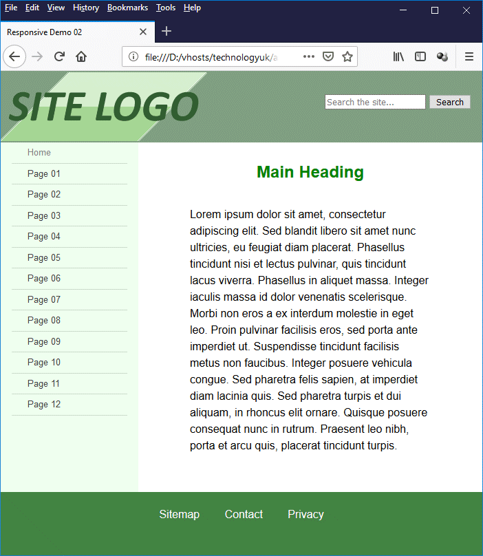
The two-column responsive layout on a desktop computer
When the browser is resized, the right-hand panel containing the main heading and text is resized, but the left-hand panel containing navigation menu stays the same width. Once the display width is less than 600 pixels, the page will reconfigure itself to its mobile device layout. Here is a screenshot of the same page taken from a smartphone:
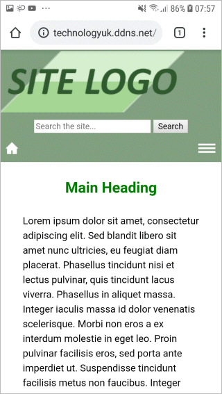
The same two-column responsive layout on a Samsung Galaxy A5 smartphone
Here is the HTML code for the page (responsive-demo-02.html):
<!doctype html>
<html lang="en">
<head>
<meta charset="utf-8">
<title>Responsive Demo 02</title>
<meta name="viewport" content="width=device-width, initial-scale=1.0">
<meta name="mobile-web-app-capable" content="yes">
<meta http-equiv="X-UA-Compatible" content="IE=edge">
<link href="css/responsive-demo-02.css" rel="stylesheet">
<script>
function toggle_visibility(id) {
var e = document.getElementById(id);
if(e.style.display == 'block')
e.style.display = 'none';
else
e.style.display = 'block';
}
window.onresize = function(event) {
var e = document.getElementById("menu");
var w = window.innerWidth;
if(w > 599)
e.style.display = 'block';
else
e.style.display = 'none';
};
</script>
</head>
<body>
<div class="wrapper">
<header>
<div class="logo">
<img src="http://www.technologyuk.net/assets/demo-images/responsive-demo-02-logo.gif" alt="Site Logo">
</div>
<div class="search">
<form>
<input type="search" placeholder="Search the site...">
<button>Search</button>
</form>
</div>
</header>
<div class="mobile_bar">
<div class="topnav_home">
<a href="#"><img src="http://www.technologyuk.net/assets/demo-images/responsive-demo-home.gif" alt="Home"></a>
</div>
<div class="topnav_menu">
<a href="#" onClick='toggle_visibility("menu"); return false;'><img src="http://www.technologyuk.net/assets/demo-images/responsive-demo-menu.gif" alt="Menu"></a>
</div>
</div>
<section>
<nav id="menu">
<ul class="menu">
<li class="dead"><a>Home</a></li>
<li><a href="#">Page 01</a></li>
<li><a href="#">Page 02</a></li>
<li><a href="#">Page 03</a></li>
<li><a href="#">Page 04</a></li>
<li><a href="#">Page 05</a></li>
<li><a href="#">Page 06</a></li>
<li><a href="#">Page 07</a></li>
<li><a href="#">Page 08</a></li>
<li><a href="#">Page 09</a></li>
<li><a href="#">Page 10</a></li>
<li><a href="#">Page 11</a></li>
<li><a href="#">Page 12</a></li>
</ul>
</nav>
<div class="content">
<h1>Main Heading</h1>
<p>
Lorem ipsum dolor sit amet, consectetur adipiscing elit. Sed blandit libero sit amet nunc ultricies, eu feugiat diam placerat. Phasellus tincidunt nisi et lectus pulvinar, quis tincidunt lacus viverra. Phasellus in aliquet massa. Integer iaculis massa id dolor venenatis scelerisque. Morbi non eros a ex interdum molestie in eget leo. Proin pulvinar facilisis eros, sed porta ante imperdiet ut. Suspendisse tincidunt facilisis metus non faucibus. Integer posuere vehicula congue. Sed pharetra felis sapien, at imperdiet diam lacinia quis. Sed pharetra turpis et dui aliquam, in rhoncus elit ornare. Quisque posuere consequat nunc in rutrum. Praesent leo nibh, porta et arcu quis, placerat tincidunt turpis.
</p>
<br>
</div>
</section>
<footer>
<a href="#">Sitemap</a>
<a href="#">Contact</a>
<a href="#">Privacy</a>
</footer>
</div>
</body>
</html>
And here is the CSS code (responsive-demo-02.css):
/* GENERAL STYLES */
html { overflow-y: auto; background: #408040; }
body { margin: 0; font-family: sans-serif; }
header{
display: inline-block;
width: 100%;
background: #80a080;
text-align: center;
}
div.wrapper {
background: #ffffff;
line-height: 0;
}
header, footer, section {line-height: 1.5;}
div.logo { text-align: center; float: left; }
div.search { float: right; padding: 2em 1em; }
div.mobile_bar {
height: 24px;
background: #80a080;
padding: 5px 5px 10px;
}
section { background: #efffef; }
nav {
float:left;
width: 200px;
background: #efffef;
}
div.content {
overflow: auto;
min-height: 480px;
background: #ffffff;
}
div.topnav_home { float: left; }
div.topnav_menu { float: right; }
div.topnav_home a { position: relative; left: 5%; margin: 0; }
div.topnav_menu a { position: relative; right: 5%; margin: 0; }
footer {
clear: both;
text-align: center;
padding: 20px 0;
background: #408040;
}
h1, h2 { color: #008000; margin: 1em; text-align: center; }
p { text-align: left; margin: 2em 15%; }
img { display: block; }
/* NAVIGATION & LINK STYLES */
ul.menu { padding: 0 1em; margin: 0; }
ul.menu li {
padding: 5px 10px;
border-bottom: solid 1px #ccddcc;
font-size: small;
list-style: none;
}
a { text-decoration: none; margin: 0 1em; color: #ffffff; }
a:hover { text-decoration: underline; }
a.dead:hover { text-decoration: none; }
ul.menu li:hover{ background-color: #ccffcc; }
ul.menu li.dead:hover{ background-color: #efffef; }
ul.menu li a { display: block; }
ul.menu li a { color: #404040; }
ul.menu li a:hover { text-decoration: underline; }
ul.menu li.dead a { color: #808080; }
ul.menu li.dead a:hover { text-decoration: none; }
/* MOBILE DEVICE SPECIFIC */
@media only screen and (max-width: 599px) {
nav { display: none; visibility: none; width: 100%; }
div.logo, div.search { width: 100%; }
div.search { padding: 0.5em 0; }
p { text-align: left; margin: 1em 10%; }
div.content { width: 100%; }
}
/* SXGA/WXGA Screens and wider */
@media only screen and (min-width: 600px) {
div.mobile_bar { display: none; }
nav { display: block; }
}
Most of the CSS is code very similar to the code we have seen previously. The first problem we had to solve here was caused by the fact that we want our navigation pane to have a fixed width, but we also want our content pane to occupy the remaining width of the parent container - in this case, a <section> element that takes up the full width of the browser window.
Within the main body of the page, we have used a <nav> element to implement our navigation pane (column 1) and a <div> element to implement the main content pane (column 2). We have specified a width for our navigation pane of 200 pixels. Unfortunately, there is no way of knowing what the remaining width will be in pixels. Furthermore, because we specified the width of the navigation pane in pixels, we can't calculate the remaining width as a percentage.
We solve this problem by setting the value of the <div> element's overflow property to "auto", which makes it a block formatting context, and the value of the <nav> element's float property to "left" (a detailed explanation of why this works is beyond the scope of this article). We have another problem, however.
Suppose the height of the content pane is greater than that of the navigation pane? Actually, it will be for this example, because we have specified a minimum height of 480 pixels for the <div> element.The background colour for the <nav> element does not extend beyond its boundaries. If the content pane is taller than the navigation pane, there will be a gap between the bottom of the navigation pane and the page footer which will have the default background colour (i.e. white), which is going to look odd. It's no use setting the height of the <nav> element to 100%, because this will only work when the height of the parent container is set to a fixed value, which it isn't.
Fortunately, there is a solution. Because the <nav> element is floated left, it has been taken out of the normal "flow" of the HTML document. This means it is not contained by the <section> element, and will have no influence on its height. The <div> element, on the other hand, is contained by the <section> element. The height of the <section> element will therefore be determined by that of the <div> element.
All we need to do to make sure there is no gap between the bottom of the navigation pane and the page footer is to set the background colour of the <section> element to be the same as that of the <nav> element, and set the background colour of the <div> element to the default background colour.
This is not a particularly elegant way of coding a two-column web page, and it is by no means the only way of doing it. It does however seem to work in all of the desktop browsers we have tried, including Internet Explorer 11 and Safari for Windows. We have also tested it successfully on several mobile devices, which is why we have included it. It may be worth noting that the "work-arounds" required to make multi-column layouts behave the way we want them to tend do become more elaborate as the number of columns increases.
There is an easier way to create the same two coloumn layout that involves using the CSS Flexbox Layout Module, the first working draft of which appeared in 2009. Although, at the time of writing, Flexbox still has only "Candidate Recommendation" status (as opposed to "Recommendation" status), it is fairly well supported by most current browser implementations. The notable exceptions are Internet Explorer 11 and Safari for Windows, although Flexbox can usually be made to work, even with these and other older browsers, if you use the right browser prefixes (the subject of browser prefixes will be dealt with elsewhere).
To give you an idea of the sort of thing that can be achieved using Flexbox, we have rewritten the HTML and CSS code for the two-column example using Flexbox to handle the columns instead of floats or positioning (although we are still using floats to position the logo, site search facility, and mobile menu icons). Here is the revised HTML code (responsive-demo-03.html), which is almost, though not quite, identical to the original version:
<!doctype html>
<html lang="en">
<head>
<meta charset="utf-8">
<title>Responsive Demo 03</title>
<meta name="viewport" content="width=device-width, initial-scale=1.0">
<meta name="mobile-web-app-capable" content="yes">
<meta http-equiv="X-UA-Compatible" content="IE=edge">
<link href="css/responsive-demo-03.css" rel="stylesheet">
<script>
function toggle_visibility(id) {
var e = document.getElementById(id);
if(e.style.display == 'block')
e.style.display = 'none';
else
e.style.display = 'block';
}
window.onresize = function(event) {
var e = document.getElementById("menu");
var w = window.innerWidth;
if(w > 599)
e.style.display = 'block';
else
e.style.display = 'none';
};
</script>
</head>
<body>
<div class="wrapper">
<header>
<div class="logo">
<img src="http://www.technologyuk.net/assets/demo-images/responsive-demo-03-logo.gif" alt="Site Logo">
</div>
<div class="search">
<form>
<input type="search" placeholder="Search the site...">
<button>Search</button>
</form>
</div>
</header>
<div class="mobile_bar">
<div class="topnav_home">
<a href="#"><img src="http://www.technologyuk.net/assets/demo-images/responsive-demo-home.gif" alt="Home"></a>
</div>
<div class="topnav_menu">
<a href="#" onClick='toggle_visibility("menu"); return false;'><img src="http://www.technologyuk.net/assets/demo-images/responsive-demo-menu.gif" alt="Menu"></a>
</div>
</div>
<section>
<nav id="menu">
<ul class="menu">
<li class="dead"><a>Home</a></li>
<li><a href="#">Page 01</a></li>
<li><a href="#">Page 02</a></li>
<li><a href="#">Page 03</a></li>
<li><a href="#">Page 04</a></li>
<li><a href="#">Page 05</a></li>
<li><a href="#">Page 06</a></li>
<li><a href="#">Page 07</a></li>
<li><a href="#">Page 08</a></li>
<li><a href="#">Page 09</a></li>
<li><a href="#">Page 10</a></li>
<li><a href="#">Page 11</a></li>
<li><a href="#">Page 12</a></li>
</ul>
</nav>
<main>
<h1>Main Heading</h1>
<p>
Lorem ipsum dolor sit amet, consectetur adipiscing elit. Sed blandit libero sit amet nunc ultricies, eu feugiat diam placerat. Phasellus tincidunt nisi et lectus pulvinar, quis tincidunt lacus viverra. Phasellus in aliquet massa. Integer iaculis massa id dolor venenatis scelerisque. Morbi non eros a ex interdum molestie in eget leo. Proin pulvinar facilisis eros, sed porta ante imperdiet ut. Suspendisse tincidunt facilisis metus non faucibus. Integer posuere vehicula congue. Sed pharetra felis sapien, at imperdiet diam lacinia quis. Sed pharetra turpis et dui aliquam, in rhoncus elit ornare. Quisque posuere consequat nunc in rutrum. Praesent leo nibh, porta et arcu quis, placerat tincidunt turpis.
</p>
<br>
</main>
</section>
<footer>
<a href="#">Sitemap</a>
<a href="#">Contact</a>
<a href="#">Privacy</a>
</footer>
</div>
</body>
</html>
And here is the revised CSS code (responsive-demo-03.css):
/* GENERAL STYLES */
html { overflow-y: auto; background: #408040; }
body { margin: 0; font-family: sans-serif; }
header{
background: #80a080;
text-align: center;
}
div.wrapper {
background: #ffffff;
display: flex;
flex-direction: column;
line-height: 1.5;
}
div.logo { float: left; }
div.search { float: right; padding: 2em 1em; }
div.mobile_bar {
height: 24px;
background: #80a080;
padding: 5px 5px 10px;
}
nav {
order: 1;
width: 200px;
background: #efffef;
}
main {
order: 2;
flex: 1;
background: #ffffff;
min-height: 480px;
}
div.topnav_home { float: left; }
div.topnav_menu { float: right; }
div.topnav_home a { position: relative; left: 5%; margin: 0; }
div.topnav_menu a { position: relative; right: 5%; margin: 0; }
footer {
text-align: center;
padding: 20px 0;
background: #408040;
}
h1, h2 { color: #008000; margin: 1em; text-align: center; }
p { margin: 2em 15%; }
img { display: block; }
/* NAVIGATION & LINK STYLES */
ul.menu { padding: 0 1em; margin: 0; }
ul.menu li {
padding: 5px 10px;
border-bottom: solid 1px #ccddcc;
font-size: small;
list-style: none;
}
a { text-decoration: none; margin: 0 1em; color: #ffffff; }
a:hover { text-decoration: underline; }
a.dead:hover { text-decoration: none; }
ul.menu li:hover{ background-color: #ccffcc; }
ul.menu li.dead:hover{ background-color: #efffef; }
ul.menu li a { display: block; }
ul.menu li a { color: #404040; }
ul.menu li a:hover { text-decoration: underline; }
ul.menu li.dead a { color: #808080; }
ul.menu li.dead a:hover { text-decoration: none; }
/* MOBILE DEVICE SPECIFIC */
@media only screen and (max-width: 599px) {
nav { display: none; visibility: none; width: 100%; }
div.logo, div.search { width: 100%; }
div.search { padding: 0.5em 0; }
p { margin: 1em 10%; }
}
/* SXGA/WXGA Screens and wider */
@media only screen and (min-width: 600px) {
div.mobile_bar { display: none; }
section{ display: flex; flex: 1; }
nav { display: block; }
}
The first thing to note here is the CSS code for the "wrapper" container:
div.wrapper {
background: #ffffff;
display: flex;
flex-direction: column;
line-height: 1.5;
}
The display: flex; directive tells the browser that a <div> element of class "wrapper" should be treated as a flex container; all of the flex container's child elements (but not their descendants) are to be treated as flex items. The flex-direction: column; directive tells the browser that the flex items must be displayed vertically, i.e. as a column. We will therefore see the following elements stacked vertically:
<header> . . . </header>
.
.
.
<div class="mobile_bar"> . . . </div>
.
.
.
<section> . . . </section>
.
.
.
<footer> . . . </footer>
The next block of code we must look at is at the bottom of the CSS file:
/* SXGA/WXGA Screens and wider */
@media only screen and (min-width: 600px) {
div.mobile_bar { display: none; }
section{ display: flex; flex: 1; }
nav { display: block; }
}
This code applies only if the display width is 600 pixels or greater. The line we are interested in is section{ display: flex; flex: 1; }. This tells the browser that the <section> element is a flex container; all of the flex container's child elements will be treated as flex items, and will be displayed horizontally, i.e. as a row (we don't have to explicitly declare this, because it's the default behaviour). The flex: 1; directive tells the browser that the <section> element should occupy the full width of its parent container.
The last block of code that we need to examine is this one:
nav {
order: 1;
width: 200px;
background: #efffef;
}
main {
order: 2;
flex: 1;
background: #ffffff;
min-height: 480px;
}
The <nav> and <main> elements are child elements of the <section> element, and as such are flex items; they will be displayed side by side. We have specified a width of 200 pixels for the <nav> element. The <main> element has the directive flex: 1; applied to it, which means it will occupy all of the remaining horizontal space within the <section> element.
What's really interesting here is the use of the order property; this is set to "1" for the <nav> element and "2" for the <main> element (this is the element that contains our main block of content). This tells the browser that it should display the <nav> element first, and then the <main> element. If we decide that, instead of having the navigation pane on the left and the content pane on the right we want to swap them around, all we have to do is replace this:
nav {
order: 1;
width: 200px;
background: #efffef;
}
main {
order: 2;
flex: 1;
background: #ffffff;
min-height: 480px;
}
with this:
nav {
order: 2;
width: 200px;
background: #efffef;
}
main {
order: 1;
flex: 1;
background: #ffffff;
min-height: 480px;
}
We just have to swap the numbers around to change the order in which the two panes appear! We won't delve into the full capabilities of flexbox here – that's something we'll look in more detail in the section "Introduction to CSS". Nevertheless, we think you'll agree that Flexbox has the potential to make the creation of responsive web page layouts relatively straightforward. We'll also be looking at CSS Grid Layout, a more recent and an even more versatile framework for creating web page layouts.
Before we leave the subject of creating responsive web page layouts, we'd like to present one more example, just for fun. The idea is for the page we are going to create to serve as an index page for a photo gallery. The overall layout is similar to the first example we showed you. The main difference is that the main content pane will contain a number of thumbnail images, each of which will link to a full-sized photographic image. When the user clicks on a thumbnail image, the corresponding full-size image is displayed in a new browser window.
Here is the HTML code (responsive-demo-04.html):
<!doctype html>
<html lang="en">
<head>
<meta charset="utf-8">
<title> Responsive Demo 04</title>
<meta name="viewport" content="width=device-width, initial-scale=1.0">
<meta name="mobile-web-app-capable" content="yes">
<meta http-equiv="X-UA-Compatible" content="IE=edge">
<link href="css/responsive-demo-04.css" rel="stylesheet">
<script>
function toggle_visibility(id) {
var e = document.getElementById(id);
if(e.style.display == 'block')
e.style.display = 'none';
else
e.style.display = 'block';
}
window.onresize = function(event) {
var e = document.getElementById("MobileMenu");
var w = window.innerWidth;
if(w > 599)
e.style.display = 'none';
};
</script>
</head>
<body>
<div class="wrapper">
<header>
<div class="logo">
<img src="http://www.technologyuk.net/assets/demo-images/responsive-demo-04-logo.gif" alt="Site Logo">
</div>
<div class="search">
<form>
<input type="search" placeholder="Search the site...">
<button>Search</button>
</form>
</div>
</header>
<div class="bar">
<nav>
<div class="topnav_home">
<a href="#"><img src="http://www.technologyuk.net/assets/demo-images/responsive-demo-home.gif" alt="Home"></a>
</div>
<div class="topnav">
<span>
<a href="#">Home</a>
<a class="dead">Gallery 1</a>
<a href="#">Gallery 2</a>
<a href="#">Gallery 3</a>
</span>
</div>
<div class="topnav_menu">
<a href="#" onClick='toggle_visibility("MobileMenu"); return false;'><img src="http://www.technologyuk.net/assets/demo-images/responsive-demo-menu.gif" alt="Menu"></a>
</div>
</nav>
</div>
<nav id="MobileMenu">
<ul class="mobile_menu">
<li><a href="#">Home</a></li>
<li class="dead"><a>Photo Gallery 1</a></li>
<li><a href="#">Photo Gallery 2</a></li>
<li><a href="#">Photo Gallery 3</a></li>
</ul>
</nav>
<div class="content">
<h1><em>Photo Gallery 1</em></h1>
<div class="thumbnail_wrapper">
<div class="thumbnail"><a href="https://www.technologyuk.net/assets/demo-images/sa/sa-01.jpg" target="_blank"><img src="https://www.technologyuk.net/assets/demo-images/sa/sa-01-thumb.jpg" alt="SA-2011-11-[1]" title="Off to the water hole."></a></div>
<div class="thumbnail"><a href="https://www.technologyuk.net/assets/demo-images/sa/sa-02.jpg" target="_blank"><img src="https://www.technologyuk.net/assets/demo-images/sa/sa-02-thumb.jpg" alt="SA-2011-11-[2]" title="Crocodile River at sunset."></a></div>
<div class="thumbnail"><a href="https://www.technologyuk.net/assets/demo-images/sa/sa-03.jpg" target="_blank"><img src="https://www.technologyuk.net/assets/demo-images/sa/sa-03-thumb.jpg" alt="SA-2011-11-[3]" title="Too much monkey business."></a></div>
<div class="thumbnail"><a href="https://www.technologyuk.net/assets/demo-images/sa/sa-04.jpg" target="_blank"><img src="https://www.technologyuk.net/assets/demo-images/sa/sa-04-thumb.jpg" alt="SA-2011-11-[4]" title="Springboks? What Springboks?"></a></div>
<div class="thumbnail"><a href="https://www.technologyuk.net/assets/demo-images/sa/sa-05.jpg" target="_blank"><img src="https://www.technologyuk.net/assets/demo-images/sa/sa-05-thumb.jpg" alt="SA-2011-11-[5]" title="Tina the Hyena . . ."></a></div>
<div class="thumbnail"><a href="https://www.technologyuk.net/assets/demo-images/sa/sa-06.jpg" target="_blank"><img src="https://www.technologyuk.net/assets/demo-images/sa/sa-06-thumb.jpg" alt="SA-2011-11-[6]" title="You're welcome to stay for lunch . . ."></a></div>
<div class="thumbnail"><a href="https://www.technologyuk.net/assets/demo-images/sa/sa-07.jpg" target="_blank"><img src="https://www.technologyuk.net/assets/demo-images/sa/sa-07-thumb.jpg" alt="SA-2011-11-[7]" title="I'm on a break, OK?"></a></div>
<div class="thumbnail"><a href="https://www.technologyuk.net/assets/demo-images/sa/sa-08.jpg" target="_blank"><img src="https://www.technologyuk.net/assets/demo-images/sa/sa-08-thumb.jpg" alt="SA-2011-11-[8]" title="Gerald the Giraffe."></a></div>
<div class="thumbnail"><a href="https://www.technologyuk.net/assets/demo-images/sa/sa-09.jpg" target="_blank"><img src="https://www.technologyuk.net/assets/demo-images/sa/sa-09-thumb.jpg" alt="SA-2011-11-[9]" title="Walter the Warthog."></a></div>
<div class="thumbnail"><a href="https://www.technologyuk.net/assets/demo-images/sa/sa-10.jpg" target="_blank"><img src="https://www.technologyuk.net/assets/demo-images/sa/sa-10-thumb.jpg" alt="SA-2011-11-[10]" title="Come on, kiddo . . ."></a></div>
<div class="thumbnail"><a href="https://www.technologyuk.net/assets/demo-images/sa/sa-11.jpg" target="_blank"><img src="https://www.technologyuk.net/assets/demo-images/sa/sa-11-thumb.jpg" alt="SA-2011-11-[11]" title="Jiminy Cricket?"></a></div>
<div class="thumbnail"><a href="https://www.technologyuk.net/assets/demo-images/sa/sa-12.jpg" target="_blank"><img src="https://www.technologyuk.net/assets/demo-images/sa/sa-12-thumb.jpg" alt="SA-2011-11-[12]" title="Kruger National Park seen from on high."></a></div>
<div class="thumbnail"><a href="https://www.technologyuk.net/assets/demo-images/sa/sa-13.jpg" target="_blank"><img src="https://www.technologyuk.net/assets/demo-images/sa/sa-13-thumb.jpg" alt="SA-2011-11-[13]" title="Go away, it's my pond!"></a></div>
<div class="thumbnail"><a href="https://www.technologyuk.net/assets/demo-images/sa/sa-14.jpg" target="_blank"><img src="https://www.technologyuk.net/assets/demo-images/sa/sa-14-thumb.jpg" alt="SA-2011-11-[14]" title="I'm a Rock Hyrax - but call me "Dassie"!"></a></div>
<div class="thumbnail"><a href="https://www.technologyuk.net/assets/demo-images/sa/sa-15.jpg" target="_blank"><img src="https://www.technologyuk.net/assets/demo-images/sa/sa-15-thumb.jpg" alt="SA-2011-11-[15]" title="I think it says "Don't feed the birds . . .""></a></div>
<div class="thumbnail"><a href="https://www.technologyuk.net/assets/demo-images/sa/sa-16.jpg" target="_blank"><img src="https://www.technologyuk.net/assets/demo-images/sa/sa-16-thumb.jpg" alt="SA-2011-11-[16]" title="A view from Table Mountain."></a></div>
</div>
</div>
<footer>
<a href="#">My Blog . . .</a>
<a href="#">Contact me!</a>
</footer>
</div>
</body>
</html>
And here is the CSS code (responsive-demo-04.css):
/* GENERAL STYLES */
html { overflow-y: scroll; background: #6C5530; }
body {
margin: 0;
font-family: sans-serif;
}
div, header, footer, nav {line-height: 1.5;}
div.wrapper {
background: #ffffff;
line-height: 0;
}
header {
display: inline-block;
width: 100%;
}
div.logo { float: left; }
div.search { float: right; padding: 2em 1em; }
div.bar {
height: 24px;
background: #dbc8a8;
padding: 20px 5px;
}
div.topnav {
text-align: center;
padding: 0 1em;
}
div.topnav_home { float: left; }
div.topnav_menu { float: right; }
div.topnav_home a { position: relative; left: 5%; margin: 0; }
div.topnav_menu a { position: relative; right: 5%; margin: 0; }
div.content {
padding: 0em 2em 2em 2em;
text-align: center;
background: #ffffff;
}
div.thumbnail_wrapper {
display: flex;
flex-wrap: wrap;
justify-content: center;
}
div.thumbnail {
border: solid 1px #6c5530;
margin: 10px;
height: 120px;
width: 180px;
padding: 0;
}
div.thumbnail a { margin: 0; }
footer {
text-align: center;
padding: 10px 0;
background: #6c5530;
}
h1 { color: #6c5530; text-align: center; }
p { text-align: left; margin: 2em 20%; }
li { font-size: 90%; text-align: left; list-style: none; }
img { display: block; margin: 0; }
/* NAVIGATION & LINK STYLES */
ul.mobile_menu { padding: 0; margin: 0; }
ul.mobile_menu li {
padding: 5px 10px;
border-bottom: solid 1px #eeeeee;;
background: #ffffff;
font-size: small;
list-style: none;
}
ul.mobile_menu li:hover{ background-color: #f0f0f0; }
ul.mobile_menu li a { color: #404040; text-decoration: none; }
ul.mobile_menu li a:hover { text-decoration: underline; }
ul.mobile_menu li.dead { background-color: #fafbc9; }
ul.mobile_menu li.dead a:hover { text-decoration: none; }
li a { display: block; }
a {
text-decoration: none;
margin: 0 1em;
color: #6c5530;
}
a.dead { color: #9c8560; }
a:hover { text-decoration: underline; }
a.dead:hover { text-decoration: none; }
footer a {color: #ffffff;}
footer a:hover { text-decoration: underline; }
/* MOBILE DEVICE SPECIFIC */
@media only screen and (max-width: 599px) {
html { overflow-y: auto; background: #ffffff; }
div.topnav { display: none; }
#MobileMenu { display: none; }
div.logo, div.search { width: 100%; }
div.search { text-align: center; padding: 0.5em 0; }
p { text-align: left; margin: 1em 10%; }
}
/* SXGA/WXGA Screens and wider */
@media only screen and (min-width: 600px) {
#MobileMenu { visibility: hidden; display: none; }
div.topnav_menu {display: none;}
div.topnav_home {display: none;}
}
If you examine the HTML code you will see that, inside the main content pane, we have a "wrapper" <div> element (<div class="thumbnail_wrapper"> . . . </div>) that contains sixteen "thumbnail" <div> elements (<div class="thumbnail"> . . . </div>), each of which has dimensions of 180 pixels wide by 120 pixels high, and each of which will contain a thumbnail image with the same dimensions.
The following CSS code determines how our thumbnail images will be displayed:
div.thumbnail_wrapper {
display: flex;
flex-wrap: wrap;
justify-content: center;
}
The display property has been set to flex, which defines the "wrapper" element as a flex container; the "thumbnail" elements will therefore all be flex items. We have not specified a value for the flex-direction property, because we want the thumbnails to be displayed horizontally, i.e. as a row (this is the default behaviour).
There are obviously too many thumbnails to fit in one row, so we have set the flex-wrap property to wrap. By doing so, we have ensured that any thumbnails that don't fit into the current row will automatically be moved to the next row. The last thing we have done, just to tidy things up, is to set the justify-content property to center. This centres the thumbnails in the content pane.
The screenshot below shows what the page looks like on a desktop computer.
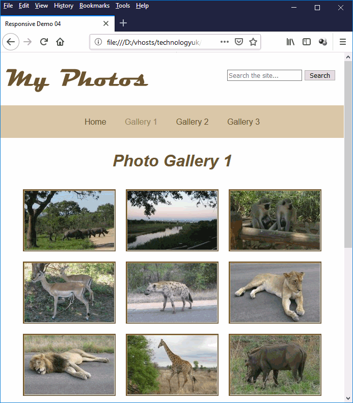
The photo gallery layout on a desktop computer
Here is the same page as seen on a smartphone:
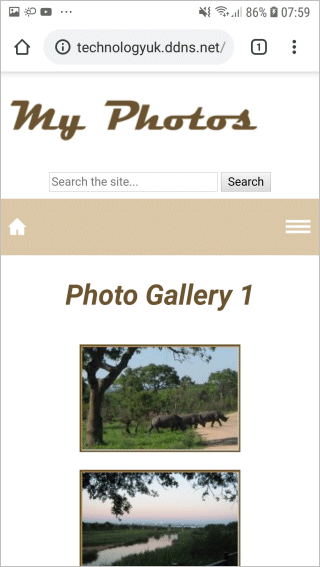
The photo gallery layout on a Samsung Galaxy A5 smartphone
The page layouts we have shown you are relatively simple to implement, and will work on most platforms. When you start to design page layouts for your own projects, you will obviously want to devise your own logos, colour schemes and graphic content. You can however use (and probably improve upon) the examples we have presented here in order to create a set of templates that can be used to build responsive web pages.