CSS Syntax and Selectors
Basic syntax
We have already looked at a number of examples of how CSS can be used to style web pages, so you should be starting to get a good feel for how CSS works and what it can do. In this page we want to take a closer look at CSS syntax, which defines the formal structure of a CSS rule. We also want to look at the CSS selectors used by CSS rules to target specific HTML elements. Note that, to keep things simple, the example pages provided here will use embedded stylesheets.
A CSS stylesheet, as we have seen, consists of a collection of CSS rules. The basic syntax of a CSS rule is very straightforward. In its simplest form, a rule consists of a selector followed by a declaration block. The declaration block starts with a left curly brace ({), ends with a right curly brace (}), and contains zero or more declarations. Each declaration consists of a property-value pair. Here is the basic syntax:
selector { property: value; }
The selector identifies the HTML element that will be affected by the rule. The property-value pair identifies a single CSS property, and assigns a value to that property. The property identifier must always be followed by a colon, and the property-value pair should be terminated with a semi-colon (note that this is not strictly necessary if the declaration block only contains one property-value pair, but it's a good habit to get into).
CSS rules may be accompanied by comments. Comments in CSS take the following form:
/* Your comment goes here */
Comments can span multiple lines, as long as they start with "/*" and end with "*/". It's good practice to use comments in your stylesheets. They are ignored by the user agent, but provide developers with useful information about the code that can save valuable time later, when it comes to maintaining or updating the stylesheet. Temporarily commenting out individual CSS rules can also help you to track down bugs in the CSS code.
Let's suppose we want to make all the level 2 headings in a web page red. We could use the following CSS rule:
/* Make all level 2 headings red */
h1 { color: red; }
In this example, we have set the value of the color property for all level 2 heading elements (<h1>) to "red". Note that, when we use an HTML element name as a selector, we don't include the angle brackets. Note also that both property names and values are case sensitive, and that property names must have the correct (U.S.) spelling. If we use the U.K. spelling in our example, i.e. "colour" instead of "color", the rule simply won't work.
The HTML code below creates a web page containing an embedded style sheet that demonstrates the use of basic CSS syntax.
<!doctype html>
<html lang="en">
<head>
<meta charset="utf-8">
<title>Basic CSS Syntax Demo</title>
<style>
body { background-color: lightgrey; }
h2 { color: darkred; }
p { font-family: monospace; }
</style>
</head>
<body>
<h1>Basic CSS Syntax Demo</h1>
<h2>This is a level 2 heading</h2>
<p>
Lorem ipsum dolor sit amet, consectetur adipiscing elit. Nullam viverra arcu eu tellus venenatis, dapibus imperdiet leo viverra. Cras nec ligula elit. Praesent nec finibus risus. Sed sed nisi laoreet sapien egestas molestie a at massa. Ut a turpis tempor, bibendum enim et, egestas purus. Quisque eget sapien ultricies, rutrum lorem id, vestibulum massa. Orci varius natoque penatibus et magnis dis parturient montes, nascetur ridiculus mus. Proin sapien diam, eleifend eget sapien vitae, cursus laoreet nunc. Sed dapibus arcu eu faucibus vestibulum. Cras blandit lorem mauris, a sollicitudin ipsum rutrum id.
</p>
</body>
</html>
Copy and paste this code into a new file in your HTML editor, save the file as css-basic-syntax-demo.html, and open the file in a web browser. You should see something like the illustration below.
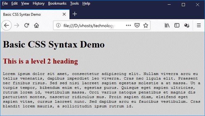
Result of using basic CSS rules to style a page
There are three CSS rules in our embedded stylesheet; the first rule sets the background colour of the <body> element to light grey; the second rule sets the text colour for the <h2> element to dark red; and the third rule sets the typeface for the <p> element to a monospaced font.
Selectors
A selector is the part of a CSS rule that identifies the HTML element (or elements) to which the rule will apply. It precedes the declaration block containing the property-value pairs that define what effect the rule will have on the element(s). There are four basic kinds of selector that you will frequently encounter:
- The type selector - matches a specific HTML element
- The class selector - matches the value of a class attribute
- The id selector - matches the value of an id attribute
- The universal selector - matches everything
We will see examples of these common types of selector being used in due course.
When a user agent reads a stylesheet, it uses a set of pattern-matching rules to determine which element (or elements) in the document tree are matched by each selector (note that, for this purpose, HTML element names are considered to be case insensitive). In addition to the basic selector types mentioned above, there are a number of other kinds of selectors whose use is more difficult to master, but that also more powerful. These include:
- Attribute selectors - select elements based on the value of the given attribute
- Descendant combinators - match elements that are descendants of another element
- Child combinators - match elements that are children of another element
- General sibling combinators - match elements that follow other elements
- Adjacent sibling combinators - match elements that immediately follow other elements
- Pseudo-classes - allow the selection of elements based on state information that is not contained in the document tree
- Pseudo-elements - represent entities that are not included in HTML
We will be looking at examples of all of these selector types in due course. Meanwhile, those of you who like reading formal specifications might be interested in the relevant W3C documentation "Selectors Level 3 W3C Recommendation 06 November 2018", which can be found here.
Multiple style rules
It is often the case that we need to style several properties for a single element. The declaration block will therefore contain two or more property value pairs, each of which must be terminated with a semicolon, as follows:
element { property1: value1; property2: value2; property3: value3; . . . }
Although the browser would understand a CSS rule in this form perfectly well, it is not particularly readable from a human point of view. When there are multiple property-value pairs inside a declaration block, we can make our CSS code more readable by putting each declaration on a separate line, like this:
element {
property1: value1;
property2: value2;
property3: value3;
. . .
}
Note that we have also added indentation at the beginning of each declaration. This is not strictly necessary as it is completely ignored by the user agent, but it helps to make our CSS rule easier to read.
Note also that, as we mentioned earlier, the last declaration in the block does not need to be terminated with a semi-colon. We recommend doing so, however. It is considered good practice, and if you later need to add another declaration to the end of the declaration block, you don't have to worry about terminating any previously unterminated declarations.
In the previous example, we set the background colour for the <body> element, the font face for the <p> element, and the text colour for the <h2> element. Let's suppose we want both level 1 heading (<h2>) and the level 2 heading (<h2>) to have the same font face as the paragraph text, and that we also want them both to be centred on the page. Here is the revised HTML code:
<!doctype html>
<html lang="en">
<head>
<meta charset="utf-8">
<title>Multiple Style Rule Demo</title>
<style>
body { background-color: lightgrey; }
h1 {
text-align: center;
font-family: monospace;
}
h2 {
color: darkred;
text-align: center;
font-family: monospace;
}
p { font-family: monospace; }
</style>
</head>
<body>
<h1>Multiple Style Rule Demo</h1>
<h2>This is a level 2 heading</h2>
<p>
Lorem ipsum dolor sit amet, consectetur adipiscing elit. Nullam viverra arcu eu tellus venenatis, dapibus imperdiet leo viverra. Cras nec ligula elit. Praesent nec finibus risus. Sed sed nisi laoreet sapien egestas molestie a at massa. Ut a turpis tempor, bibendum enim et, egestas purus. Quisque eget sapien ultricies, rutrum lorem id, vestibulum massa. Orci varius natoque penatibus et magnis dis parturient montes, nascetur ridiculus mus. Proin sapien diam, eleifend eget sapien vitae, cursus laoreet nunc. Sed dapibus arcu eu faucibus vestibulum. Cras blandit lorem mauris, a sollicitudin ipsum rutrum id.
</p>
</body>
</html>
Copy and paste this code into a new file in your HTML editor, save the file as css-multiple-style-rules-demo.html, and open the file in a web browser. You should see something like the illustration below.
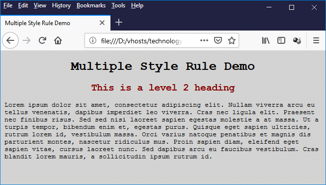
Multiple style rules have been used here to style the <h1> and <h2> elements
We have used multiple style rules to style both the level 1 header and the level 2 header:
h1 {
text-align: center;
font-family: monospace;
}
h2 {
color: darkred;
text-align: center;
font-family: monospace;
}
You can place as many property-value pairs inside a declaration block as you like, as long as they form valid declarations. The order in which you insert the property-value pairs into the declaration block is unimportant. Note however that not all properties apply to all elements; if you include a declaration whose property does not apply to the selector, it will be ignored. The same is true if you pair a property up with a value that is not valid for that property.
Type selectors
A type selector (sometimes called an element selector) is the simplest kind of selector; it selects a specific type of HTML element, and all of the property-value pairs within the declaration block will be applied to every instance of that element wherever it is found in the HTML document tree. We have already seen the basic syntax for using a type selector. Just to remind you, here it is once more:
element { property: value; }
We have already seen the type selector in use. Here is the embedded stylesheet code from the previous example (css-multiple-style-rules-demo.html):
<style>
body { background-color: lightgrey; }
h1 {
text-align: center;
font-family: monospace;
}
h2 {
color: darkred;
text-align: center;
font-family: monospace;
}
p { font-family: monospace; }
</style>
As you can see, the embedded stylesheet was written solely using type selectors. In fact, for relatively simple web pages, we can often achieve all of the required styling using just the type selector. As the size and scope of our projects increases, however, we will find ourselves wanting to use different styles for different instances of the same HTML element.
We really need to start looking at selectors that allow us to pick out one or more specific instances of an element - or possibly even specific instances of two or more different elements - based on other criteria, such as whether they have a particular attribute, or whether they belong to a particular class, or whether they have a given id (we'll be talking about attribute, class and id selectors in some detail in the following sections).
Class selectors
One of the disadvantages of using type selectors is that they will select every instance of a particular element. When that is our intention, then type selectors alone are sufficient to get the job done. But suppose we want to apply different styles to different instances of the same element depending on whether or not they are used in a particular context?
Let's suppose we want to highlight different sentences in a block of text according to sentence type (declarative, interrogative, imperative or exclamatory)? HTML has a <mark> element that allows us to render text as highlighted text. From a semantic point of view, we should use this element if we want to highlight text.
There is however a problem which is that, by default, the <mark> element highlights text using a yellow background. We want to highlight different kinds of sentences using different colours. Which is where CSS comes to the rescue! We can modify the behaviour of the <mark> element using class selectors to specify different background colours. A class selector can be associated with a specific HTML element:
element.classname {
property: value;
.
.
.
}
or it can be declared on its own like this:
.classname {
property: value;
.
.
.
}
We'll start with an example of using class selectors to style a specific element. The HTML code below creates a web page that demonstrates the use of class selectors to specify different background colour for the <mark> element so that we can use it to highlight different kinds of sentences in different colours.
<!doctype html>
<html lang="en">
<head>
<meta charset="utf-8">
<title>CSS Class Selector Demo</title>
<style>
h1 { text-align: center; }
mark.hilite_dec { background: #ffff00; }
mark.hilite_int { background: #00ff00; }
mark.hilite_imp { background: #ffcccc; }
mark.hilite_exc { background: #80ffff; }
</style>
</head>
<body>
<h1>Sentence Types</h1>
<p>There are four types of English sentence, classified by purpose:</p>
<ul>
<li><mark class="hilite_dec">declarative</mark> (a simple statement)</li>
<li><mark class="hilite_int">interrogative</mark> (a question)</li>
<li><mark class="hilite_imp">imperative</mark> (a command)</li>
<li><mark class="hilite_exc">exclamatory</mark> (an exclamation)</li>
</ul>
<p>We have highlighted the sentences in the following passage accordingly:</p>
<p>
<mark class="hilite_dec">The peacock is one of the most beautiful birds in the world.</mark> <mark class="hilite_exc">The peacock is remarkable!</mark> <mark class="hilite_dec">The peacock's tail has wonderful colors, too.</mark> <mark class="hilite_int">Did you know the tail is almost five feet long?</mark> <mark class="hilite_dec">The peacock's tail slows him down when he has to run from predators like the tiger.</mark> <mark class="hilite_int">So, why does the peacock have such a long tail if he might get caught?</mark> <mark class="hilite_imp">Think about it.</mark> <mark class="hilite_dec">If the male peacock is strong enough to survive even with his long tail, the female peacock figures he will make a good partner.</mark> <mark class="hilite_exc">So, in the peacock world, the most gorgeous guy always gets the girl!</mark>
</p>
</body>
</html>
Copy and paste this code into a new file in your HTML editor, save the file as css-class-selector-demo.html, and open the file in a web browser. You should see something like the illustration below.
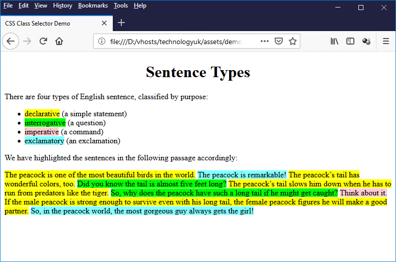
This page demonstrates the use of class selectors
The following lines of code create four different classes (declarative, interrogative, imperative, and exclamatory) that can be used with the <mark> element:
mark.hilite_dec { background: #ffff00; }
mark.hilite_int { background: #00ff00; }
mark.hilite_imp { background: #ffcccc; }
mark.hilite_exc { background: #80ffff; }
We apply a class to an HTML element by setting its class attribute to the name of the class:
<mark class="hilite_dec">The peacock is one of the most beautiful birds in the world.</mark>
Note that it is considered good practice to name classes according to their functionality rather than the effect they have on the appearance of an element. For example, we named the first of our classes "hilite_dec" to indicate that we will use this class to highlight any declarative sentences.
We could have called it "hilite_yellow", which is certainly descriptive, but suppose we later decide to use a different colour for highlighting declarative text? We can still use the "hilite_yellow" class, but its name would be even less meaningful because it would no longer correctly describe how it styles our text. Too many changes of that nature can lead to confusion, especially if somebody else has to maintain the code.
As we have seen, a class selector consists of a class name prefixed with a period:
.classname
We can declare a class without having to associate it with a particular element. For example, we could just as easily have written the embedded stylesheet for the css-class-selector-demo.html example like this:
<style>
h1 { text-align: center; }
.hilite_dec { background: #ffff00; }
.hilite_int { background: #00ff00; }
.hilite_imp { background: #ffcccc; }
.hilite_exc { background: #80ffff; }
</style>
Omitting the name of an element means that the class can be applied to any element. We could, for example, do something like this:
<style>
.center { text-align: center; }
</style>
.
.
.
<h1 class="center">This is a Level 1 Heading</h1>
<p class="center">This is a paragraph.</p>
Both the level 1 heading and the paragraph will be rendered in accordance with the user agent's default stylesheet except that, instead of being left-aligned (the default for heading elements <h1> through <h6> and the paragraph element <p>), they will both be centre-aligned.
Classes declared in this way can be applied to any HTML element simply by setting that element's class attribute to the relevant class name (assuming the properties affected are valid for the element in question - if not, any CSS rules applying to those properties will be ignored).
HTML elements can also have more than one class applied to them. Consider the following:
<style>
.center { text-align: center; }
..smaller { font-size: 75%; }
</style>
.
.
.
<p class="center smallprint">Beware of the small print!</p>
The embedded stylesheet defines two classes: .center, which sets the text-align property of an element to "center", and .smallprint, which sets the font-size property of an element to 75% of that of the element's parent container. The paragraph element (<p>) has its class attribute set to "center smallprint", so any text between the opening and closing paragraph tags will be centred. It will also be displayed with a smaller font size.
Now for something not completely different, but a little trickier to get your head around. Suppose we want to apply a particular style to an element only if that element has a specific subset of classes applied to it. The example given by W3C here is as follows:
"The following rule matches any p element whose class attribute has been assigned a list of whitespace-separated values that includes both pastoral and marine:
p.pastoral.marine { color: green }
This rule matches when class="pastoral blue aqua marine" but does not match for class="pastoral blue"."
This might be useful if you had some special styling requirements for elements to which a specific combination of classes applied. Having said that, we have never actually encountered a real-world example. If anyone out there has ever actually used this kind of construct in a web page we would be delighted to hear from them!
Bear in mind also that this:
p.pastoral.marine { color: green }
is not the same thing as this:
p.pastoral .marine { color: green }
The gap between p.pastoral and .marine means that we will apply the style { color: green } to a child element of a paragraph element that has the class .pastoral, if that child element has the class .marine. For example, when the following HTML code is rendered by a web browser, the phrase "text that we want to style differently" will be green:
<!doctype html>
<html lang="en">
<head>
<meta charset="utf-8">
<title>Parent and Child Classes</title>
<style>
p.pastoral .marine { color: green }
</style>
</head>
<body>
<p class="pastoral">
This sentence contains some <span class="marine">text that we want to style differently</span> for some reason.
</p>
</body>
</html>
The ID selector
The global HTML id attribute can be used to assign a unique identifier to a single element in an HTML document. This has two advantages. The first is that we can use the id attribute to target a specific element in an HTML document using a scripting language like JavaScript. The second is that we can apply CSS style rules to a specific element. An id selector is declared like this:
#id_name {
property: value;
.
.
.
}
Note that the name of an id selector always begins with a hash symbol (#). We use an id attribute with the same unique name to target a specific element in our HTML document like this:
<element id="id_name">
.
.
.
something goes here
.
.
.
</element>
Note that you can use the id attribute for as many elements as you like in a single HTML document, but the value assigned to each id attribute must be unique within that document.
In truth, use of the id attribute for styling purposes is normally only justified in a limited number of use cases. The TechnologyUK website uses an id attribute to identify the <nav> element containing its navigation menu for mobile devices. Users viewing this site on a desktop computer will not see this menu (unless they reduce the size of their browser window considerably) because we have created the following CSS rule:
@media only screen and (min-width: 600px) {
#MobileMenu { display: none; }
.
.
.
}
And here is the relevant HTML code (on the home page):
<nav id="MobileMenu">
<ul class="mobile_menu">
<li class="dead"><a>Home</a></li>
<li><a href="/index.shtml">Computing</a></li>
<li><a href="/software-development/index.shtml">Software development</a></li>
<li><a href="/computer-gaming/index.shtml">Computer gaming</a></li>
<li><a href="/website-development/index.shtml">Website development</a></li>
<li><a href="/telecommunications/index.shtml">Telecommunications</a></li>
<li><a href="/mathematics/index.shtml">Mathematics</a></li>
<li><a href="/physics/index.shtml">Physics</a></li>
<li><a href="/links.shtml">Links</a></li>
</ul>
</nav>
As long as the browser window has a width of 600 pixels or greater (which is almost always the case on a desktop or laptop computer), this version of the navigation menu will not be displayed. On a mobile device with a viewport width of less than 600 pixels, the user can display the navigation menu (or hide it) by tapping the menu icon.
The universal selector
The universal selector, as its name suggests, matches all of the elements in an HTML document. In its simplest form, the universal selector consists of an asterisk (*) followed by a declaration block:
* {
property: value;
.
.
.
}
The style rules inside the declaration block will be applied to every element in the document. If the universal selector is not the only component of a simple selector (i.e. it is followed immediately by zero or more attribute selectors, ID selectors, or pseudo-classes), the asterisk can be omitted and its presence will be implied. For example:
*[title] is the same as [title] - matches any element with a title attribute
*.center is the same as .center - matches any element with class="center"
*#id_name is the same as #id_name - matches any element with id="id_name"
As far as we can ascertain, by far the most common usage of the universal selector is to carry out something called a "CSS reset". This is essentially used to override the user agent's default stylesheet - or at least, those parts of it that we don't particularly like. One reason for doing this is that, although many styles are consistent across browsers, some aren't. CSS resets were conceived as a way to deal with these inconsistencies.
A CSS reset is essentially a set of CSS rules that is applied to a web page before any other styles are applied, giving us a clean slate to work with. As browsers have become more consistent over the years, the need to apply a CSS reset has become less obvious. It is nevertheless a useful tool if you want to change certain default behaviours - even if those default behaviours are the same for all browsers. It can also be used to eliminate inconsistencies that arise due to the use of older browsers.
One argument against using a CSS reset is that our own stylesheets should (eventually) override all of the user agent defaults. This means that our CSS reset code will become somewhat superfluous, and add to the CSS file size. On the other hand, the performance difference in real terms will be negligible, and using a CSS reset gives at least assures us that we won't have to deal with the annoyance of default user agent styles messing up our layout.
There are a number of freely available CSS reset stylesheets, ranging in scope and complexity, that you can download and link to your HTML files, if you haven't got the time (or can't be bothered) to write your own reset code. There are also some basic CSS resets that you can add to the beginning of your external stylesheet. The most basic of these is probably the so called "Universal Reset", which removes all margins and padding from all elements using the universal selector:
* {
margin: 0;
padding: 0;
}
You might want to avoid using this one, however, because it removes the padding from literally everything - and in some cases that might not be particularly desirable. A much more widely-used reset is the CSS reset provided by the US web design consultant and author Eric A. Meyer. Meyer's reset sets the margin, padding, borders, and font size on certain elements to zero or none, but leaves other elements (such as elements where you would expect to find padding) alone. Here is the Meyer CSS reset code:
html, body, div, span, applet, object, iframe, h1, h2, h3, h4, h5, h6, p, blockquote, pre, a, abbr, acronym, address, big, cite, code,
del, dfn, em, img, ins, kbd, q, s, samp, small, strike, strong, sub, sup, tt, var, b, u, i, center, dl, dt, dd, ol, ul, li, fieldset, form, label, legend, table, caption, tbody, tfoot, thead, tr, th, td,
article, aside, canvas, details, embed, figure, figcaption, footer, header, hgroup, menu, nav, output, ruby, section, summary, time, mark, audio, video {
margin: 0;
padding: 0;
border: 0;
font-size: 100%;
font: inherit;
vertical-align: baseline;
}
Attribute selectors
An attribute selector is considered to match an element if that element has an attribute that matches the attribute represented by the attribute selector. The selector may simply specify that the attribute must be present. Alternatively, it may specify that the attribute must be present, and must be assigned a particular value. A third possibility is that the attribute must be present, and must be assigned a value that matches a particular pattern.
The table below is based on the online documentation provided by MDN Web Docs, which you can find here. It describes the different kinds of attribute selector, and gives examples of their use.
| Selector | Description | Example |
|---|---|---|
| [attr] | Represents elements with an attribute name of attr. | a[title] { color: green } Matches all <a> elements with a title attribute. |
| [attr=value] | Represents elements with an attribute name of attr whose value is exactly value. | a[href="/downloads/"] { color: green } Matches all <a> elements with an href attribute assigned a value of "/downloads/". |
| [attr~=value] | Represents elements with an attribute name of attr whose value is exactly value. Can include multiple values in the form of a whitespace-separated list of words. | abbr[title~="Organisation"] { color: red } Matches all <abbr> elements with a title attribute assigned a value that contains the word "Organisation" (for example: title="World Health Organisation"). |
| [attr|=value] | Represents elements with an attribute name of attr whose value can be exactly value or can begin with value immediately followed by a hyphen, "-" (U+002D). It is often used for language subcode matches. | html[lang|="en"] { color: green } Matches html elements with a lang attribute that contains "en" - for example, lang="en-gb". |
| [attr^=value] | Represents elements with an attribute name of attr whose value is prefixed with (preceded by) value. | a[href^="https://"] { color: red } Matches <a> elements with an href attribute that has been assigned a value beginning with "https://". |
| [attr$=value] | Represents elements with an attribute name of attr whose value is suffixed with (followed by) value. | a[href$=".net"] { color: green } Matches <a> elements with an href attribute that has been assigned a value beginning with ".net". |
| [attr*=value] | Represents elements with an attribute name of attr whose value contains at least one occurrence of value within the string. | a[href*="technologyuk"] { color: red } Matches <a> elements with an href attribute that has been assigned a value which contains "technologyuk". |
| [attr operator value i] | Adding an i (or I) before the closing bracket causes the value to be compared case-insensitively (for characters within the ASCII range). | a[href*="technology" i] { color: green; } Matches <a> elements with an href attribute that has been assigned a value which contains "technology", regardless of case. |
Descendant and child selectors
Sometimes we may wish to apply a style to an element that is a descendant of another element (which basically means that it appears somewhere between that element's opening and closing tags; exactly where it appears is otherwise unimportant). Suppose, for example, we had the following style rules:
element1 { color: green }
element2 { color: green }
Let's further suppose that we have chosen to use the colour green in order to make these elements stand out from the content around them. What happens if we have an instance of element2 inside an instance of element1? The whole point of making element2 green in the first place was to make it stand out in a crowd.
An instance of element2 inside an instance of element1 is going to blend in rather than stand out. What do we do? The answer is that we make element2 a different colour if it is a descendant of element1. We might, for example, do this:
element1 { color: green }
element2 { color: green }
element1 element2 { color: red }
The second CSS rule says: "make element2 green". The third CSS rule says "make element2 red if it is a descendant of element1". The third rule wins out over the second rule because it is more specific. Note that a descendant selector consists of two (or more) simple selectors separated by white space. A descendant selector of the form:
A B {
property: value;
.
.
.
}
matches any element B that is a descendant of some ancestor element A. Suppose we have three simple selectors - how does that work? We now have a descendant selector of the form:
A B C {
property: value;
.
.
.
}
This selector matches any element C that is a descendant of some ancestor element B, that is in turn a descendant of some ancestor element A. A variation on this would be to make the second selector the universal selector, like this:
A * B {
property: value;
.
.
.
}
This selector matches any element B that is a descendant of any ancestor element whatsoever that is a descendant of some ancestor element A. The HTML code below creates a web page that demonstrates how descendant selectors work.
<!doctype html>
<html lang="en">
<head>
<meta charset="utf-8">
<title>Descendant Selector Demo</title>
<style>
h1 { text-align: center; }
section span { color: green; }
section div span { color: red; }
div span { color: blue; }
div * span { color: orange; }
</style>
</head>
<body>
<h1>Descendant Selector Demo</h1>
<section>
<span>This span element is a child of a section element.</span>
<div>
<span>This span element is a child of a div element inside a section element.</span>
</div>
</section>
<div>
<span>This span element is a child of a div element.</span>
<nav>
<span>This span element is a child of a nav element inside a div element.</span>
<div>
<span>This span element is a child of a div element inside a nav element inside a div element.</span>
</div>
</nav>
</div>
</body>
</html>
Copy and paste this code into a new file in your HTML editor, save the file as css-descendant-selector-demo.html, and open the file in a web browser. You should see something like the illustration below.
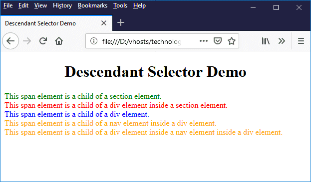
This page demonstrates the use of decendant selectors
The above example is admittedly somewhat contrived, but it serves to demonstrate how descendant selectors work. Suppose, however, we want to apply a style to an element that is a child element of another element, but not to any elements that are more deeply nested descendants? This is where child selectors come to the rescue.
A child selector consists of two (or more) simple selectors separated by a right angle-bracket (">"). A child selector of the form:
A > B {
property: value;
.
.
.
}
matches any element B that is a child of some element A. The HTML code below creates a web page that demonstrates how descendant selectors work.
<!doctype html>
<html lang="en">
<head>
<meta charset="utf-8">
<title>Child Selector Demo</title>
<style>
h1 { text-align: center; }
section > span { color: green; }
section > div > span { color: red; }
</style>
</head>
<body>
<h1>Child Selector Demo</h1>
<section>
<span>This span element is a child of a section element.</span>
<div>
<span>This span element is a child of a div element inside a section element.</span>
<div>
<span>This span element is a child of a div element inside a div element inside a section element.</span>
</div>
</div>
</section>
</body>
</html>
Copy and paste this code into a new file in your HTML editor, save the file as css-cild-selector-demo.html, and open the file in a web browser. You should see something like the illustration below.
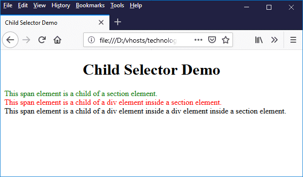
This page demonstrates the use of child selectors
As you can see, this CSS rule:
section > div > span { color: red; }
will be applied to any <span> element that is a child of a <div> element inside a <section> element, but not to a <span> element that is a grandchild (or later descendant) of a <div> element inside a <section> element.
We can use the universal selector in a child selector in the same way we did for the descendant selector. We can also combine child and descendant selectors in various ways. However, in view of the sheer number of possible permutations, we leave it to the reader to experiment if they wish to do so.
Sibling selectors
Siblings (in the context of HTML documents) are HTML elements that have the same parent. A sibling selector, therefore, is a selector that matches elements that are siblings of a particular element. There are two kinds of sibling selector, depending on whether we wish to match all siblings of the element in question, or just the sibling that immediately follows it in the document.
A sibling selector that matches all siblings of a given element is called a general sibling selector, and takes the following form:
A ~ B {
property: value;
.
.
.
}
This selector matches any element B that is a sibling of some element A.
A sibling selector that matches a sibling of given element only if that sibling immediately follows the element is called an adjacent sibling selector. An adjacent sibling selector takes the following form:
A + B {
property: value;
.
.
.
}
This selector matches any element B that immediately follows some element A.
The HTML code below creates a web page that demonstrates how general and adjacent sibling selectors work.
<!doctype html>
<html lang="en">
<head>
<meta charset="utf-8">
<title>Sibling Selector Demo</title>
<style>
h1 { text-align: center; }
h1 + p { color: red; }
h1 ~ cite { color: green; }
</style>
</head>
<body>
<h1>Sibling Selector Demo</h1>
<p>This paragraph element is a sibling of, and adjacent to, the level 1 header element.</p>
<p>This paragraph element is a sibling of, but NOT adjacent to, the level 1 header element.</p>
<cite>This citation is a sibling of the level 1 header element.</cite><br><br>
<cite>This citation is ALSO a sibling of the level 1 header element.</cite><br><br>
<span><cite>This citation is NOT a sibling of the level 1 header element.</cite></span>
</body>
</html>
Copy and paste this code into a new file in your HTML editor, save the file as css-sibling-selector-demo.html, and open the file in a web browser. You should see something like the illustration below.
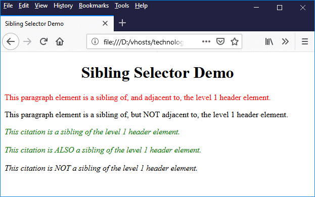
This page demonstrates the use of sibling selectors
Pseudo-classes
A pseudo-class is used to define some special state of an HTML element. One of the most frequently encountered examples of an element that can have different states is the anchor element (<a>), which is used in an HTML document to create a hypertext link. A link can be in one of the following four states:
- an unvisited link
- a link over which the mouse is hovering
- an active link (i.e. a link that is in the process of being clicked)
- a visited link
Suppose we want to style a link in different ways, depending on which of these four states it happens to be in at any time. How exactly do we achieve this? We will obviously use a type selector to select the anchor tag, but how do we specify state? Essentially, we have to rely on the fact that the browser keeps track of the state of a hypertext link, as well as that of other elements, which is where pseudo-classes come in.
Pseudo-classes are special classes that are recognised by all user agents that support CSS, and that can be used to select an element that is in some predefined state. This will allow us, for example, to apply different styles to a link as and when the browser detects a change in the state of the link. The basic syntax for using a pseudo-class is as follows (note that pseudo-class names are not case sensitive):
selector:pseudo-class {
property: value;
.
.
.
}
Four pseudo-classes are frequently used with hypertext links, each of which corresponds to one of the states described above. These pseudo-classes are used with links as follows:
a:link /* an unvisited link */
a:hover /* a link over which the mouse is hovering */
a:active /* an active link */
a:visited /* a visited link */
The color property of an unvisited hypertext link is set to blue by default. If we left-click on the link and hold the mouse button down, the link will change to red, and will stay that way until we release the mouse button. If we subsequently return to the page (by clicking on the browser's "Back" button, we will see that the link is now purple, and will remain so until we clear the browser's history.
Hovering over a link will not, by default, cause the link to change colour, but it will change the cursor from an arrow to a hand symbol, and it will also (usually) cause the URL assigned to the link's href attribute to be displayed in the browser's status bar, which is normally displayed at the bottom of the browser window, on the left-hand side.
Let's say we wanted to change the default colours assigned to hypertext links in their various states, and at the same time assign a (non-default) colour to links over which the mouse is hovering. We might do something like this:
a:link { color: green; }
a:visited { color: orange; }
a:hover { color: red; }
a:active { color: blue; }
Note that a:hover must appear after a:link and a:visited if we want to set a value for its color property, or the cascade rules will cause that value to be overridden by that belonging to either a:link or a:visited (depending on whether or not the link has already been visited). The same situation occurs with a:active, which must appear after a:hover for a similar reason.
We can also use pseudo-classes with other class selectors. For example, suppose we want to style links to internal page bookmarks so that they don't change colour after having been visited. Let's suppose we have created a special "bookmarks" class for these links. We could then do something like this:
a.bookmark:link { color: green; }
a.bookmark:visited { color: green; }
a.bookmark:hover { color: red; }
a.bookmark:active { color: blue; }
Some pseudo-classes, like the :link, :visited, :hover, and :active pseudo classes we have already seen, are dynamic. This means that they may be applied to an element or removed from an element in real time as the result of some interaction between a user and a document. For other pseudo-classes, the user agent must examine the document tree to determine whether or not they have a match. The table below describes the available pseudo-classes, and provides examples of their use.
| Selector | Description | Example |
|---|---|---|
| :active | Matches an element that is being activated, such as a link being clicked on. | a:active { color: red; } Matches an active link. |
| :checked | Matches a radio or checkbox type input element that is checked. | input:checked { outline: 2px solid red; } Matches a checkbox, radio button or option that is checked/selected. |
| :disabled | Matches form control elements that are disabled. | input:disabled { border-color: red; } Matches any input element that is disabled. |
| :empty | Matches elements that are empty (i.e. that contain no text or HTML elements). | div:empty { display: none; } Matches an empty <div> element. |
| :enabled | Matches form control elements that are not disabled. | input:enabled { border-color: green; } Matches any input element that is not disabled. |
| :first-child | Matches the first child of an element. | div p:first-child { color: green; } Matches the first child of a <div> element if it is a paragraph. |
| :first-of-type | Matches the first instance of its type in an element. | div p:first-of-type { color: green; } Matches the first instance of a paragraph inside a <div> element. |
| :focus | Matches an element that has the focus. | input:focus { background: yellow; } Matches an input element that has the focus. |
| :hover | Matches an element over which the cursor is hovering. | a:hover { text-decoration: none; } Matches a link over which the cursor is hovering. |
| :lang() | Matches an element that has a lang attribute with the specified language code value. | p:lang(it) { color: red; } Matches a paragraph element that has a lang attribute with an assigned language code value of "it". |
| :last-child | Matches the last child of an element. | div p:last-child { color: red; } Matches the last child of a <div> element if it is a paragraph. |
| :last-of-type | Matches the last instance of its type in an element. | div p:last-of-type { color: green; } Matches the first instance of a paragraph inside a <div> element. |
| :link | Matches a hypertext link that has not been visited. | a:link { color: blue; } |
| :not() | Negation pseudo-class. Matches an element that does not match the specified selector. | div p:not(:first-child) { color: red; } Matches all children of a <div> element that are paragraphs except the first one. |
| :nth-child() | Matches an element that is the nth child of its parent. | div p:nth-child(2) { color: green; } Matches the second child of a <div> element if it is a paragraph. |
| :nth-last-child() | Matches an element that is the nth-to-last child of its parent. | div p:nth-last-child(2) { color: blue; } Matches the second-to-last child of a <div> element if it is a paragraph. |
| :nth-last-of-type() | Matches the nth-to-last instance of its type in an element. | div p:nth-last-of-type(2) { color: orange; } Matches the second-to-last instance of a paragraph inside a <div> element. |
| :nth-of-type() | Matches the nth instance of its type in an element. | div p:nth-of-type(3) { color: blue; } Matches the third instance of a paragraph inside a <div> element. |
| :only-child | Matches an element if it is the only child of its parent. | div p:only-child { color: green; } Matches a paragraph if it is the only child of a <div> element. |
| :only-of-type | Matches an element if it is the only instance of its type in an element. | div p:only-of-type { color: blue; } Matches a paragraph if it is the only paragraph in a <div> element. |
| :root | Matches the root element of a document (in an HTML document this is the <html> element). | :root { background: lightgrey; } |
| :target | Matches an element that has been linked to. | h3:target { color: red; } Matches a level 3 heading that has been linked to. |
| :visited | Matches a hypertext link that has been visited. | a:visited { color: purple; } |
Just for fun, we thought we'd write a web page that demonstrates all of the pseudo-classes described above. Here is the HTML code:
<!doctype html>
<html lang="en">
<head>
<meta charset="utf-8">
<title>Sibling Selector Demo</title>
<style>
a:link { color: green; }
a:visited { color: blue; }
a:hover { color: red; }
a:active { color: orange; }
input:checked { outline: 2px dotted orange; }
input:disabled { border-color: red; }
input:enabled { border-color: green; }
div:empty { border: solid 1px dodgerblue; }
div p:first-child { color: red; }
p span:first-of-type { color: blue; }
input:focus { background: yellow; }
p:lang(fr) { color: hotpink; }
div p:last-child { color: gold; }
p span:last-of-type { color: lightcoral; }
section p:not(:first-child) { color: grey; }
div p:nth-child(2) { color: fuchsia; }
div p:nth-last-child(2) { color: olive; }
section p:nth-last-of-type(2) { text-decoration: underline; }
section p:nth-of-type(3) { font-weight: bold; }
div *:only-child { font-size: 200%; }
section em:only-of-type { font-size: 200%; }
:root { background: beige; }
h1:target { color: red; }
div, section { border: grey dotted 1px; }
table { margin: auto; }
td.label { text-align: right; }
h1 { text-align: center; }
</style>
</head>
<body>
<h1 id="top">Top of Page</h1>
<p>An empty div element:</p>
<div></div>
<form method="post" action="">
<table>
<tr><td class="label">Name: </td><td><input type="text"></td></tr>
<tr><td class="label">Email: </td><td><input type="email"></td></tr>
<tr><td class="label">Address: </td><td><input type="address" disabled></td></tr>
<tr>
<td colspan="2">
<p>Gender:</p>
<input type=radio name=gender value="M"> Male
<input type=radio name=gender value="F"> Female
<input type=radio name=gender value="RNS"> Rather not say
</td>
</tr>
</table>
</form>
<div>
<p>Paragraph 1</p>
<p>Paragraph 2</p>
<p>Paragraph 3</p>
<p>Paragraph 4 - <span>first span</span> | <span>second span</span> | <span>third span</span></p>
<p>Paragraph 5</p>
<p>Paragraph 6</p>
</div>
<p lang="fr">Bonjour!</p>
<section>
<p>Paragraph 1</p>
<p>Paragraph 2</p>
<p>Paragraph 3</p>
<em>One of a kind!</em>
<p>Paragraph 4</p>
<p>Paragraph 5</p>
<p>Paragraph 6</p>
</section>
<div><span>I'm an only child!</span></div>
<a href="https://www.technologyuk.net">https://www.technologyuk.net</a><br>
<a href="#top">Go to the top of the page</a>
</body>
</html>
Copy and paste this code into a new file in your HTML editor, save the file as css-pseudo-classes-demo.html, and open the file in a web browser. You should see something like the illustration below.
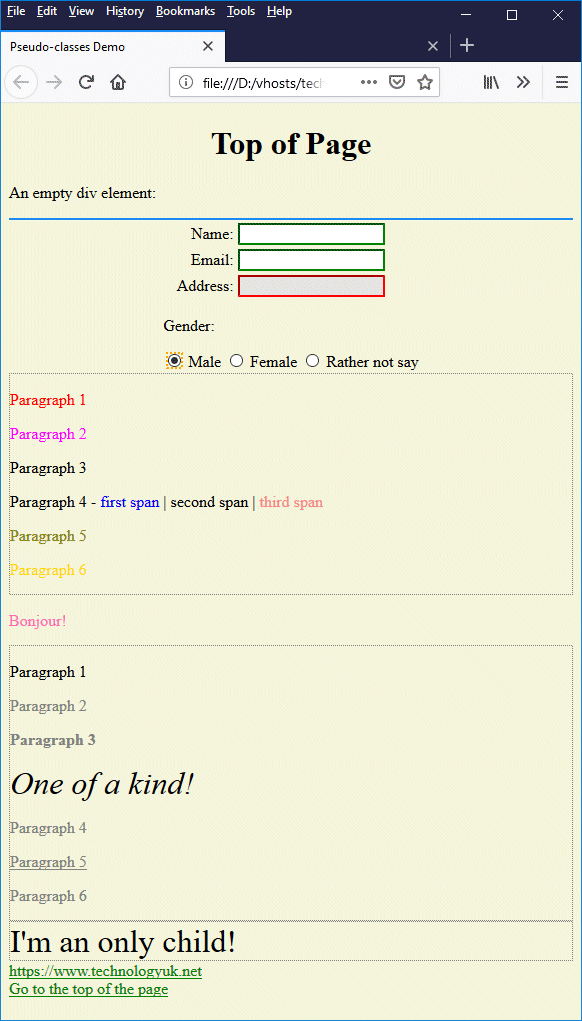
This page demonstrates all of the pseudo-classes!
Go through the code if you wish, and identify which pseudo-classes are responsible for the way in which the various page elements have been displayed (you will need to interact with the page in some cases to see the effect). You may never need to use many of these pseudo-classes, but it doesn't do any harm to know that they are available, and what they can do. You never know!
Pseudo elements
As we have seen, selectors that involve pseudo-classes identify elements according to their state, or according to their position within the document hierarchy, or according to their position relative to some other element or elements. We are now going to look at pseudo-elements, which represent entities that are not, in fact, elements in their own right.
Pseudo-elements are recognised by all user agents that support CSS. A pseudo-element can be used to style some part of an element. This will allow us, for example, to apply a special style to the first letter of a paragraph. The basic syntax for using a pseudo-element is as follows (note that pseudo-element names are not case sensitive):
selector::pseudo-element {
property: value;
.
.
.
}
There are currently only a relatively small number of pseudo-elements in widespread use. The table below describes some of these pseudo-elements, and provides examples of their use.
| Selector | Description | Example |
|---|---|---|
| ::after | Used to insert some content after the content of an element. | h1::after { content: "+"; } Puts a plus-sign at the end of a level 1 heading. |
| ::before | Used to insert some content before the content of an element. | p::before { content: "*"; } Puts an asterisk at the start of a paragraph. |
| ::first-letter | Used to style to the first letter of the text in a block-level element. | p::first-letter { font-size: 300%; } Makes the first letter in a paragraph three times as big as other characters in the text. |
| ::first-line | Used to style the first line of text in a block-level element. | p::first-line { font-weight: bold } Makes the first line in a paragraph bold. |
| ::selection | Used to dynamically style content that is selected by the user (the CSS properties that can be applied to ::selection are color, background, cursor, and outline). | ::selection { background: yellow; } Highlights content selected by the user by giving it a yellow background. |
One respect in which pseudo-elements differ from pseudo-classes is the use of a double-colon prefix (::). This is not an absolute requirement, since earlier versions of CSS used a single-colon prefix, which is still accepted for the sake of backward compatibility (it is also more likely to be supported by older browsers). All of the examples provided in this page use the double-colon prefix.
You can only use one pseudo-element in a selector, and it must appear after any other simple selectors. You can, however, use pseudo-elements in combination with class selectors, including pseudo-class selectors. Suppose we create a special class (which we'll call "latin") that italicises and enlarges the text of a paragraph, sets it to a serif font face, and increases the left and right margins, like this:
p.latin {
font-style: italic;
font-size: 125%;
font-family: serif;
margin: 1em 3em;
}
Now further suppose that we want to change the colour of the first line of the paragraph to red. We could do something like this:
p.latin::first-line { color: red; }
The HTML code below creates a web page that demonstrates the use of pseudo-elements.
<!doctype html>
<html lang="en">
<head>
<meta charset="utf-8">
<title>Pseudo-elements Demo</title>
<style>
div p::after { content: "?" }
div p::before { content: "*" }
section p::first-letter { font-size: 300%; }
p.latin {
font-style: italic;
font-size: 125%;
font-family: serif;
margin: 1em 3em;
}
p.latin::first-line { color: red; }
::selection { background: yellow; }
div, section { border: grey dotted 1px; }
h1 { text-align: center; }
</style>
</head>
<body>
<h1>Pseudo-elements Demo</h1>
<div>
<p>Paragraph 1</p>
<p>Paragraph 2</p>
<p>Paragraph 3</p>
</div>
<br>
<section>
<p>Paragraph 1</p>
<p>Paragraph 2</p>
<p>Paragraph 3</p>
</section>
<p class="latin">
<span class="drop_cap">L</span><span>orem ipsum dolor sit amet, consectetur adipiscing elit. Sed blandit libero sit amet nunc ultricies, eu feugiat diam placerat. Phasellus tincidunt nisi et lectus pulvinar, quis tincidunt lacus viverra. Phasellus in aliquet massa. Integer iaculis massa id dolor venenatis scelerisque. Morbi non eros a ex interdum molestie in eget leo. Proin pulvinar facilisis eros, sed porta ante imperdiet ut. Suspendisse tincidunt facilisis metus non faucibus. Integer posuere vehicula congue. Sed pharetra felis sapien, at imperdiet diam lacinia quis. Sed pharetra turpis et dui aliquam, in rhoncus elit ornare. Quisque posuere consequat nunc in rutrum. Praesent leo nibh, porta et arcu quis, placerat tincidunt turpis.</span>
</p>
</body>
</html>
Copy and paste this code into a new file in your HTML editor, save the file as css-pseudo-elements-demo.html, and open the file in a web browser. You should see something like the illustration below.
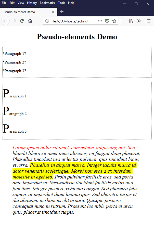
This page demonstrates the use of pseudo-elements
Go through the code if you wish, and identify which pseudo-elements are responsible for the way in which the various page elements have been displayed. Note that the ::selection pseudo-class is dynamic in nature - you will need to select some text to see it in action. As with some of the pseudo-classes we saw earlier, you may never need to use these pseudo-elements, but it doesn't hurt to know that they are available, and how they can be used.
Grouping selectors
We quite often want to apply exactly the same CSS rules to a number of different HTML elements. For example, we might want to apply the same special style to all of the heading elements (<h1> through <h6>). We could of course simply do something like this:
<style>
h1 {
text-align: center;
color: red;
font-family: sans-serif;
font-variant: small-caps;
}
h2 {
text-align: center;
color: red;
font-family: sans-serif;
font-variant: small-caps;
}
h3 {
text-align: center;
color: red;
font-family: sans-serif;
font-variant: small-caps;
}
h4 {
text-align: center;
color: red;
font-family: sans-serif;
font-variant: small-caps;
}
h5 {
text-align: center;
color: red;
font-family: sans-serif;
font-variant: small-caps;
}
h6 {
text-align: center;
color: red;
font-family: sans-serif;
font-variant: small-caps;
}
</style>
As you can probably see, however, this could become somewhat tedious, not to mention the fact that it increases the size of our CSS file - unnecessarily, as it turns out. CSS allows us to group selectors together when we want to apply a common set of CSS rules to them. We group selectors by preceding the declaration block with a comma-separated list of the selectors we wish to group, like this:
<style>
h1, h2, h3, h4, h5, h6 {
text-align: center;
color: red;
font-family: sans-serif;
font-variant: small-caps;
}
</style>