Working with CSS
Overview
There are three basic methods of using CSS to style your web pages – inline styles, embedded stylesheets, and external stylesheets. If you have read all of the pages in the section "HTML Basics", you will have seen each of these methods used at least once. We use a lot of inline styles and embedded style sheets in those pages, mostly for the sake of convenience. Once you start creating your own websites, you should really start thinking in terms of creating one or more external style sheets.
Inline styling is going to quickly become very time consuming, not to mention tedious, especially if you have a large number of web pages, and even more so if those web pages have a significant amount of content. You could of course create an embedded style sheet and simply copy and paste it into the head of every new web page you create or, better still, create a web page template that contains the embedded stylesheet.
This would save you a lot of work initially, but what happens if you then decide you want to amend part of your style sheet, or add something to it? The only way to make sure that all of your pages have the same styling information would be to make the necessary changes in the embedded style sheet on each page. This is not a huge problem if you only have a few pages, but for a large website it could mean a lot of additional work.
In this article, we will show you how to create an external style sheet that can be used to style any number of individual web pages, and explain why this is a far more efficient way of doing things. We also take a look at what is meant by inheritance, and at how the cascade principle is used to determine priority when two or more CSS rules are in conflict.
Using external style sheets will save you an awful lot of work, both in terms of developing your web pages in the first place, and in terms of maintaining and updating those pages. Maintaining a consistent look and feel for all of the pages in your website is an essential part of giving it a unique identity. One way of achieving this is to use the same stylesheet to style all of your pages.
Ultimately, you should be looking at a single style sheet that provides the style information for all of your web pages. That way, whether you decide to change just one aspect of your styling or want to give your site a major facelift, you only need to change one file. There is no danger of having omitted to make the necessary changes to one of your pages, because all of the styling information, for all of your pages, is held in a single file.
Having said all that, you may from time to time find yourself in a situation where the use of inline styles or embedded stylesheets is a better option than cluttering up your external stylesheet with CSS code you will only ever use in one or two very specific cases, so we certainly don't suggest you should never use these methods of adding style information to a page.
Keep in mind also that CSS is very flexible in this respect. You can apply inline styles, embedded style sheets and external style sheets to any web page, in any combination. Furthermore, you are not restricted to having just one external style sheet. In theory you can have as many external style sheets as you like.
This site, for example, has a lot of CSS code that is used purely for styling mathematical and scientific notation. If we felt that our main CSS file was becoming too big and unwieldy to manage efficiently, we could perhaps remove this code and put it in a separate CSS file (there are arguments for and against doing so, but that's a discussion for another time).
Inline styling
We should perhaps start by saying that inline styling is a bit of a last resort, which may come as a bit of a surprise, since we've already demonstrated the use of inline styles on a number of occasions. There are however circumstances under which the use of inline styles is justified. When you are starting a new project, for example, it is a convenient way of trying out different styles on a test page. It's also useful if you have to perform a "quick fix", or implement a "one-off" special feature.
We're going to create a cut-down and much-simplified version of one of the pages on this website - "Mainframe Computers" – to demonstrate the various ways in which styles can be applied to a web page starting, of course, with inline styles. First of all, we present the HTML code for the web page minus any styling:
<!doctype html>
<html lang="en">
<head>
<meta charset="utf-8">
<title>Mainframe Computers (No Style)</title>
</head>
<body>
<div>
<header>
<div>
<a href="/index.shtml"><img src="https://www.technologyuk.net/assets/images/logo.png" alt="The TechnologyUK Logo" width="300" height="80"></a>
</div>
<nav>
<div>
<a href="#">Home</a>
<span>»</span>
<a href="#">Computing</a>
<span>»</span>
<a href="#">Computer systems</a>
<span>»</span>
<a>Mainframe computers</a>
</div>
</nav>
</header>
<div>
<h1>Mainframe Computers</h1>
<p>
Many large organisations began using computers for data processing in the 1950s, with the advent of the <em>mainframe</em> computer. Mainframes were both very expensive and very large, occupying entire rooms or even buildings. The mainframe system consisted of a number of cabinets and various items of peripheral hardware. Stricly controlled conditions were required to keep the mainframe running, including a dust-free environment and air-conditioning. The name <em>mainframe</em> comes from the fact that the computer's processing and memory units were housed in a single large cabinet called the <em>main frame</em>.
</p>
<div>
<br>
<img src="https://www.technologyuk.net/assets/demo-images/mainframe01.jpg" alt="Mainframe computers occupied a lot of space">
<p>Mainframe computers occupied a lot of space</p>
<br>
</div>
<p>
Mainframe computers were initially used for <em>batch processing</em>, with batches of jobs being loaded together to run sequentially. The data to be processed was loaded into the mainframe by feeding punched cards into a card reader. The use of magnetic tape, and later magnetic disks, improved efficiency by speeding up data input, but the mainframe's processing unit was still idle for much of the time.
</p>
<br>
</div>
<footer>
<br>
<span><a href="#">Sitemap</a></span>
<span><a href="#">Contact</a></span>
<span><a href="#">Privacy</a></span>
<br><br>
<span>Copyright © 2001 - present TechnologyUK</span><br><br>
</footer>
</div>
</body>
</html>
Copy and paste this code into a new file in your HTML editor, save the file as css-nostyle-demo.html, and open the file in a web browser. You should see something like the illustration below.
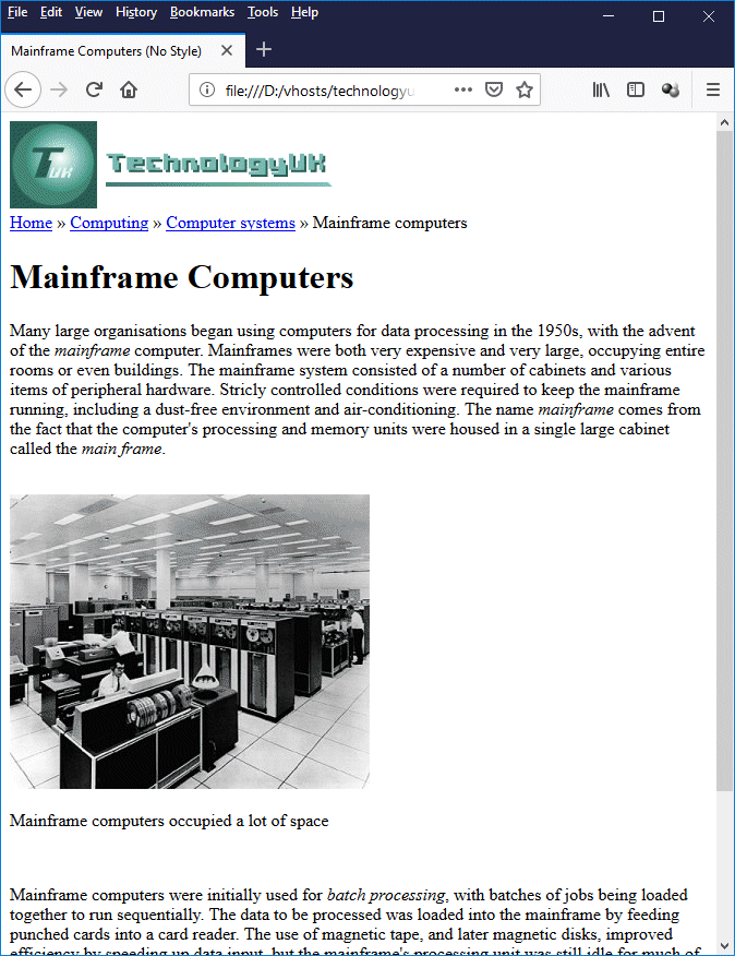
The "mainframe Computers" page with no styling
We can probably agree that the page is perfectly functional, although from a style point of view, it doesn't look much like the original at the moment. Here is a screenshot of the actual live web page as it appears with styling on the TechnologyUK website:

A screenshot of the actual "Mainframe Computers" page
(http://www.technologyuk.net/computer-systems/mainframe-computers.shtml)
How much inline styling would it take to make our page look like the original? The outer <div> element acts as a "wrapper" for the whole page. We'll start by adding the necessary style to this element. Open the file css-nostyle-demo.html in your HTML editor if you have closed it, and save it as css-inline-style-demo.html. Change the first opening <div> tag (that's the one immediately following the opening <body> tag) to read as follows:
<div style="width: 100%; height: 100%; margin: 0; padding: 0; text-align: center; vertical-align: top; background: #ffffff;">
If you now open the page in a web browser, you will see that we have managed to centre our main illustration. Unfortunately, we've centred everything else as well, which is not what we want. We're going to have to do a lot more work to get things how we want them. Let's deal with the site logo first, which should be over on the left. Locate the first opening <div> tag inside the <header> element and amend it to read as follows:
<div style="float: left; padding: 10px;">
This will move the site logo to (more or less) where we want it to be. We now need to sort out our navigation bar which at the moment is floating somewhat aimlessly up in the top left-hand corner of our page. Style the opening <div> tag inside the <nav> element as follows:
<div style="width: 100%; min-height: 4em; clear: both; text-align: left; background: #182F48; padding: 0 1em;">
If you refresh your browser, you'll see that we now have a navigation bar that looks almost like the original, although the navigation links are almost unreadable. We'll do something about that now. Change the HTML code inside the <div> tag from this:
<a href="#">Home</a>
<span>»</span>
<a href="#">Computing</a>
<span>»</span>
<a href="#">Computer systems</a>
<span>»</span>
<a>Mainframe computers</a>
to this:
<a style="display: inline-block; color: #ffffff; font-size: 83.33%; font-weight: bold; text-decoration: none; margin: 0.5em;" href="#">Home</a>
<span style="color: #ffffff; font-size: 83.33%; font-weight: bold; margin: 0.5em 0;">»</span>
<a style="display: inline-block; color: #ffffff; font-size: 83.33%; font-weight: bold; text-decoration: none; margin: 0.5em;" href="#">Computing</a>
<span style="color: #ffffff; font-size: 83.33%; font-weight: bold; margin: 0.5em 0;">»</span>
<a style="display: inline-block; color: #ffffff; font-size: 83.33%; font-weight: bold; text-decoration: none; margin: 0.5em;" href="#">Computer systems</a>
<span style="color: #ffffff; font-size: 83.33%; font-weight: bold; margin: 0.5em 0;">»</span>
<a style=" display: inline-block; font-size: 83.33%; font-weight: bold; text-decoration: none; color: #ffdd00; margin: 0.5em;" >Mainframe computers</a>
We're kind of getting there but you're probably beginning to appreciate why inline styling is not the recommended method for styling web pages! The main page content lives inside another <div> element, which we also need to style in order to get the correct page margins. Change the opening <div> tag that encounter immediately after the closing </header> tag to the following:
<div style="padding: 0 15%;">
Next on the agenda is the level one heading. Change this to read as follows:
<h1 style="color: #8fa4de; font-size: 150%; margin: 2em 0 0;">Mainframe Computers</h1>
Now we'll change the font-face for the whole page. While we're at it, we'll also make the navigation bar extend for the full width of the page (you may have noticed a slight gap either side that doesn't appear on the original page). We do this by applying the appropriate styles to the <body> element:
<body style="font-family: sans-serif; margin: 0;">
Things are now looking much better, but we still have centred body text, and our line spacing is wrong. We'll deal with that next. Edit the first and third opening <p> tags (but not the one immediately underneath the <img> element) to read as follows:
<p style="font-family: sans-serif; margin: 1.5em 0; text-align: left; line-height: 1.5em;">
Now change the remaining opening <p> tag (the one that contains our image caption) as follows:
<p style="margin: 1em; font-size: 83.33%; line-height: normal;">
Almost there. We just need to sort out the page footer. Edit the <footer> element and its contents to read as follows:
<footer style="clear: both; padding-top: 5px; min-height: 4em; background: #182F48;">
<br>
<span><a style="color: #cccccc; font-size: 83.33%; padding: 0 1em; text-decoration: none;" href="#">Sitemap</a></span>
<span><a style="color: #cccccc; font-size: 83.33%; padding: 0 1em; text-decoration: none;" href="#">Contact</a></span>
<span><a style="color: #cccccc; font-size: 83.33%; padding: 0 1em; text-decoration: none;" href="#">Privacy</a></span>
<br><br>
<span style="font-size: 83.33%; color: #cccccc;">Copyright © 2001 - present TechnologyUK</span>
<br><br>
</footer>
Well, we got there in the end. Save the file one final time and refresh it in your browser. It should now look something like this:
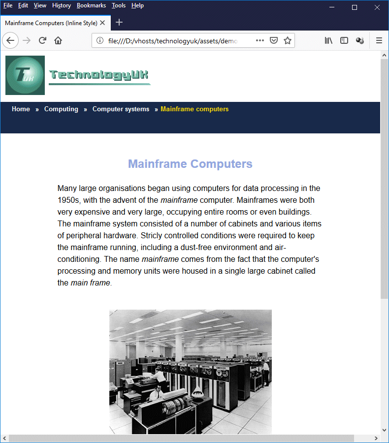
The "mainframe Computers" page with inline styling
This is pretty much identical to the original page apart from the fact that we left out some of the bells and whistles (there is no search facility at the top of the page or social media buttons at the bottom, for example) and all of the links are just for show, they don't actually go anywhere. We also took some shortcuts on the styling, believe it or not. Next, we'll see how we could rewrite this page to use an embedded stylesheet.
An embedded stylesheet
You are probably familiar by now with using the HTML <style> element to create an embedded stylesheet for a web page. What we want to do here is to take all of the inline styling we created in the previous example and put it into an embedded stylesheet in the head of the document.
HTML is primarily a semantic markup language whose job is to describe the meaning or purpose of content. CSS is a presentational markup language whose job is to take care of the aesthetic aspects of the content - how it looks on the page. Moving inline styles into an embedded stylesheet is the first step towards completely separating semantic markup from presentational markup.
We're going to go through the HTML code in the order in which it appears in our HTML file, building our embedded style sheet step by step and making the necessary changes to our HTML code. The first step is to open the file css-inline-style-demo.html in your HTML editor and save it as css-embedded-stylesheet-demo.html.
The first line we need to deal with is this:
<body style="font-family: sans-serif; margin: 0;">
Insert the following code inside the <head> element, after the closing </title> tag:
<style>
body {
font-family: sans-serif;
margin: 0;
}
</style>
Now delete the style attribute from inside the opening <body> tag, and refresh the page in your browser - you should see that it functions just as it did before. The next line we need to change is this:
<div style="width: 100%; height: 100%; margin: 0; padding: 0; text-align: center; vertical-align: top; background: #ffffff;">
Add the following code to the bottom of your embedded style sheet (i.e. immediately before the closing </style> tag):
.wrapper {
width: 100%;
height: 100%;
margin: 0;
padding: 0;
text-align: center;
vertical-align: top;
background: #ffffff;
}
And change the HTML code for the <div> tag to read:
<div class="wrapper">
Next, we'll deal with the site logo. Add this code to your embedded stylesheet:
.logo {
float: left;
padding: 10px;
}
And change this line:
<div style="float: left; padding: 10px;">
to this:
<div class="logo">
Now we'll create the style for our main navigation bar. Insert the following code into your embedded style sheet:
.navbar {
width: 100%;
min-height: 4em;
clear: both;
text-align: left;
background: #182F48;
padding: 0 1em;
}
and change the opening <div> tag inside the <nav> element from this:
<div style="width: 100%; min-height: 4em; clear: both; text-align: left; background: #182F48; padding: 0 1em;">
To this
<div class="navbar">
We will next create a style for our main navigation links. Add this code to your embedded style sheet:
nav a {
display: inline-block;
color: #ffffff;
font-size: 83.33%;
font-weight: bold;
text-decoration: none;
margin: 0.5em;
}
You can now simply delete the style attribute in each of the first three navigation links in its entirety (don't do anything to the last one just yet). Up until now, we have pretty much been replacing inline styles with embedded styles on a one-for-one basis - not much labour saving there, you might think. Now, for the first time, we have replaced three separate inline style declarations with just one embedded style - a sign of things to come.
The last link in our main navigation bar appears to point to the current page ("Mainframe computers") but it's really only a placeholder to show the user where they are on the "breadcrumb trail", and not an actual link. We can thus think of it as being a "dead" link, and it will be styled differently to indicate that this is the case.
Add this code to your embedded style sheet:
nav a.dead { color: #ffdd00; }
Now delete the last link's style attribute and set its class attribute as follows:
<a class="dead">Mainframe computers</a>
All we really needed to do here was to change the colour of the link. The CSS rules that apply to the other links also apply to this link because it is inside the <nav> element. We have simply overridden the value assigned to the link's color attribute by setting its class attribute to "dead".
We can deal with the <span> elements inside the <nav> element in similar fashion. Add the following code to your embedded style sheet:
nav span {
color: #ffffff;
font-size: 83.33%;
font-weight: bold;
margin: 0.5em 0;
}
and delete the style attribute from each of the <span> elements.
The style for the main content pane's <div> is one line of code. Put this in your embedded style sheet:
.content { padding: 0 15%; }
and replace this line of HTML code:
<div style="padding: 0 15%;">
with this:
<div class="content">
The level one heading is even more straightforward. Add this code to your embedded style sheet:
h1 {
color: #8fa4de;
font-size: 150%;
margin: 2em 0 0;
}
and remove the style attribute from the opening <h1> tag.
The same goes for the paragraph element. Add this code to your embedded style sheet:
p {
font-family: sans-serif;
margin: 1.5em 0;
text-align: left;
line-height: 1.5em;"
}
and remove the style attributes from the first and third opening <p> tags. The remaining <p> element provides the caption for our image, and is styled a little differently because we want it to be centred and rendered in a smaller font. Add this code to your embedded style sheet:
.caption {
margin: 1em;
font-size: 83.33%;
text-align: center;
line-height: normal;
}
and change this line:
<p style="margin: 1em; font-size: 83.33%; line-height: normal;">Mainframe computers occupied a lot of space</p>
to this:
<p class="caption">Mainframe computers occupied a lot of space</p>
Now we'll set up the style for the <footer> element. Add this code to your embedded style sheet:
footer {
clear: both;
padding-top: 5px;
min-height: 4em;
background: #182F48;
}
and delete the style attribute from the opening <footer> tag.
All that is left to do now is to style the <span> elements and the links inside the footer. We can handle these to some extent like we handled the <span> elements inside the <nav> element. Add the following styles to your embedded style sheet:
footer span {
font-size: 83.33%;
color: #cccccc;
}
footer a {
color: #cccccc;
padding: 0 1em;
text-decoration: none;
}
And delete the style attributes from all of the elements inside the <footer> element. And that's it! Here is the final version of css-embedded-stylsheet-demo.html:
<!doctype html>
<html lang="en">
<head>
<meta charset="utf-8">
<title>Mainframe Computers (Embedded Stylesheet)</title>
<style>
body {
font-family: sans-serif;
margin: 0;
}
.wrapper {
width: 100%;
height: 100%;
margin: 0;
padding: 0;
text-align: center;
vertical-align: top;
background: #ffffff;
}
.logo {
float: left;
padding: 10px;
}
.navbar {
width: 100%;
min-height: 4em;
clear: both;
text-align: left;
background: #182F48;
padding: 0 1em;
}
nav a {
display: inline-block;
color: #ffffff;
font-size: 83.33%;
font-weight: bold;
text-decoration: none;
margin: 0.5em;
}
nav a.dead { color: #ffdd00; }
nav span {
color: #ffffff;
font-size: 83.33%;
font-weight: bold;
margin: 0.5em 0;
}
.content { padding: 0 15%; }
h1 {
color: #8fa4de;
font-size: 150%;
margin: 2em 0 0;
}
p {
font-family: sans-serif;
margin: 1.5em 0;
text-align: left;
line-height: 1.5em;"
}
.caption {
margin: 1em;
font-size: 83.33%;
text-align: center;
line-height: normal;
}
footer {
clear: both;
padding-top: 5px;
min-height: 4em;
background: #182F48;
}
footer span {
font-size: 83.33%;
color: #cccccc;
}
footer a {
color: #cccccc;
padding: 0 1em;
text-decoration: none;
}
</style>
</head>
<body>
<div class="wrapper">
<header>
<div class="logo">
<a href="/index.shtml"><img src="https://www.technologyuk.net/assets/images/logo.png" alt="The TechnologyUK Logo" width="300" height="80"></a>
</div>
<nav>
<div class="navbar">
<a href="#">Home</a>
<span>»</span>
<a href="#">Computing</a>
<span>»</span>
<a href="#">Computer systems</a>
<span>»</span>
<a class="dead" >Mainframe computers</a>
</div>
</nav>
</header>
<div class="content">
<h1>Mainframe Computers</h1>
<p>
Many large organisations began using computers for data processing in the 1950s, with the advent of the <em>mainframe</em> computer. Mainframes were both very expensive and very large, occupying entire rooms or even buildings. The mainframe system consisted of a number of cabinets and various items of peripheral hardware. Stricly controlled conditions were required to keep the mainframe running, including a dust-free environment and air-conditioning. The name <em>mainframe</em> comes from the fact that the computer's processing and memory units were housed in a single large cabinet called the <em>main frame</em>.
</p>
<div>
<br>
<img src="https://www.technologyuk.net/assets/demo-images/mainframe01.jpg" alt="Mainframe computers occupied a lot of space">
<p class="caption">Mainframe computers occupied a lot of space</p>
<br>
</div>
<p>
Mainframe computers were initially used for <em>batch processing</em>, with batches of jobs being loaded together to run sequentially. The data to be processed was loaded into the mainframe by feeding punched cards into a card reader. The use of magnetic tape, and later magnetic disks, improved efficiency by speeding up data input, but the mainframe's processing unit was still idle for much of the time.
</p>
<br>
</div>
<footer>
<br>
<span><a href="#">Sitemap</a></span>
<span><a href="#">Contact</a></span>
<span><a href="#">Privacy</a></span>
<br><br>
<span>Copyright © 2001 - present TechnologyUK</span>
<br><br>
</footer>
</div>
</body>
</html>
As you can see, we now have more lines of code in the document head than in its body! The HTML code in the body of the document is, in fact, now reasonably compact. You may at this stage be wondering if the result was worth all the effort, but remember, this is only a short web page with a couple of paragraphs and a single image. The benefits will manifest themselves more clearly when we start working with significantly longer pages.
Imagine a web page containing hundreds of paragraphs, all of which require the same inline style. Certainly, we can use a copy and paste facility to eliminate the need to manually enter all of the CSS rules, but it still involves a fair amount of work, and generates an awful lot of additional code. A single entry in an embedded style sheet in the head of the document eliminates all of those copy and paste operations, and all of that extra code.
Furthermore, if you find you need to change something, it's much easier to do so in an embedded style sheet than to have to trudge through the entire document changing each instance of an inline style. Even if you are able to use an automatic find and replace facility, there is always the chance of something going wrong.
Having established how much more efficient it is to use an embedded stylesheet, as opposed to inline styles, we can now turn our attention to the relative merits of external style sheets which, after all, is what we have been leading up to.
An external stylesheet
Converting our "Mainframe Computers" page from having inline styling to having an embedded stylesheet was quite hard work. So how hard do we have to work to create an external stylesheet for our page that does the same thing? Actually, surprisingly little. We've already done all the hard work!
You should already have a sub-directory in your htdocs directory (or wherever you save your HTML files) called css. If not, create one now. Then, using your HTML editor or text editor, create a new blank text file and save it in the css directory as style.css (all external CSS stylesheets will have the extension .css). Leave the file open for the moment.
Open the file css-embedded-stylsheet-demo.html once more and save it as css-external-stylsheet-demo-html. Now copy all of the CSS code between the opening and closing <style> . . . </style> tags, paste it into the file style.css, then save and close style.css. Once you have done this, delete the <style> element from css-external-stylsheet-demo-html, including everything between its opening and closing tags.
We have now removed all of the CSS rules from css-external-stylsheet-demo-html and put them into an external style sheet. If you save the file and open it in a browser, you will see that we appear to be back where we started from in terms of styling (i.e. there isn't any). That's because we have one final step to take before our external stylesheet can have the desired effect, which is to link the HTML file to the stylesheet file.
To achieve this, add the following line of code to the HTML document, somewhere between the opening and closing <head . . . </head> tags:
<link href="css/style.css" rel="stylesheet">
Now save the file once more and open it in a web browser (or hit the refresh button if you still have it open). You should see that order has been restored, and all your CSS rules are now doing what they are supposed to do (if they are not working for any reason, make sure you have saved the .css file in the right place, and with the right file extension, and that you have used the correct path and filename in your <link> tag).
And that's it! You can now create any number of HTML documents and link them to the same stylesheet, enabling you to re-use the CSS rules you have created. You will inevitably find that as you develop more pages, situations will arise that require additional CSS rules. Simply add the new rules to your external stylesheet file.
The overwhelming consensus is that unless you have compelling reasons to do otherwise, you should put all of your CSS rules in an external stylesheet. The advantages of doing so can be summarised as follows (no particular order should be implied):
- Ease of maintenance - additions, changes and corrections to CSS rules can be achieved by editing a single text file, and will be immediately applied to all of your pages simultaneously.
- Smaller HTML files - removing CSS rules to a separate file will considerably reduce the amount of code required for individual web pages, which will make them faster to download and (perhaps more importantly) easier to maintain.
- Improved SEO profile - removing CSS rules to a separate file will increase the ratio of text to code. Some search engines include the text-to-code ratio in the set of metrics they use to determine web page ranking.
- Separation of semantic and presentational code - this is one of the overriding goals of the W3C in developing CSS.
Inheritance
The term inheritance in the context of cascading stylesheets refers to the fact that some properties of an HTML element can inherit values from a parent element, or from an "ancestor" element much higher up in the document tree.
Consider what would happen, for example, if we were to comment out all CSS rules assigning a value to the color property of an element in the external stylesheet file style.css, and then open the file css-external-stylsheet-demo-html in a browser. We would see something like this:
The "mainframe Computers" page with no values set for the color property
You should be able to see that the colour of the links, as well as the colour of the text in the level one heading, have been changed to the browser's default colours. Suppose, however, I now add a new rule to the block of CSS code that styles the <body> element as follows:
body {
font-family: sans-serif;
padding: 0;
margin: 0;
color: orange; /* this is a new rule */
}
What will this new rule change, if anything? If we refresh the browser once more, we will see something like this:
The value of the <body> element's color property is selectively inherited
As we can see, the color property for each of the <h1>, <p>, and <span> elements has inherited its value, through the document tree, from the <body> element's color property. Interestingly, none of the <a> elements are affected except for the single instance that does not have a value assigned to its href attribute.
According to the W3C, the color property "describes the foreground color of an element's text content". Its initial value is stated as being dependent on the user agent, and its value is inherited. You will have realised by now that any value we assign to an element's color property using a CSS rule will override any inherited value.
The <a> element's color property does not inherit its value from the <body> element because it has its value assigned by the user agent's internal style sheet (something we'll discuss in more detail shortly). We can override the user agent's internal style sheet rules with our own style sheet rules by virtue of the fact that the CSS rules generated by the user agent are only applied in the absence of any other CSS rules, and our style sheet thus take precedence (the weighting given to CSS rules differs, depending on their origin - we'll be discussing this in more detail shortly).
W3C provides a complete definition for every property that can be specified for an HTML element, which includes whether or not the property's value is inherited. If it is inherited, and if it has not been assigned a value by a CSS rule, it will take the same value as that assigned to the same property for the parent element.
A good example of how this works is given in the W3C documentation. Suppose we have the following CSS rules in an embedded or an external stylesheet:
body { font-size: 10pt; }
h1 {
font-size: 130%;
color: blue;
}
Now suppose we apply those rules to an HTML document that contains the following HTML code:
<body>
<h1>This is an <em>important</em> heading!</h1>
</body>
The values of both color and font-size are inherited. The text between the opening and closing <em> . . . </em> tags will be blue because the value of the <em> element's color property is inherited from its parent, the <h1> element. The <h1> element has had its color property set to "blue" by a stylesheet rule.
Another stylesheet rule sets the <h1> element's font-size property to "130%", which is a calculated value - it is evaluated as 130% × 10pt (the value of the <body> element's font-size property) resulting in a calculated value of "13pt". If a value is inherited, it makes no difference whether that value has been explicitly assigned to the parent or is calculated. The <em> element's font-size property will thus inherit the calculated value ("13pt").
A property may also be assigned a value of "inherit", which explicitly tells it to take the same value as that assigned to the same property on the element's parent, even if that property is one whose value would not normally be inherited.
The cascade principle
Stylesheets can originate from three distinct sources. There are, of course, the stylesheets created by the web developer, which can be either embedded stylesheets or external stylesheets (we should probably include inline styles as well, since there may occasionally be situations in which their use is justified). There is also the default stylesheet provided by the user agent.
Stylesheets can also originate with the user themselves. Most modern browsers provide a facility that allows the user to create their own stylesheet (we tried this with Firefox and managed to successfully override the TechnologyUK stylesheet rules). This is probably not something most users would do, but it's something to keep in mind. Another thing to bear in mind is that most browsers allow users to change the settings for things like default font sizes and colours.
Even if we ignore user-defined stylesheets and the user agent's default stylesheet for the moment, opportunities still exist for CSS rules to be in conflict, because it is quite possible for an HTML document to have inline styles and an embedded stylesheet, and be linked to an external stylesheet.
Of course, we don't knowingly create conflicting CSS rules. Even so, in a large website that has been developed over many years, it is always possible for a new CSS rule to be introduced that will override an older CSS rule that has all but been forgotten about. This can happen even if all your CSS rules are in a single external stylesheet!
Another thing that can happen is that you write a new CSS rule only to find that it doesn't work on certain pages because there is an existing inline style in place that overrides the new rule (this is a good argument, I suppose, for avoiding inline styles). These problems happen from time to time, and are not usually serious. They are almost always easy enough to resolve once you have discovered them.
What will help in this respect is having a good understanding of the circumstances under which one CSS rule will override another, i.e. an understanding of the rules by which precedence is determined. This is where the "cascading" part of cascading style sheets comes into play. It was realised from the beginning that style sheets from different origins, and at different levels in the document hierarchy, would inevitably overlap in scope from time to time.
The "cascade", as W3C have dubbed it, is basically a mechanism by which one CSS rule is given precedence over another (conflicting) CSS rule according to a well-defined algorithm. The CSS cascade works by assigning a weight to each style rule. Quite simply, if two or more style rules apply to the same HTML element, the rule with the greatest weight takes precedence. Let's try and summarise this in simple terms:
- CSS rules in user stylesheets have more weight than CSS rules in the user agent's default stylesheet.
- CSS rules in developer stylesheets have more weight than those in either user stylesheets or the user agent's default stylesheet.
- Developer and user CSS rules may both include the !important directive, which enables them to override any other (conflicting) CSS rule, regardless of its position in the document tree.
- If a developer rule and a user rule are in conflict, and both rules include the !important directive, normal rules of precedence are reversed and the user rule has more weight than the developer rule.
The general order of precedence, starting with the lowest and ending with the highest, is as follows:
- User agent declarations
- User "normal" declarations
- Developer "normal" declarations
- Developer "important" declarations
- User "important" declarations
If after applying the order of precedence detailed above, two or more conflicting CSS rules are found to be equally weighted, precedence is determined according to specificity; more specific selectors will override more general ones (we will be looking at the rules used to determine the specificity of selectors elsewhere). Pseudo-elements and pseudo-classes are counted as normal elements and classes, respectively.
If two or more CSS rules are still evenly weighted, whichever rule appears last takes precedence (so for example, inline CSS rules take precedence over CSS rules in embedded stylesheets, which in turn take precedence over external stylesheets). Note however that if a link to an external stylesheet appears in the head of the document after the declaration of an embedded stylesheet using the HTML <style> element, the external style sheet takes precedence).