| Author: | |
| Website: | |
| Page title: | |
| URL: | |
| Published: | |
| Last revised: | |
| Accessed: |
Visual Basic has an extensive range of features for creating graphics. Using the appropriate commands, it is possible to draw shapes and lines, to create and manipulate images, to intermingle text and graphics, and to utilise a vast range of colours. The subject of computer graphics, and of the graphics capabilities of Visual Basic in particular, is worthy of a book or website in its own right.
We will not delve too deeply into the capabilities of Visual Basic's graphics library in these pages. We will however explore some of its useful features by developing a fully functional application for creating graphic images. The program is based on the Microsoft Windows Paint program. It allows the user to create simple graphic images and save them to a file.
The functionality of the program has been limited in order to simplify the design of the interface and reduce the amount of coding required, so there is plenty of scope for further experimentation. Even so, the application is far from trivial, so we have a fair amount of work to do.
| Property | Value |
|---|---|
| Text | "EasyPaint" |
| Size | 640, 600 |
| Property | Value |
|---|---|
| Name | pnlMain |
| Enabled | False |
| Location | 0, 24 |
| Size | 624, 538 |
| Property | Value |
|---|---|
| Name | pnlFrame |
| BorderStyle | FixedSingle |
| Location | 9, 49 |
| Size | 482, 482 |
| Property | Value |
|---|---|
| Name | picCanvas |
| BackColor | Gray |
| Location | 10, 50 |
| Size | 480, 480 |
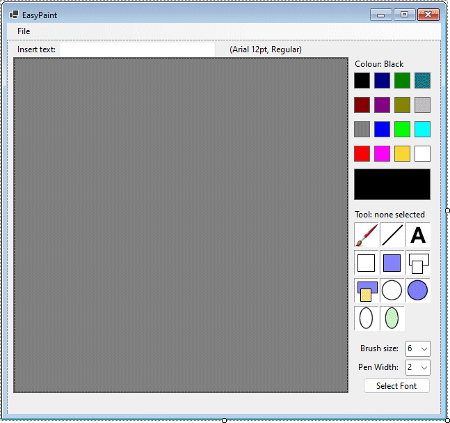
Your form should now look like the illustration below.
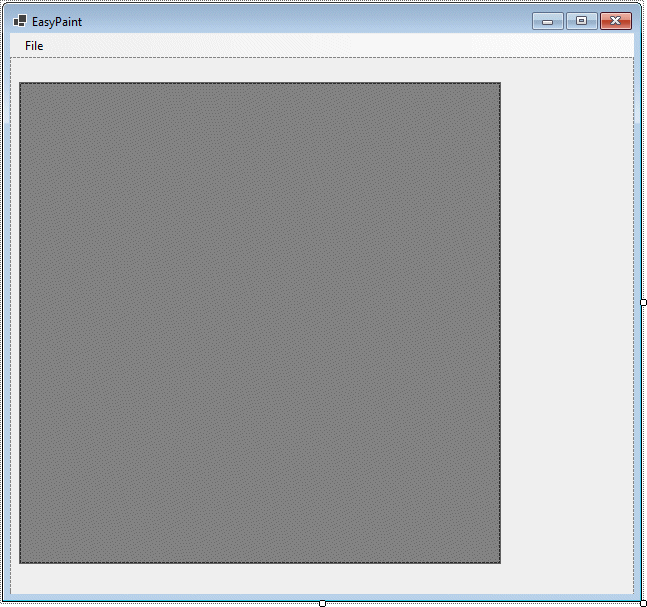
The EasyPaint program interface
The form does not yet have much in the way of controls, but we have created a drawing area. The drawing area is is defined by the PictureBox control picCanvas, which will be assigned a bitmap image. It is the bitmap image, rather than the control itself, that we will draw on. This means that turning the images we create into files is relatively easy (we will elaborate on how this is done later). The PictureBox control serves both to define the boundaries of the drawing area and to provide a background for the lines, shapes, text, and freehand brush strokes drawn by the user.
The pnlMain control sits behind all of the other controls on the form (including those not yet created) except for the mnuEasyPaint control, and effectively becomes the parent object for them. We have intentionally disabled this panel so that when the user opens the application the only control that will be available to them is the File menu.
The pnlFrame control sits behind picCanvas, and is larger by two pixels in each direction. Its sole purpose is to provide a frame for picCanvas, and its BorderStyle property is set to FixedSingle, whereas that of picCanvas is set to None (we will explain the reason for this later).
We will now create controls to allow the user to choose the text size and font for their drawings (note that the remaining controls will be assigned coordinates relative to the pnlMain control).
| Property | Value |
|---|---|
| Name | lblEditText |
| Location | 12, 6 |
| Text | Insert text: |
| Property | Value |
|---|---|
| Name | txtInsertText |
| Location | 75, 3 |
| Size | 225, 20 |
| Property | Value |
|---|---|
| Name | lblFontDetails |
| Location | 317, 6 |
| Text | (Arial 12pt, Regular) |
| Property | Value |
|---|---|
| Name | cmdFont |
| Location | 512, 485 |
| Size | 97, 23 |
| Text | Select Font |
Later, we will be adding some code to the cmdFont button that opens the FontDialog control to allow the user to select from the fonts available on their computer. The selection will be reflected in the contents of the label control lblFontDetails, which is set to display "(Arial 12pt, Regular)" by default.
The text box will be used to enter any text that the user wants to insert into their image. The programming can wait for the moment, however. Next, we will create the controls that allow the user to select a colour for whatever tool they are currently using. For this application, we have limited the palette to sixteen colours, but there is no reason it could not be extended to the full range of available colours (up to a little over sixteen million colours, in fact!) with a little more work.
| Property | Value |
|---|---|
| Name | lblBlack |
| AutoSize | False |
| BackColor | Black |
| BorderStyle | FixedSingle |
| Location | 499, 47 |
| Size | 23, 23 |
| Text | None |
This control is the first of sixteen colour selector controls. The remaining controls will share many of the same property values, with the only differences between them being the Name, BackColor and Location properties.
| Name | BackColor | Location |
|---|---|---|
| lblNavy | Navy | 528, 47 |
| lblGreen | Green | 557, 47 |
| lblTeal | Teal | 586, 47 |
| lblMaroon | Maroon | 499, 82 |
| lblPurple | Purple | 528, 82 |
| lblOlive | Olive | 557, 82 |
| lblSilver | Silver | 586, 82 |
| lblGray | Gray | 499, 117 |
| lblBlue | Blue | 528, 117 |
| lblLime | Lime | 557, 117 |
| lblCyan | Cyan | 586, 117 |
| lblRed | Red | 499, 152 |
| lblFuchsia | Fuchsia | 528, 152 |
| lblYellow | Yellow | 557, 152 |
| lblWhite | White | 586, 152 |
| Property | Value |
|---|---|
| Name | lblColor |
| AutoSize | False |
| BackColor | Black |
| BorderStyle | FixedSingle |
| Location | 499, 185 |
| Size | 110, 45 |
| Text | None |
| Property | Value |
|---|---|
| Name | lblColorSelected |
| Location | 497, 27 |
| Text | Colour: Black |
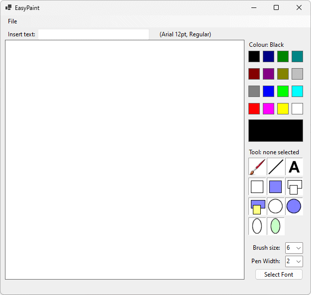
Your application's user interface should now look like the illustration below.
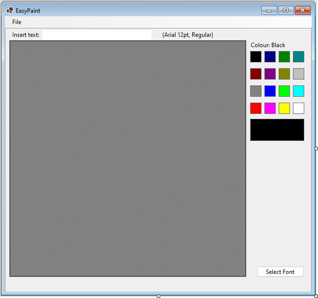
The EasyPaint program interface with its colour selection controls
Once we have coded the event handler for the colour selector controls, the user will be able to click on any one of the sixteen available selections to choose a colour, which will then be used by whatever drawing tool is chosen (including text). The large colour box underneath the colour selector controls will change to whatever the currently selected colour is, and the label above the colour selector controls will display the colour's name. The name of the colour selected will also be stored in a global program variable so that the various tools can be coded to output text or graphics in the correct colour.
The next task is to create controls to allow the user to select a drawing tool. The tool selection controls will again be labels, each of which will display an image, allowing the user to see at a glance what kind of tools are available. We have created a zipped file called easy_paint.zip that contains the images for the tool selection controls. The file can be downloaded from the link below.
Download the easy_paint.zip file here.
| Property | Value |
|---|---|
| Name | lblBrush |
| AutoSize | False |
| BorderStyle | Fixed3D |
| Image | brush.gif |
| Location | 499, 262 |
| Size | 36, 36 |
| Tag | Brush |
| Text | None |
This control is the first of eleven tool selector controls. The remaining controls will share many of the same property values, with the only differences between them being the Name, Image, Location and Tag properties.
| Name | Image | Location | Tag |
|---|---|---|---|
| lblLine | line.gif | 536, 262 | Line |
| lblText | text.gif | 573, 262 | Text |
| lblSqOut | square_outline.gif | 499, 302 | Square |
| lblSqFill | square_filled.gif | 536, 302 | SquareFilled |
| lblRecOut | rectangle_outline.gif | 573, 302 | Rect |
| lblRecFill | rectangle_filled.gif | 499, 342 | RectFilled |
| lblCircOut | circle_outline.gif | 536, 342 | Circ |
| lblCircFill | circle_filled.gif | 573, 342 | CircFilled |
| lblEllOut | ellipse_outline.gif | 499, 382 | Ellipse |
| lblEllFill | ellipse_filled.gif | 536, 382 | EllipseFilled |
| Property | Value |
|---|---|
| Name | lblToolSelected |
| Location | 497, 243 |
| Text | Tool: none selected |
Your application's user interface should now look like the illustration below.
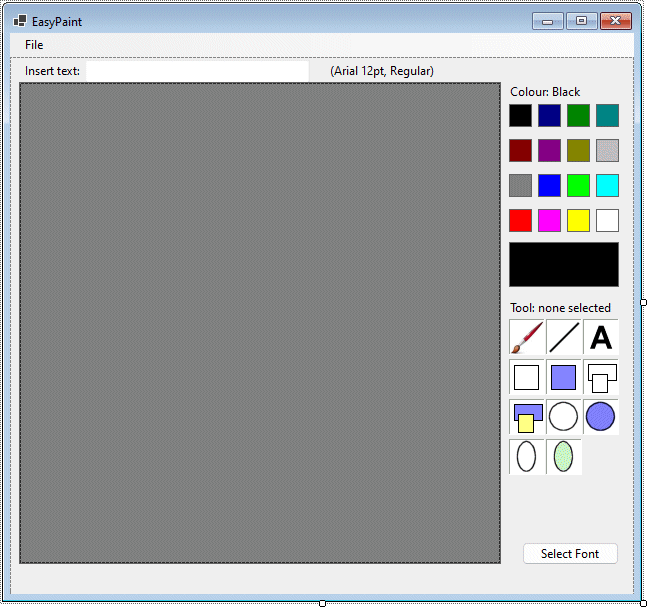
The EasyPaint program interface with its tool selection controls
The remaining controls will allow the user to select the brush size (for freehand painting) and the pen width (for drawing lines and outline shapes) . Both controls consist of a combo box that allows the user to choose from a range of values (1 to 32 for the brush size, and 1 to 12 for the pen width).
| Property | Value |
|---|---|
| Name | lblBrushSize |
| AutoSize | False |
| Location | 496, 435 |
| Size | 71, 13 |
| Text | Brush size: |
| TextAlign | MiddleRight |
| Property | Value |
|---|---|
| Name | cmbBrushSize |
| Items | 1-32* |
| Location | 573, 432 |
| Size | 36, 23 |
| Sorted | False |
| Text | 6 |
*In the Items property box, click on the browse button. You will see a dialog box like the one illustrated below. Type in the values (1-32), one per line, Then click OK.
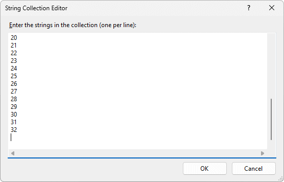
The ComboBox control's String Collection Editor
| Property | Value |
|---|---|
| Name | lblPenWidth |
| AutoSize | False |
| Location | 496, 462 |
| Size | 71, 13 |
| Text | Pen Width: |
| TextAlign | MiddleRight |
| Property | Value |
|---|---|
| Name | cmbPenWidth |
| Items | 1-12 |
| Location | 573, 459 |
| Size | 36, 23 |
| Sorted | False |
| Text | 2 |
That's it for the interface design! We can now add the code. First, run the application to see what it looks like. You should see something very similar to the illustration below. Note that the controls (apart from the File menu) are disabled when the program first opens. That is as it should be.
The completed EasyPaint program interface
Dim G As Drawing.Graphics
Dim drawFlag As Boolean = False
Dim xDown, yDown, xUp, yUp As Integer
Dim intL, intR, intT, intB, intW, intH As Integer
Dim clrSelected As Color = Color.Black
Dim intToolSelected As Integer = 0
Dim intBrushSize As Integer = 6
Dim intPenWidth As Integer = 2
Dim intFontSize As Integer = 12
Dim strText As String
Dim strFont As String = "Arial"
Dim styFontStyle As FontStyle
Dim strFontStyleArray() As String = {"Regular", "Bold", "Italic", "Bold Italic", "Unknown", _
"Unknown", "Unknown", "Unknown", "Regular Strikeout", "Bold Strikeout", _
"Italic Strikeout", "Bold Italic Strikeout", "Regular Underline Strikeout", _
"Bold Underline Strikeout", "Italic Underline Strikeout", _
"Bold Italic Underline Strikeout"}
Dim bmpPic As Bitmap
Some explanations are required here. The first line of code declares a variable (G) of type Graphics. The Graphics class defines an incredible number of methods for drawing and manipulating gaphic objects. An object of this type inherits those methods, allowing us to call on them for the purposes of drawing graphics in our application. We can associate a control (for example a form or a picture box) with this variable, and by so doing effectively turn the control into a canvas on which to draw.
As you will see, we are going to create a bitmap image and draw graphics to it, which will make the task of saving our completed artwork to a file relatively easy. The next variable is a Boolean variable called drawFlag, which is set to True when the mouse is down and False when the mouse is up. Essentially, whatever drawing tool we are currently using can only have an effect when the mouse is down (i.e. the user is holding down the left mouse button).
The next four integer variables (xDown, yDown, xUp, and yUp) are used to track the screen positions (relative to the drawing surface) at which a mouse button is pressed down and released respectively. Note that for freehand drawing, we are interested in tracking the mouse in real time as it moves around the canvas. For all other controls, we require a snapshot of the points at which the mouse button is clicked and subsequently released.
The six integer variables declared on the next line (intL, intR, intT, intB, intW and intH) define the bounding rectangle for all of the geometric shapes we will draw (and also define the start and end point for lines). They represent the left and right x coordinates, the top and bottom y coordinates, and the width and height of the rectangle respectively.
The clrSelected variable has the type Color, which stores the RGB values for a specific colour (although many common colours are referenced using names like "Black", "Red", "Blue" etc.) This variable will be used to keep track of the colour currently selected by the user, and when the program starts is set to Color.Black (black) by default.
The next four variables are relatively self-explanatory. The integer variable intToolSelected tracks which drawing tool the user has selected at any given time (a value of 0 means no tool is selected). The intBrushSize and intPenWidth integer variables keep track of the brush size and pen width selected by the user, and intFontSize keeps track of the font size selected for drawing text.
The string variable strText will hold text entered by the user, which will be added to the image if the user clicks on the drawing surface while the text tool is selected. The strFont string variable holds the name of the selected font face, and is initially set to "Arial". The styFontStyle variable is a specialised numeric data type (FontStyle) that is used to enumerate the various style characteristics (e.g. Italic, bold, underline, strikethrough etc.) and combinations thereof.
The last module variable (strFontStyleArray()) is an array of type String that holds text descriptions of the various font styles and style combinations. It has displayed correct font information in the (admittedly limited) testing carried out on the application, although documentation relating to the various font styles and their enumerations has proved somewhat elusive (the information to hand has been gleaned through experimentation with various fonts).
pnlMain.Enabled = True
picCanvas.BackColor = Color.White
bmpPic = New Bitmap(picCanvas.Width, picCanvas.Height)
picCanvas.Image = bmpPic
G = Graphics.FromImage(bmpPic)
picCanvas.DrawToBitmap(bmpPic, picCanvas.ClientRectangle)
This relatively short piece of code activates the application by setting the Enabled property of the panel control (pnlMain) to True. It also sets the background colour of the picture box control to white, setting up a "fresh canvas" for the user's artistic endeavours. The third line of code creates a bitmap image (bmpPic) of the same size as the picture box, the fourth line assigns the bitmap image it to the Image property of picCanvas, and the fifth line of code links it with the graphics object (G), which means that any drawing operations invoked with G will draw directly to the bitmap image bmpPic.
The last line looks rather cryptic, but what it does is take the white rectangle that was drawn on picCanvas by the system when we set its background colour to white, and draw it into the the bitmap image (which is initially empty). That is why we elected not to display a border for our PictureBox control, since this would also have appeared in the bitmap image.
To see the effect of this code, run the application, open the File menu, and click on the New menu item. You should see something like the screenshot below. All of the controls are now enabled (although most of them will not do anything until we have added some more code).
The File►New menu item activates the interface controls
Private Sub lblPalette_Click(sender As Object, e As EventArgs) _
Handles lblBlack.Click, lblNavy.Click, lblGreen.Click, lblTeal.Click, _
lblMaroon.Click, lblPurple.Click, lblOlive.Click, lblSilver.Click, _
lblGray.Click, lblBlue.Click, lblLime.Click, lblCyan.Click, _
lblRed.Click, lblFuchsia.Click, lblYellow.Click, lblWhite.Click
lblColor.BackColor = sender.BackColor
clrSelected = sender.BackColor
Select Case clrSelected
Case Color.Black
lblColorSelected.Text = "Colour: Black"
Case Color.Navy
lblColorSelected.Text = "Colour: Navy"
Case Color.Green
lblColorSelected.Text = "Colour: Green"
Case Color.Teal
lblColorSelected.Text = "Colour: Teal"
Case Color.Maroon
lblColorSelected.Text = "Colour: Maroon"
Case Color.Purple
lblColorSelected.Text = "Colour: Purple"
Case Color.Olive
lblColorSelected.Text = "Colour: Olive"
Case Color.Silver
lblColorSelected.Text = "Colour: Silver"
Case Color.Gray
lblColorSelected.Text = "Colour: Gray"
Case Color.Blue
lblColorSelected.Text = "Colour: Blue"
Case Color.Lime
lblColorSelected.Text = "Colour: Lime"
Case Color.Cyan
lblColorSelected.Text = "Colour: Cyan"
Case Color.Red
lblColorSelected.Text = "Colour: Red"
Case Color.Fuchsia
lblColorSelected.Text = "Colour: Fuchsia"
Case Color.Yellow
lblColorSelected.Text = "Colour: Yellow"
Case Color.White
lblColorSelected.Text = "Colour: White"
End Select
End Sub
This event handler handles the Click event for all sixteen colour selection controls, and differentiates between them by looking at the BackColor property. The first line of code within the body of the event handler sets the background colour of the lblColor label control to the same colour as that of the colour selector control clicked by the user. The second line of code sets the value of the global variable clrSelected (which is of type Color) to that colour also.
The remainder of the code consists of a Select Case statement that tests to see which colour was selected by the user and changes the text displayed by the lblColorSelected control accordingly. To see the effect of this code, run the application, open the File menu, and click on the New menu item, then click on various colour selector controls.
The next task is to write the event handler for the drawing tool selection controls. As with the colour selector controls, a single event handler serves all of them.
Private Sub lblTool_Click(sender As Object, e As EventArgs) _
Handles lblBrush.Click, lblLine.Click, lblText.Click, lblSqOut.Click, _
lblSqFill.Click, lblRecOut.Click, lblRecFill.Click, lblCircOut.Click, _
lblCircFill.Click, lblEllOut.Click, lblEllFill.Click
resetTools()
Select Case sender.Tag
Case "Brush"
intToolSelected = 1
lblBrush.BorderStyle = BorderStyle.FixedSingle
lblToolSelected.Text = "Tool: Brush"
Case "Line"
intToolSelected = 2
lblLine.BorderStyle = BorderStyle.FixedSingle
lblToolSelected.Text = "Tool: Line"
Case "Text"
intToolSelected = 3
lblText.BorderStyle = BorderStyle.FixedSingle
lblToolSelected.Text = "Tool: Text"
Case "Square"
intToolSelected = 4
lblSqOut.BorderStyle = BorderStyle.FixedSingle
lblToolSelected.Text = "Tool: Square Outlined"
Case "SquareFilled"
intToolSelected = 5
lblSqFill.BorderStyle = BorderStyle.FixedSingle
lblToolSelected.Text = "Tool: Square Filled"
Case "Rect"
intToolSelected = 6
lblRecOut.BorderStyle = BorderStyle.FixedSingle
lblToolSelected.Text = "Tool: Rectangle Outlined"
Case "RectFilled"
intToolSelected = 7
lblRecFill.BorderStyle = BorderStyle.FixedSingle
lblToolSelected.Text = "Tool: Rectangle Filled"
Case "Circ"
intToolSelected = 8
lblCircOut.BorderStyle = BorderStyle.FixedSingle
lblToolSelected.Text = "Tool: Circle Outlined"
Case "CircFilled"
intToolSelected = 9
lblCircFill.BorderStyle = BorderStyle.FixedSingle
lblToolSelected.Text = "Tool: Circle Filled"
Case "Ellipse"
intToolSelected = 10
lblEllOut.BorderStyle = BorderStyle.FixedSingle
lblToolSelected.Text = "Tool: Ellipse Outlined"
Case "EllipseFilled"
intToolSelected = 11
lblEllFill.BorderStyle = BorderStyle.FixedSingle
lblToolSelected.Text = "Tool: Ellipse Filled"
End Select
End Sub
Sub resetTools()
lblBrush.BorderStyle = BorderStyle.Fixed3D
lblLine.BorderStyle = BorderStyle.Fixed3D
lblText.BorderStyle = BorderStyle.Fixed3D
lblSqOut.BorderStyle = BorderStyle.Fixed3D
lblSqFill.BorderStyle = BorderStyle.Fixed3D
lblRecOut.BorderStyle = BorderStyle.Fixed3D
lblRecFill.BorderStyle = BorderStyle.Fixed3D
lblCircFill.BorderStyle = BorderStyle.Fixed3D
lblCircFill.BorderStyle = BorderStyle.Fixed3D
lblEllOut.BorderStyle = BorderStyle.Fixed3D
lblEllFill.BorderStyle = BorderStyle.Fixed3D
End Sub
intBrushSize = CInt(cmbBrushSize.Text)
intPenWidth = CInt(cmbPenWidth.Text)
dlgFont.ShowDialog()
strFont = dlgFont.Font.Name
styFontStyle = dlgFont.Font.Style
intFontSize = dlgFont.Font.Size
lblFontDetails.Text = "(" & strFont & " " & intFontSize & "pt, " & strFontStyleArray(styFontStyle) & ")"
The above code opens the dlgFont dialog box to allow the user to select a font. Of the values returned by the dialog box, the font name (a string value) is assigned to the string variable strFontName, the style (an enumeration) is assigned to the style variable styFontStyle, and the font size (an integer value) is assigned to the integer variable intFontSize. All of these variables have module scope, and can be accessed by any procedure.
The information is then assembled into a string, which is assigned to the Text property of the control lblFontDetails, which informs the user which font face, font size and font style are currently selected. The text for the font style is selected from the string array strFontStyleArray() using the numeric styFontStyle value returned by the dialog box (you might recall we discussed the lack of documentation on this topic earlier).
drawFlag = True
xDown = e.X
yDown = e.Y
If intToolSelected = 1 And drawFlag = True Then
xDown = e.X
yDown = e.Y
G.FillEllipse (New SolidBrush (clrSelected) , xDown, yDown, intBrushSize, intBrushSize)
picCanvas.Refresh()
End If
The second of these two procedures only applies to freehand drawing with the brush tool. Like the first procedure, it records the location of the cursor on the drawing surface at the moment when the mouse button is pressed, but because the procedure executes whenever the mouse is moved (providing the brush tool is selected and the drawFlag variable is set), then the mouse position is effectively tracked in real time.
As the mouse moves over the canvas, an ellipse is drawn at each new position recorded to create the impression of a paintbrush moving across the drawing surface. The FillEllipse method of the Graphics object uses the values stored in the clrSelected and intBrushSize variables to determine the colour and size respectively of the ellipse drawn (which is in fact a circle because it uses intBrushSize for both dimensions of the ellipse), and the xDown and yDown variables to determine where to draw each ellipse as the mouse moves.
Run the application, select New from the File menu and try out the brush tool to see how it works. Note that we have not yet written any code for the MouseUp event, so you will find that the only way to stop painting with the brush is to select another tool!
The MouseUp event does most of the useful work of the application in that it draws shapes, lines and text strings on the drawing surface. Before we write the MousUp event handler however, we need to consider the behaviour associated with the various shape tools (the tools that draw squares, rectangles, circles and ellipses) and how we want to implement them, since they will each require a slightly different approach.
Visual Basic draws shapes within a bounding rectangle defined by its top left hand corner, width and height. The top left-hand corner is defined as a pixel offset from the top left-hand corner of the drawing surface (in our case, this is the PictureBox object picCanvas). The width and height are also defined using pixel values. We will create subroutines to set up the coordinates for the rectangle within which the different shapes will be drawn, starting with the square.
Sub dimSquare()
If xUp < 0 Then xUp = 0
If xUp > 480 Then xUp = 480
If yUp < 0 Then yUp = 0
If yUp > 480 Then yUp = 480
intW = Math.Abs(xUp - xDown)
intH = Math.Abs(yUp - yDown)
If intW > intH Then intW = intH
If xUp < xDown Then intL = xDown - intW Else intL = xDown
If yUp < yDown Then intT = yDown - intW Else intT = yDown
End Sub
The first four lines here are concerned with restricting the xUp and yUp coordinates to a point within the bounding rectangle of the drawing surface. The next two lines call the Math.Abs() function to set absolute values of intW and intH respectively (saving us the bother of having to work out whether to subtract xUp from xDown, or the other way round, and so on).
The next line of code determines how big the square will be when it is drawn. Since it is a square, then by definition the sides will be equal in length. We will (somewhat arbitrarily) limit the width and height to whichever is the shorter of intW and intH. The square will be drawn within a bounding rectangle (or bounding square, in this case) that extends left or right, up or down from the xDown and yDown coordinates, depending on whether the user drags the mouse left or right, up or down, after they have pressed the mouse button.
The last two lines of code determine where the top left hand corner of the bounding rectangle should be (this will have the x and y coordinates intL and intT respectively).
Sub dimRectangle()
If xUp < 0 Then xUp = 0
If xUp > 480 Then xUp = 480
If yUp < 0 Then yUp = 0
If yUp > 480 Then yUp = 480
intW = Math.Abs (xUp - xDown)
intH = Math.Abs (yUp - yDown)
If xUp < xDown Then intL = xDown - intW Else intL = xDown
If yUp < yDown Then intT = yDown - intH Else intT = yDown
End Sub
The first six lines of code are identical to the previous procedure. The only real differences are that the line of code that reduces the value of intW to that of intH (if the latter is smaller) in the dimSquare() procedure has been removed, and that the final line of code uses intH instead of intW to determine the y coordinate for the top of the bounding rectangle.
Sub dimCircle()
If xUp < 0 Then xUp = 0
If xUp > 480 Then xUp = 480
If yUp < 0 Then yUp = 0
If yUp > 480 Then yUp = 480
intW = Math.Abs (xUp - xDown)
intH = Math.Abs (yUp - yDown)
If intW < intH Then intW = intH
intL = xDown - intW
intT = yDown - intW
intW *= 2
End Sub
The first six lines of the subroutine are identical to those used in the subroutines used for the square and the rectangle (advocates of re-usable code will be straining at the leash to remove this code to a separate subroutine - feel free to optimise the code!).
We are only going to use one of the dimensions (intW) to draw the circle, so the next line of code checks to see if intW is smaller than intH. If so the value of intW is increased to match the value of intH. This dimension represents the circle's radius, so the coordinates for the top left-hand corner of the bounding rectangle will be intW pixels to the left of the point defined by the xDown and yDown coordinates, and the same distance above it.
The penultimate two lines of code subtract intW from xDown and yDown to find intL and intY respectively. The last line of code doubles the value of intW, so that the bounding rectangle (again, read bounding square) for the circle extends for the same distance on either side, and above and below, the point defined as the centre of the circle (xDown, yDown).
Sub dimEllipse()
If xUp < 0 Then xUp = 0
If xUp > 480 Then xUp = 480
If yUp < 0 Then yUp = 0
If yUp > 480 Then yUp = 480
intW = Math.Abs (xUp - xDown)
intH = Math.Abs (yUp - yDown)
intL = xDown - intW
intT = yDown - intH
intW *= 2
intH *= 2
End Sub
The only real difference between dimCircle() and dimEllipse() are that dimEllipse() uses the values of both the intW and intH variables to determine the position of the top left-hand corner of the bounding rectangle and its size. Note that the dimensioning of shapes works the same regardless of whether the shapes are outlined or filled. The real difference between the two types of shape is in the methods used to draw them by the Graphics object.
The next piece of code we need to write is the MouseUp event handler for the picCanvas control, which will enable us to demonstrate the various shape tool methods.
Dim brushFill As SolidBrush = New Drawing.SolidBrush(clrSelected)
Dim penLine As New Pen(clrSelected, intPenWidth)
drawFlag = False
xUp = e.X
yUp = e.Y
Select Case intToolSelected
Case 2
G.DrawLine(penLine, xDown, yDown, xUp, yUp)
Case 3
strText = txtInsertText.Text
G.DrawString(strText, New System.Drawing.Font(strFont, intFontSize, styFontStyle), _
brushFill, xUp, yUp)
Case 4
dimSquare()
G.DrawRectangle(penLine, intL, intT, intW, intW)
Case 5
dimSquare()
G.FillRectangle(brushFill, intL, intT, intW, intW)
Case 6
dimRectangle()
G.DrawRectangle(penLine, intL, intT, intW, intH)
Case 7
dimRectangle()
G.FillRectangle(brushFill, intL, intT, intW, intH)
Case 8
dimCircle()
G.DrawEllipse(penLine, intL, intT, intW, intW)
Case 9
dimCircle()
G.FillEllipse(brushFill, intL, intT, intW, intW)
Case 10
dimEllipse()
G.DrawEllipse(penLine, intL, intT, intW, intH)
Case 11
dimEllipse()
G.FillEllipse(brushFill, intL, intT, intW, intH)
End Select
picCanvas.Refresh()
Here we see the tools used to draw shapes - the SolidBrush and the Pen. The SolidBrush is used to draw the filled shapes, while the Pen is used to draw lines and outline shapes. Both accept a Color argument, which is set to clrSelected at the beginning of the procedure. The Pen method also accepts a Width argument that determines the thickness of lines or the borders of any outline shapes drawn.
In our MouseUp() procedure, we use the value of intPenWidth. Although they have default values, both clrSelected and intPenWidth can be set by the user at run time. The next three lines of code set the drawFlag variable to False (signalling that no drawing tools are currently active), and set the xUp and yUp variables to the x and y coordinates (relative to the drawing surface) of the point at which the mouse button was released. The remaining code mostly consists of a Select Case statement that checks to see if a drawing tool is currently selected, and if so takes the appropriate action.
If the Line tool has been selected, the Drawline() method of the Graphics object draws the line with the penLine object (which, if you remember, has been set to the currently selected colour and line width) between the coordinates defined by xDown, yDown, and xUp, yUp.
If the Text tool is selected, whatever text is currently in the txtInsertText control's Text property (if any) is drawn using the font face, font style, and font size selected by the user, starting at the position defined by xUp, yUp.
If a shape tool is selected then - depending on which shape tool has been chosen - the appropriate subroutine (dimSquare(), dimRectangle(), dimCircle() or dimEllipse()) will be called to set the bounding rectangle.
For outline squares or rectangles, the Graphic object's DrawRectangle() method is used with the penLine object, the only difference being that the width and height dimensions used for drawing a square will be identical, whereas those used for drawing a rectangle will (usually) be different. For solid squares or rectangles, the method used will be FillRectangle() and the object used to draw will be brushFill.
Circles and ellipses follow a similar patter, with the DrawEllipse() method used for the outline shapes and FillEllipse() used for their solid counterparts.
The final line of code calls the Graphic object's Refresh() method to make sure the changes made by the program are displayed to the screen immediately.
sfdSavePic.Filter = "Bitmap |*.bmp"
If sfdSavePic.ShowDialog = DialogResult.OK Then
picCanvas.Image.Save(sfdSavePic.FileName, Drawing.Imaging.ImageFormat.Bmp)
MsgBox("File saved.")
End If
This code uses the sfdSavePic SaveFileDialog object that we added to the form earlier, and sets up a filter that will only allow the user to choose the bitmap file format. It will also add the ".bmp" file extension to any files saved. What is actually being saved here is the picCanvas PictureBox control's Image, which is a bitmap object, and to which all our graphics commands draw. To complete the application, there is one more very trivial task:
End
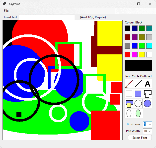
The completed program in action